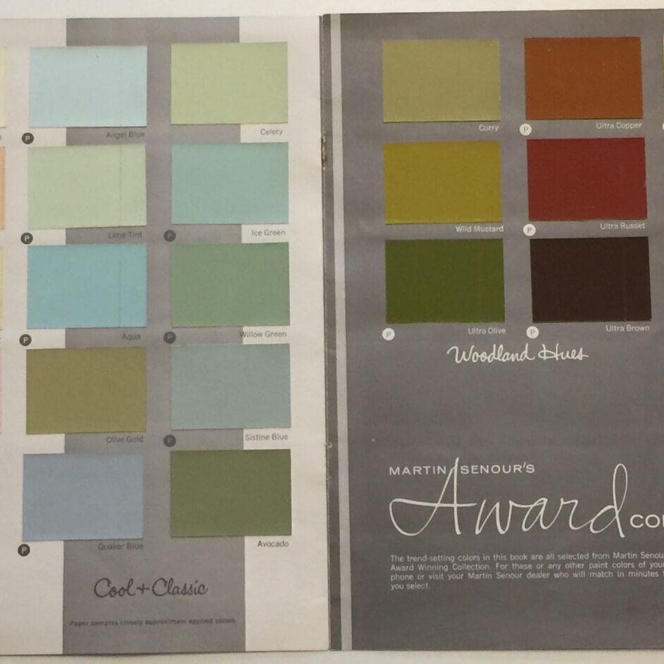
This is the Martin Senour colors of 1968 Paint Color Chart. This curated mid-century collection has warm hues and timeless appeal.

Presented in six harmonized micro-palettes that range from room enlarging pastels to deep toned accents. Here is a sample of late 1960’s color styling.
Spacemakers
Off whites that harmonize well with many furnishings. Use them in dark, dim or shaded rooms. Avoid white in too bright or sunny rooms. Stark whites look best in modern settings.
The Cheerleaders
Consider these warm, cheerful, clean and clear hues in rooms with little or no natural light. They’re good wake up colors for bedrooms and baths.
Cool + Classic
Use cool (blue) colors for the sunniest rooms. Save the most muted colors for formal rooms. Use lots of white wood trim for extra sparkle. Combine blues with greens like for cooling summer color schemes.
Woodland Hues
These best of 1968 colors are good companions for the popular Candlelight Golds. In too bright or sunny rooms cut the glare with Ultra Olive, Ultra Brown or Ultra Russet. They are good with stone, wood, brick and the Best Beiges for all informal settings.
Candlelight Golds
There are golds here for every taste and use. They provide worlds of warmth for sunless rooms.
Best Beiges
Best Beiges provide good backdrops for earth inspired furnishings. Paint a single Best Beige throughout the house for a unified effect and larger look. Extend the color effect of carpeting onto the walls by matching the two.
This trend setting palette was curated from the award winning Martin Senour colors of 1968 collection.
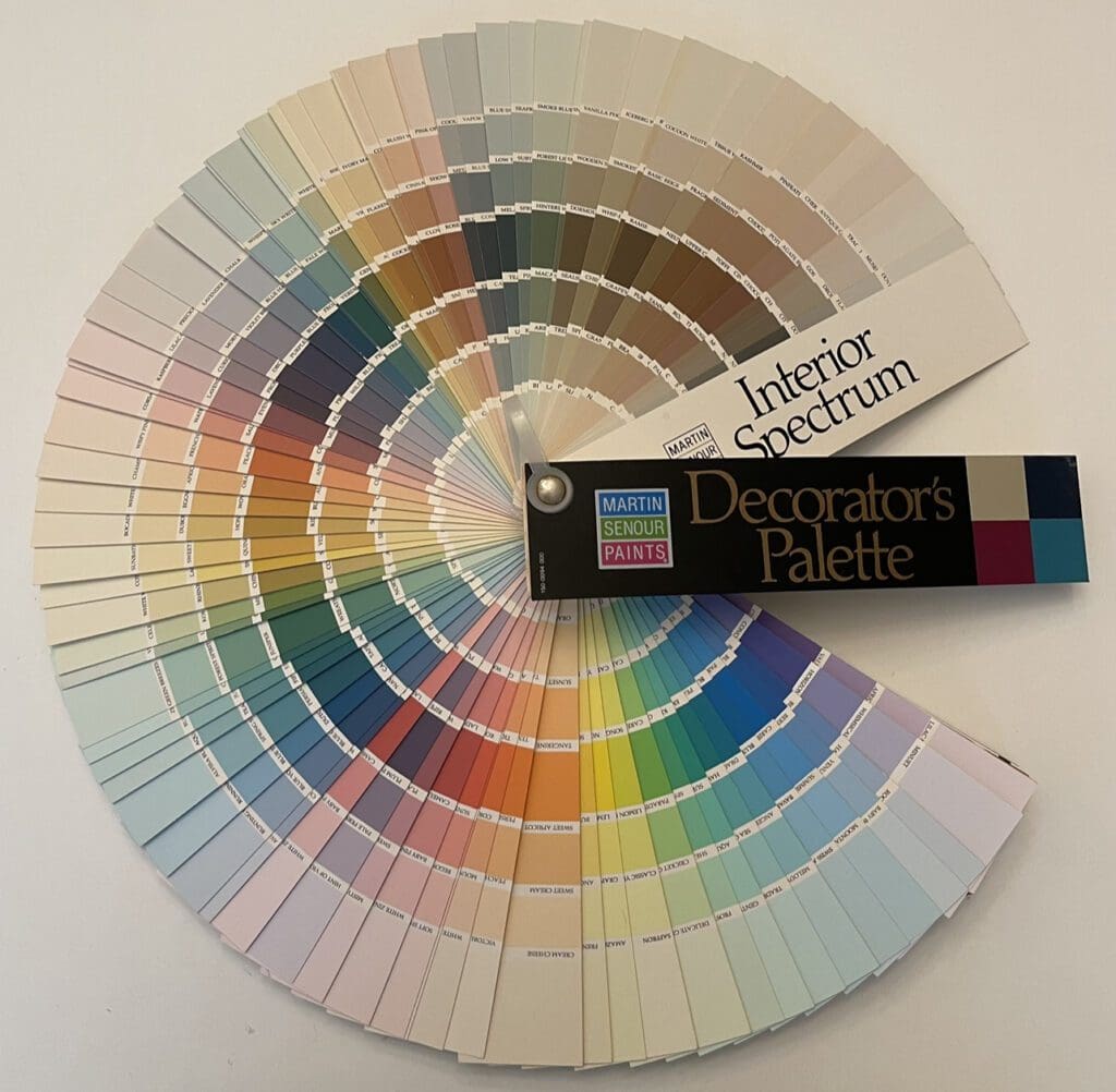
Martin Senour 1994
Dominated by pastels and mid-tones, these Martin Senour paint colors were curated to produce calm and sophisticated design schemes. They provided a backdrop that allowed room elements, such as furnishings and collections, to take center stage.

The philosophy of this color collection emphasized simplicity and timelessness. The goal was to create interiors that would withstand passing trends and remain appealing for years to come. This approach embraced a classic and enduring aesthetic, prioritizing longevity over fads.
The mid-1990’s desire for serenity and balance aligned with the growing interest in wellness and self care. Mid-range colors were seen as soothing and calming; promoting relaxation and a refuge from the outside world. This was significant given the perceived fast paced nature of life during that time.
Additionally, this era witnessed a resurgence of minimalism and clean design. The palette supported this aesthetic by providing uncomplicated visual backdrops. This simplicity helped focus on the forms and textures of furniture and decor, providing a sense of elegance and understated luxury.
Finally, the Martin Senour Interior Decorator’s Palette reflected a shift towards a more subdued and classic approach to design. Embracing lighter tones and prioritizing simplicity, this color system produced harmonious, balanced spaces that have stood the test of time. Martin Senours’ influence can still be seen in contemporary design, with homeowners and designers drawing inspiration from the enduring appeal of this classic color collection.
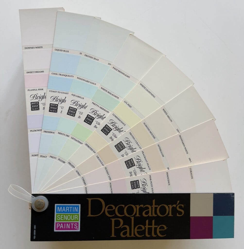
Bright Lights
The 1994 Martin Senour Interior Bright Lights Palette was popular with homeowners, designers, and decorators of the time. Made up of 48 pale, light, and subdued shades, including baby blues, pale pinks, soft greens, and delicate yellows, this curated collection offered a range of tranquil colors. These hues found their place in bedrooms, bathrooms, and other relaxing spaces, where they contributed to a serene, peaceful aesthetic.

These muted tones served as an ideal backdrop, harmonizing effortlessly with design elements such as artwork, furniture, and furnishings. Whether applied throughout an entire house or used selectively as accents, these soft hues brought a touch of calm and serenity to any space.
The popularity of these colors reminds us of the peaceful and soothing decorating schemes from the 1990s. Martin Senour Paints are no longer available.
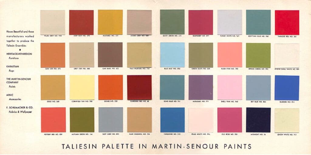
Frank Lloyd Wright Taliesin
This is the 1955 Frank Lloyd Wright Taliesin Color Palette made in Martin Senour Paints.

