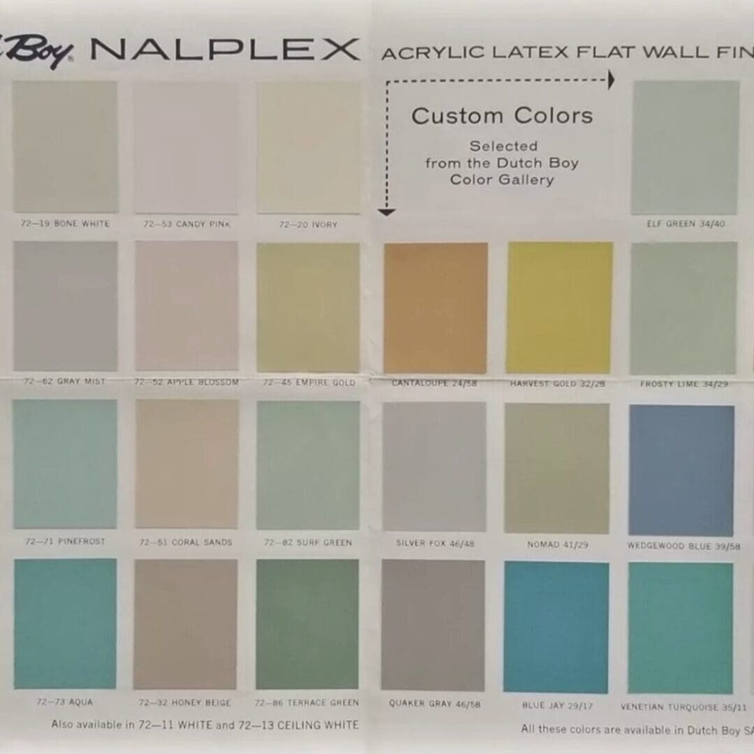
Founded in 1907, Dutch Boy is one of America’s most recognized brands in the home improvement industry. Use these Dutch Boy vintage colors to inspire an interior or exterior home design refresh.
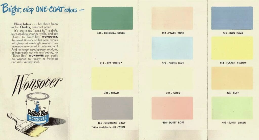
1949 Interior Wall Flat
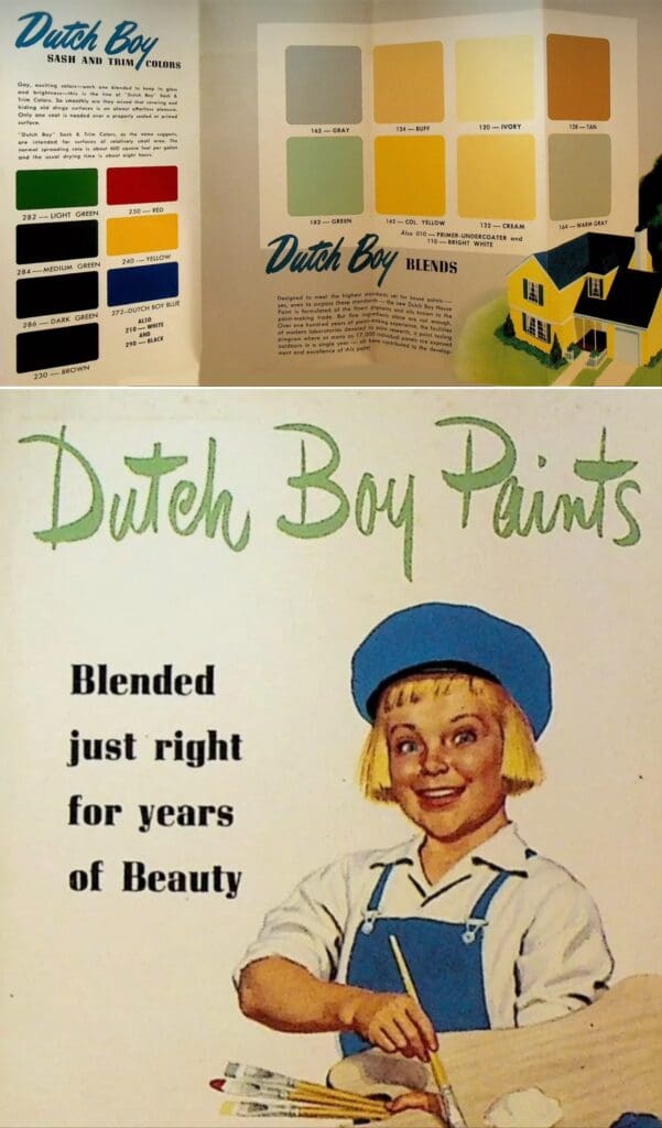
1950 Exterior Sash & Trim
These paint colors were used on exterior windows, doors, shutters and light fixtures.
1951 Interior Enamel Colors
Interior enamel colors were used on cabinets, furniture and doors & trim.
1954 Exterior House Paint Colors

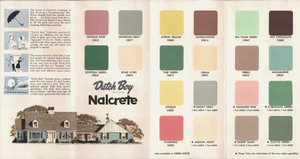
1955 Exterior Stucco & Siding
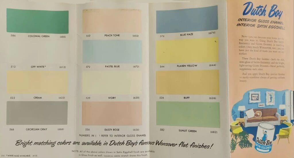
1957 Interior Gloss Paint
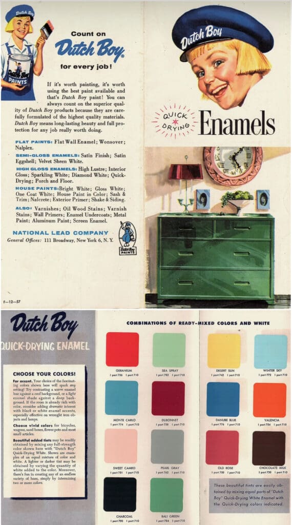
1958 Exterior Sash & Trim
Sash and trim paint came in gloss or semi-gloss enamel and was used on exterior doors, windows, facia, trim, shutters and accents like light fixtures.
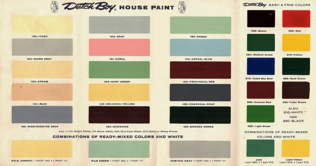
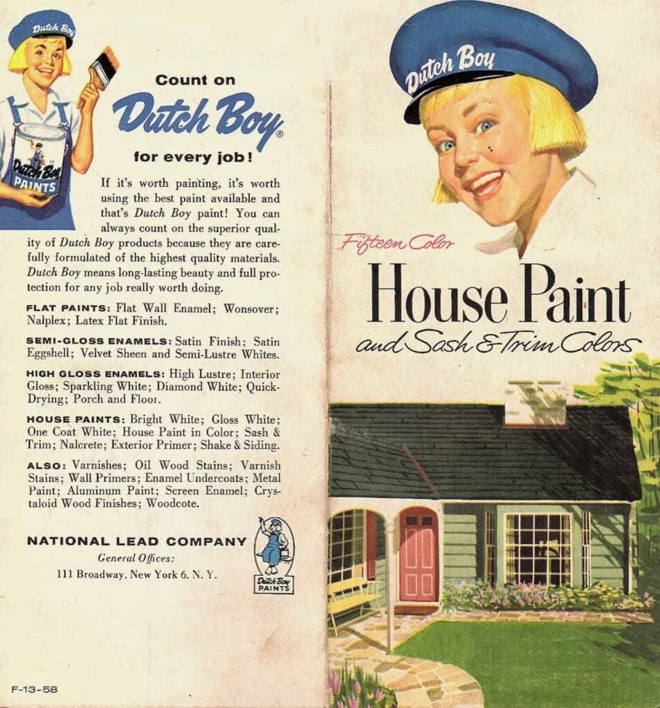
1959 Interior Wall Flat
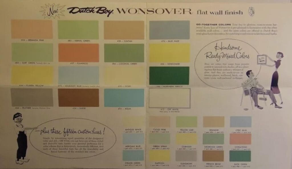
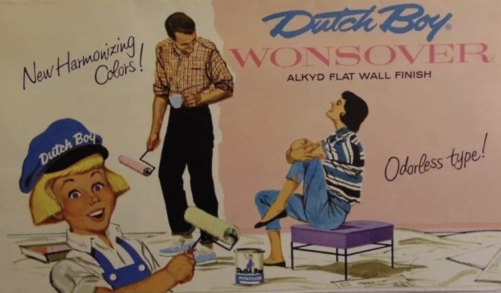
1959 Interior Semi-Gloss Enamel
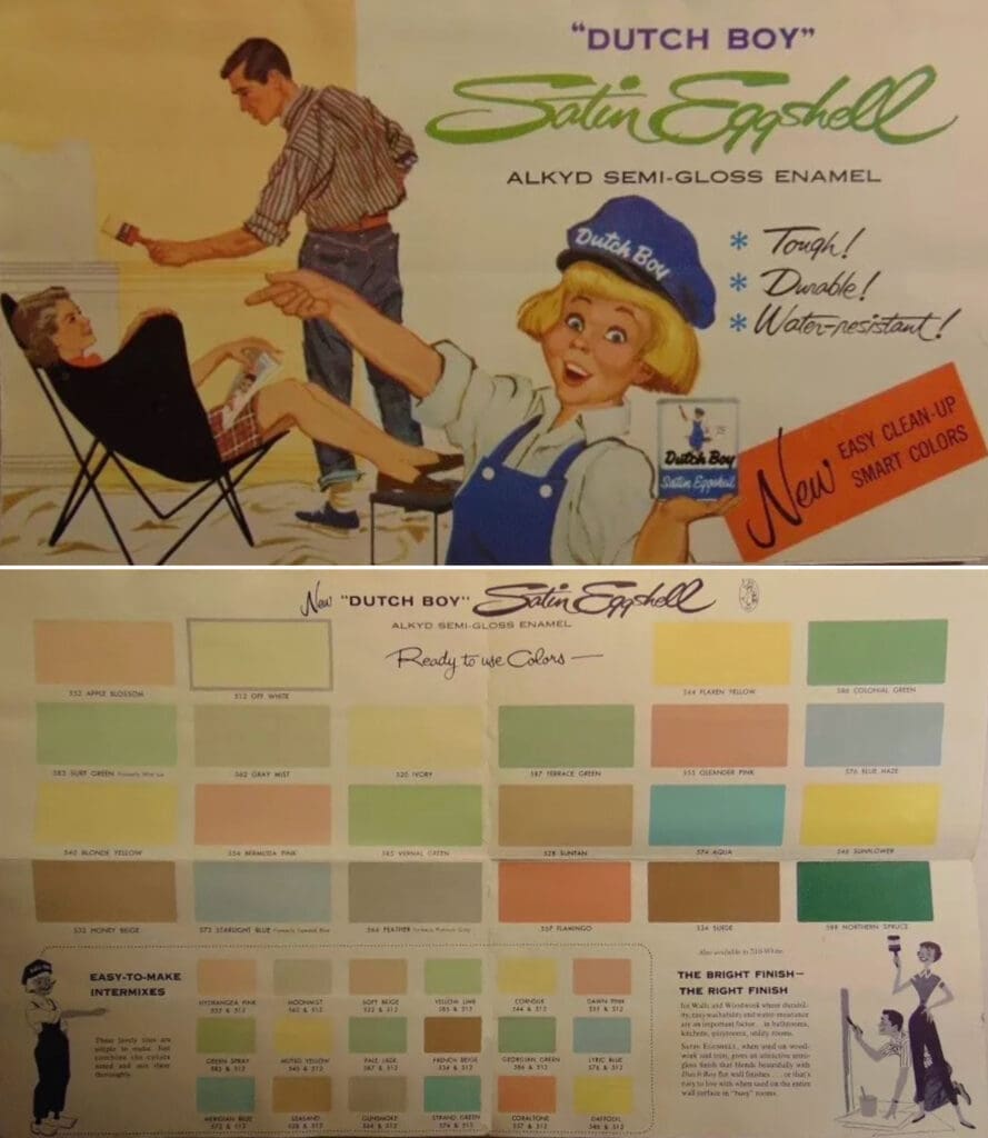
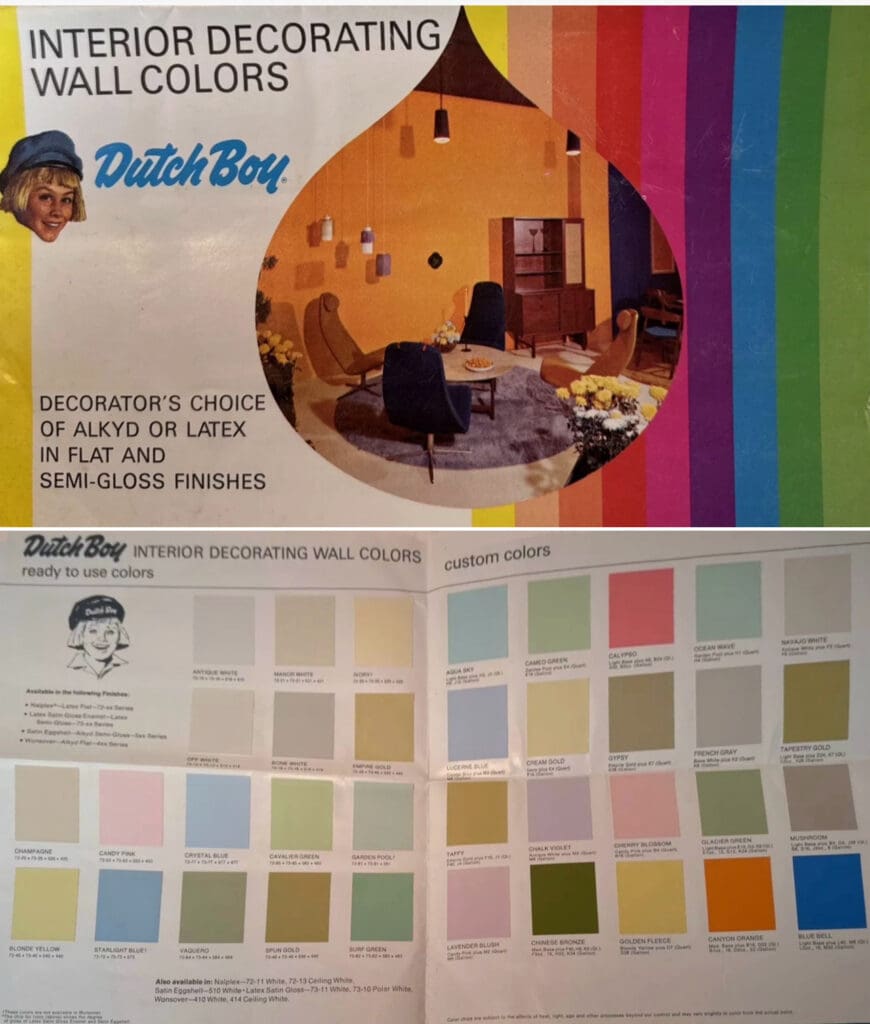
1965 Interior Wall Flat
Here are some attractive Dutch Boy Vintage Colors from their mid-century, 1965 interior color chart.
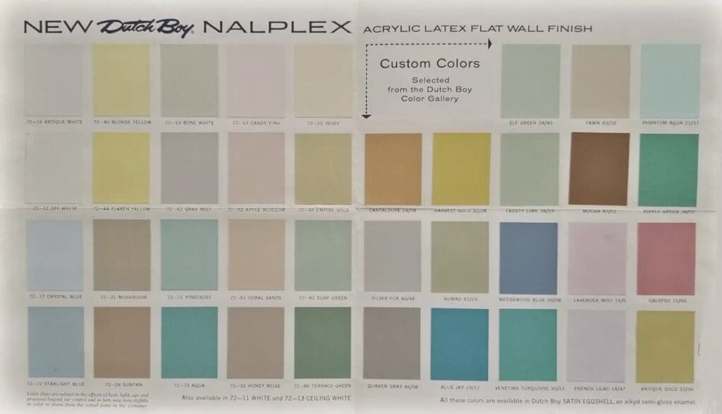
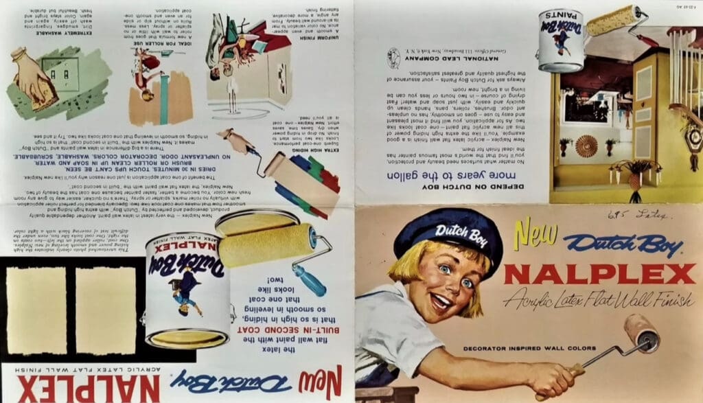
1973 Interior Wall Colors
1930’s Colors
Buckle up your time traveling seatbelt for a voyage to the land of ugly colors. These 1930’s Dutch Boy Colors are so unappealing that today’s tones would look at them and cringe. Let’s examine the hues that inspired more nausea than a small boat in choppy waters. It’s a journey that’ll have you asking “What were those color marketing people thinking?”
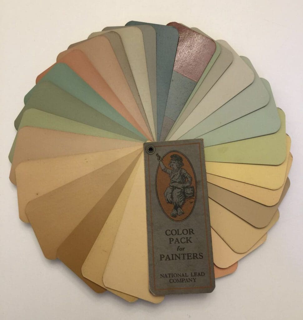
Mustard Sludge:
Meet Sludgy Mustard, the black sheep of the mustard family. Imagine traditional mustard jumping into a muddy puddle, and voila, Sludgy Mustard is born. It’s the color equivalent of mustard’s wild weekend escapade, and one can’t help but chuckle at its peculiar charm.
Putrid Green:
These Putrid Greens supply more questions than answers. This deviation from the serene greens of nature detoured into the absurd. It’s the kind of green that’s so unappealing, you can’t decide whether to scream or throw up in your mouth. Who knew greens could be so unappealing?
Funky Russet:
Russet usually spells comfort, but Funky Russet had a different agenda. This riddle of a color decided to skip the color party. It’s like russet went on a wild ride through a haunted house and emerged with a grin that says, “I’ve seen things, man.” Funky Russet is the rebel outcast of the brown family.
Wilted Marigold:
Wilted marigolds are a journey into the hideous. Picture the lively original marigold deciding to hit the town for a wild night out and coming back looking like it partied too hard. This group of yellows defy the laws of color decency and leave us questioning, “Marigold, what happened to you?” These hues have stories to tell, but no one wants to hear them.
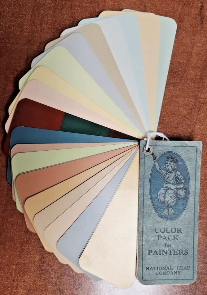
These unappealing and depressing 1930’s Dutch Boy Colors are the nerds of the design world. So, the next time you come across a color that you just don’t understand, remember, beauty is in the eye of the beholder. Here’s to the chromatic misfits that should be considered the worst options for any aesthetic. https://alllosangelespaintingcompany.com/2024/01/dutch-boy-color-trends/
