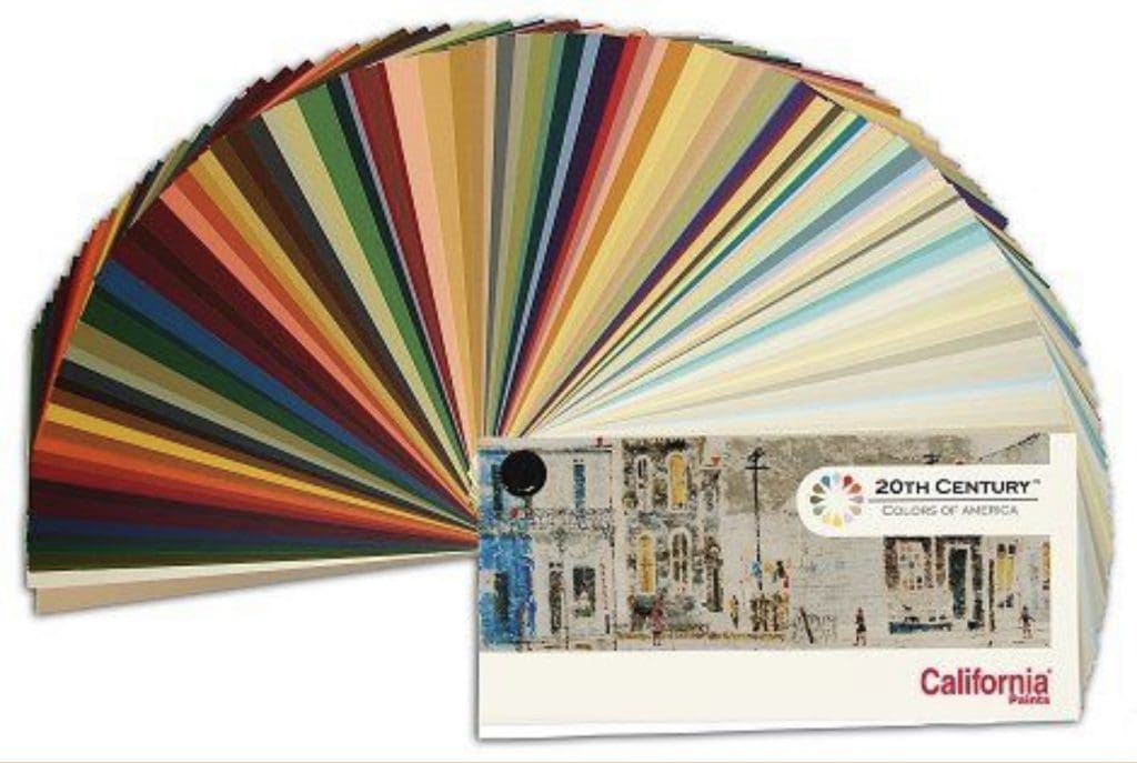
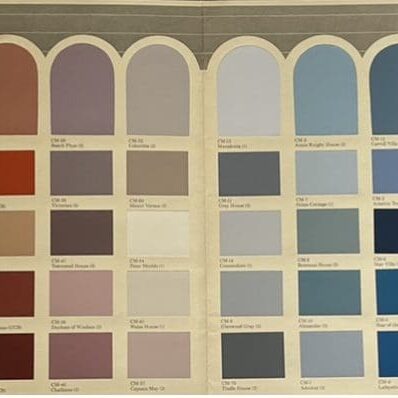
This 1990 Fuller O’Brien Cape May Color Chart presents seventy rich, bold colors of the Victorian era. Cape May, New Jersey holds the undisputed claim to being the oldest seashore resort in America. The palette provides historically accurate colors for both interior and exterior surfaces.

When using this color palette, choose carefully and strategically. For example, you might use a deep green for the walls of a room and warm browns and golds for accents such as curtains or throw pillows. Or you might try a bold burgundy for a focal point, such as an accent wall, and then use lighter shades of the same color for the rest of the room.
Another consideration is balancing bold colors with neutral tones. This prevents the space from feeling overwhelming or chaotic. For example, choose a neutral beige or ivory for your carpeting or area rugs, or use white or cream-colored trim to offset the richness of the other colors.
Use Cape May Victorian hues to add elegance and sophistication to your home decorating scheme. By carefully selecting and balancing colors, you’ll create a cohesive and stunning aesthetic that reflects the beauty of this classic style.
Historic Color Collection
California Paints Historic Color Collection provides historically accurate colors from colonial, mid century, craftsman, victorian, and ranch style homes. Whether you are looking for timeless classics or undiscovered colors, this fan deck has colors to suit most decorating styles.

The Collection is divided into five categories, each representing a different period in American history. They include Colonial, Federal, Victorian, Arts & Crafts, and Modern. It’s designed to help homeowners and designers recreate the look and feel of specific eras in their homes and buildings.
The Colonial colors evoke the aesthetic of the early American period, with soft, warm hues reflecting the simplicity and elegance of the time. Federal colors, inspired by the early 19th century, feature bold and regal hues that were popular at the time. The deep jewel tones and rich, opulent hues connect with the elaborate and ornate designs of the Victorian era. Arts & Crafts colors reflect the simple, natural tones of the era. Bold, bright hues highlight the clean lines of mid-century architectural trends.
Cape May Victorian Colors and the Colors of America Collection offer many options for those looking to bring a touch of history into their space. Whether you’re looking to create a cozy Colonial aesthetic or a sleek mid-century modern space, these colors are perfect for your decorating needs.
Looking for color inspiration for your vintage home? Call All Los Angeles Painting Company, Inc. 310-470-9218.
