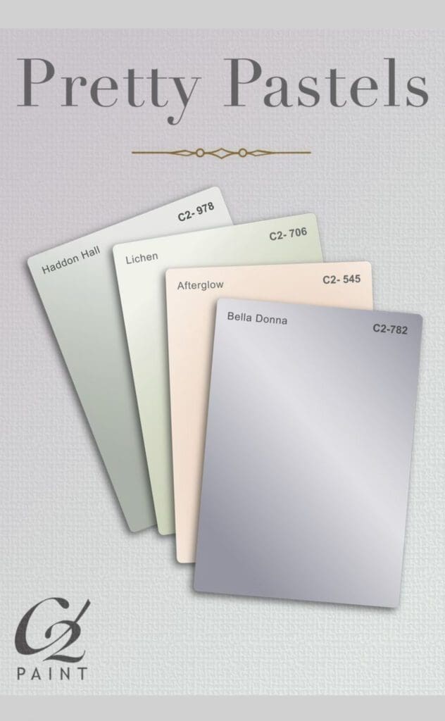
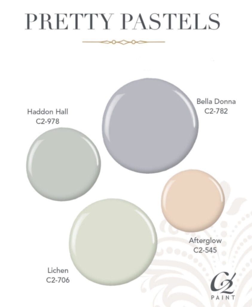
Take a break from bright and bold colors with soothing C2 Pretty Pastels. Pastels are soft, muted hues that evoke a gentle, soothing design aesthetic. They are used bedrooms, bathrooms, or living rooms to create a sense of tranquility and calm.
When decorating with pastels, it’s important to balance the softness of the hue with other colored design elements such as art and furnishings to prevent the space from feeling too flat. Pairing pastels with white or light wood accents can brighten the space, while combining them with metallic finishes adds glamour.
For a more dramatic look, use them as an accent wall or in small doses. This allows you to introduce pops of pastel without overwhelming the space. These tones will keep you calm, cool, and collected with their stress lowering essence. Match pastels in any combination to make your own personal oasis of color.
The calming essence of pastel colors makes them an excellent choice to create your own personal oasis of color. Mix and match C2’s extensive range of colors in any combination to achieve your desired aesthetic.
https://alllosangelespaintingcompany.com/2022/07/c2-paint-purple-grays/
These soft, delicate hues add a touch of whimsy and charm to any space. Use them to create a range of moods, from cheerful and energetic to peaceful and calming.
Here are additional tips for styling with C2 Paints
When choosing pastels, start by choosing an anchor color as the foundation for your palette. For example, choose a soft pink or lavender as the primary hue, and then build your scheme around that. Alternatively, choose a neutral shade, like light gray or beige, and then add pops of pastel color throughout the space.
Once you’ve chosen your dominant color, start adding accents and complementary colors. C2’s Pretty pastels pair well with other soft hues, such as Haddon Hall, Lichen, or Afterglow. These colors can be used in fabrics, accessories, and artwork to add interest and depth to your space.
Overall, styling with C2 Paint Colors is all about creating a space that feels light, airy, and welcoming. By choosing an anchor color, adding complementary accents, and balancing sweetness with contrasting textures, you’ll create a beautiful and inviting interior design scheme that is perfect for any space.
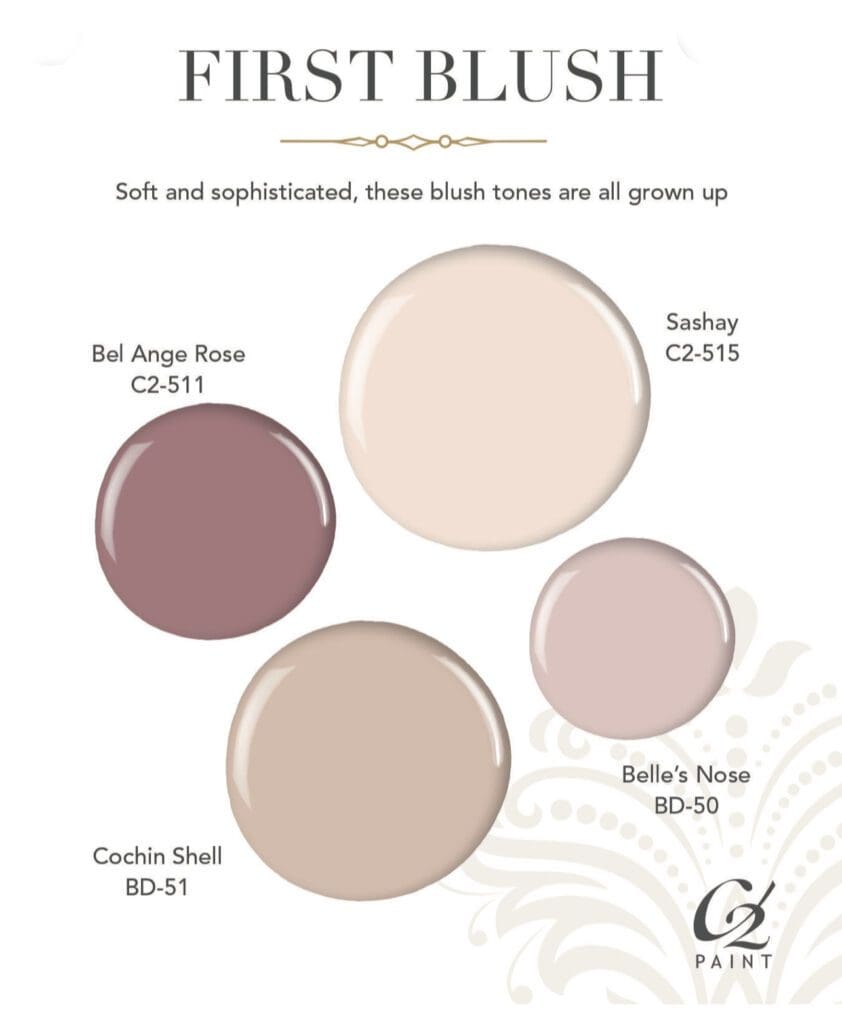
Don’t be afraid to mix and match different pastels and blushes in your design scheme. For example, pair a pale pink with a darker blush. The key is to find colors that complement each other without overwhelming the space. A touch of metallic adds glamour and sophistication to a pastel decor scheme. Consider adding gold or silver accessories, such as picture frames or decorative bowls, to add a little shine to your space.
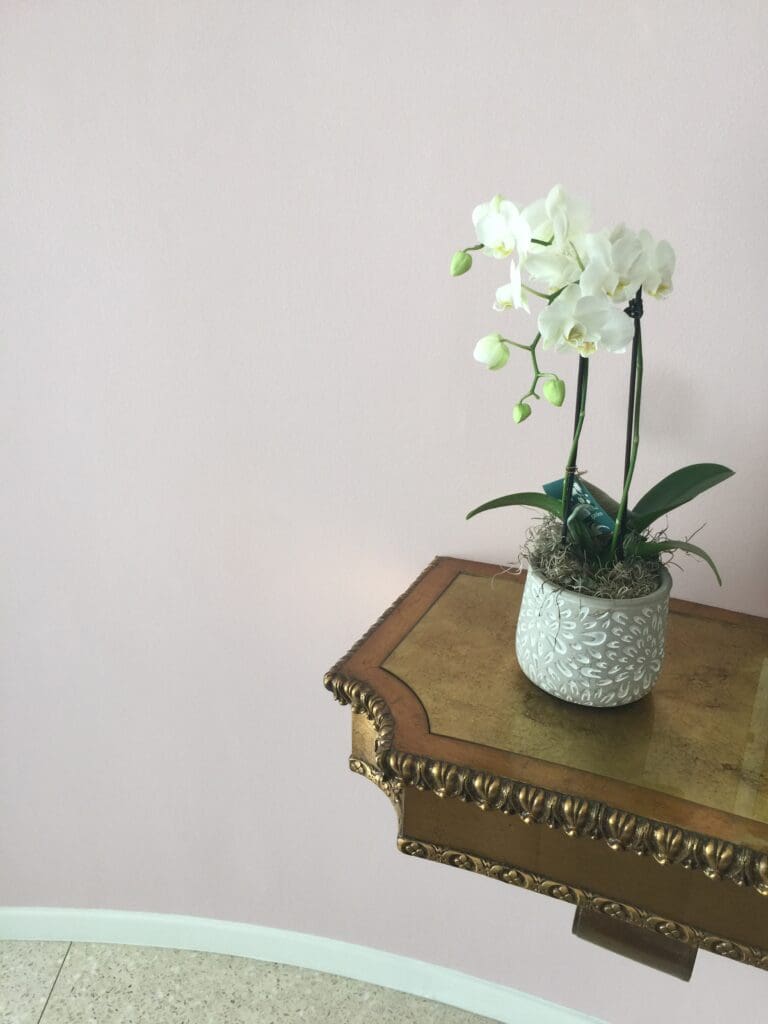
Mid-Century Pink
Pictured here is a pink Mid-century dining room using C2 Paint. The client requested that All Los Angeles Painting Company, Inc. select the perfect pink tone. Picking a balanced pink isn’t easy in any room but a dining room is very difficult. We used C2’s Luxe paint because of its unique color system.
C2 paint is made with high quality, finely ground pigments that give its paint a luminosity that conventional paints don’t have. All their colors integrate beautifully with existing design elements like furniture, flooring, fabric and art. All Los Angeles Painting Company, Inc. 310-470-9218 is a skilled applicator of C2 paints.
