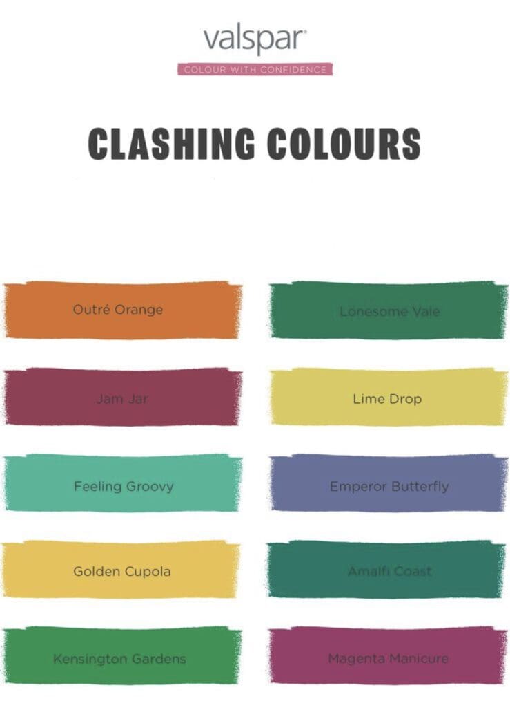
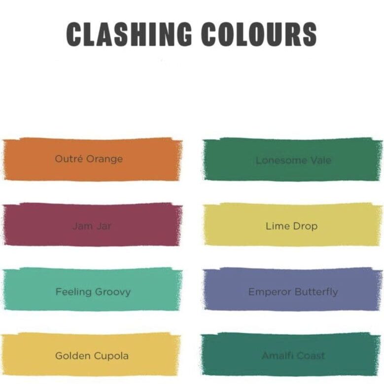
The Valspar Clashing Color Palette has 10 mismatched greens, magentas, chartreuses, teals and oranges to help you create a designer look.
Decorating with a clashing color scheme involves using hues that contrast or clash to create a bold and eclectic look. It’s often used in bohemian or playful interior design schemes. When choosing clashing colors, consider their intensity and undertones. For example, a bright blue and a vibrant orange can create a striking contrast, while a pastel yellow and a soft pink can create a more subtle clash.
To successfully decorate with clashing colors, choose a neutral color as a base and build the color palette around it. This neutral hue can serve as a visual anchor, helping to tie the clashing colors together. The use of pattern and texture can help bring the look together and make the colors work in harmony. Additionally, consider using different sheens to further enhance each color’s visual contrast.
Its important to note that this color scheme is not for everyone, and it can be a high-risk, high-reward approach. When done well, it can create a bold and unique look, but when not done carefully, it can be overwhelming and chaotic.

