Valspar’s Sunset inspired hues bring warmth and energy to any home design scheme. These tones draw from the warm, vibrant hues of the sun setting sky. They range from deep oranges, pinks, and purples to soft yellows, peaches, and reds.
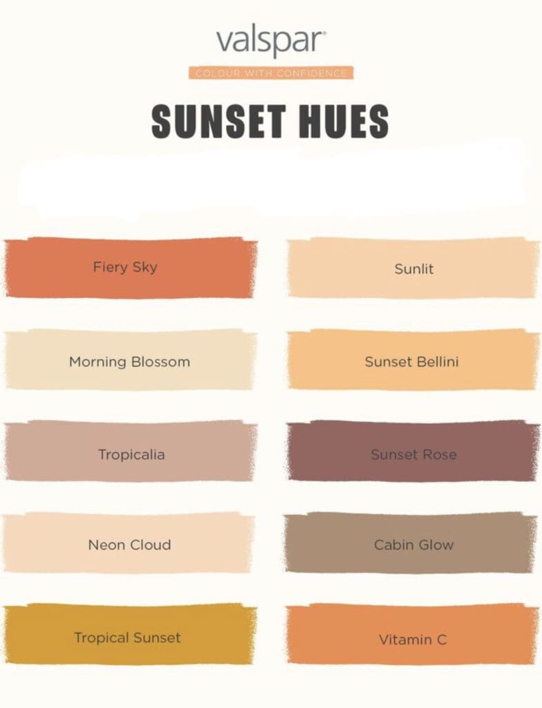
Use them in a variety of ways to create a warm and inviting aesthetic. For example, they can be painted on all four walls, or used as an accent wall in a living room, bedroom, or dining room to create a focal point and add visual interest. They can also be used in smaller ways, such as throw pillows, curtains, or rugs, to bring a pop of color to a neutral space.
Additionally, sunset inspired colors can be used on cabinetry or furniture to create a warm and cozy feel in a kitchen or bathroom. They work well with natural materials such as wood, stone, and leather, to create a harmonious and cohesive look.
Use the Valspar Sunset inspired hues to add warmth and energy to any home decorating scheme. Whether you prefer bold, bright colors or soft, muted hues, there’s something to suit every style and personality.
Clashing Color Palette
The Valspar Clashing Color Palette has 10 mismatched greens, magentas, chartreuses, teals and oranges to help you create a designer look.
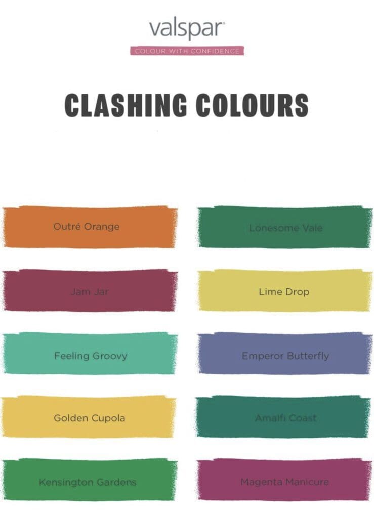
Decorating with a clashing color scheme involves using hues that contrast or clash to create a bold and eclectic look. It’s often used in bohemian or playful interior design schemes. When choosing clashing colors, consider their intensity and undertones. For example, a bright blue and a vibrant orange can create a striking contrast, while a pastel yellow and a soft pink can create a more subtle clash.
To successfully decorate with clashing colors, choose a neutral color as a base and build the color palette around it. This neutral hue can serve as a visual anchor, helping to tie the clashing colors together. The use of pattern and texture can help bring the look together and make the colors work in harmony. Additionally, consider using different sheens to further enhance each color’s visual contrast.
Its important to note that this color scheme is not for everyone, and it can be a high-risk, high-reward approach. When done well, it can create a bold and unique look, but when not done carefully, it can be overwhelming and chaotic.
Looking to update your home color scheme? Call All Los Angeles Painting Company, Inc. 310-470-9218
