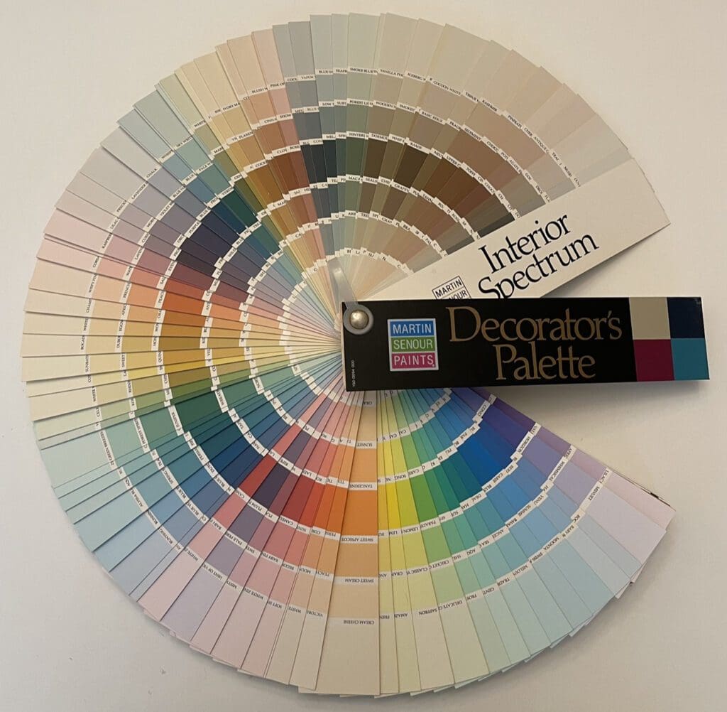
Dominated by pastels and mid-tones, these Martin Senour paint colors were curated to produce calm and sophisticated design schemes. They provided a backdrop that allowed room elements, such as furnishings and collections, to take center stage.
The philosophy of this 1994 era color collection emphasized simplicity and timelessness. The goal was to create interiors that would withstand passing trends and remain appealing for years to come. This approach embraced a classic and enduring aesthetic, prioritizing longevity over fads.
Mid-1990’s cultural trends also influenced interior design schemes. The desire for serenity and balance aligned with the growing interest in wellness and self care. Mid-range colors were seen as soothing and calming; promoting relaxation and a refuge from the outside world. This was significant given the perceived fast paced nature of life during that time.
Additionally, the mid-1990s witnessed a resurgence of minimalism and clean design. The palette supported this aesthetic by providing uncomplicated visual backdrops. This simplicity helped focus on the forms and textures of furniture and decor, providing a sense of elegance and understated luxury.
Finally, the Martin Senour Interior Decorator’s Palette reflected a shift towards a more subdued and classic approach to design. Embracing lighter tones and prioritizing simplicity, this color system produced harmonious, balanced spaces that have stood the test of time. Martin Senour paint colors’ influence can still be seen in contemporary design, with homeowners and designers drawing inspiration from the enduring appeal of this classic color collection. https://alllosangelespaintingcompany.com/2023/01/martin-senour-interior-bright-lights/

