Pittsburgh Paint Accents Color Collection
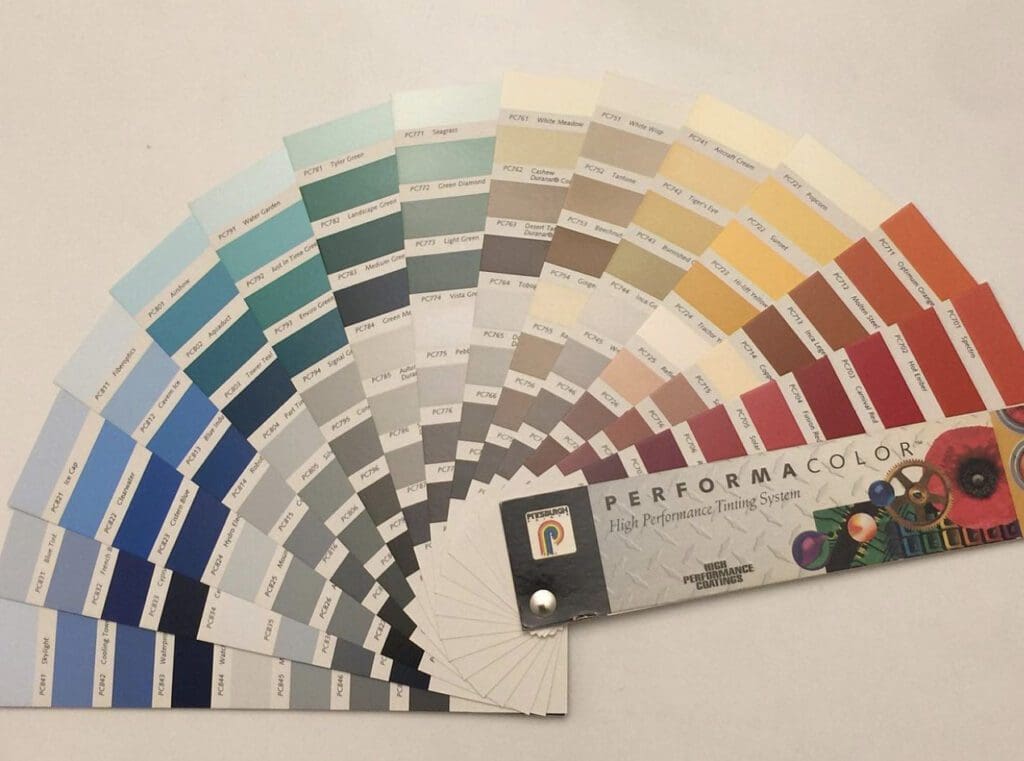
This is the 1997 Performa Color Fan Deck. These high impact Pittsburgh Paint accents were specified for color accenting. The Performa Color Collection was designed to provide color brilliance and lasting beauty.
Color Symphony:
This curated color palette caters to every taste and style. From soothing neutrals to bold statements, this collection allows you to craft the perfect ambiance for your home. This collection reflects contemporary design sensibilities, allowing you to accent your space with colors that are timeless and trending.
Endless Possibilities:
Whatever you’re updating, the range of colors and finishes lets you express your unique style and create spaces that resonate with your personality.
The Performa Color Collection marries vibrancy with durability. Elevate your space with accents that perform in terms of aesthetics. Whether you’re embracing timeless neutrals or diving into bold statements, these colors ensure your spaces tell a story of enduring beauty.
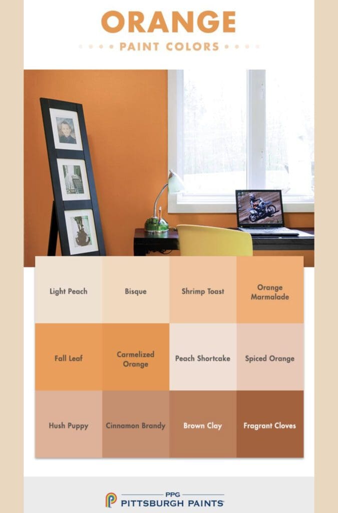
Orange
Oranges evoke feelings of warmth, sun, happiness and joy. It’s an active color that conveys good energy and enthusiasm. Don’t be afraid to use them in a dining room, kitchen, or playroom; the perfect orange can be stunning. Oranges were popular in the iconic orange and brown color schemes of the 1970’s. They are perfect for creating intriguing focal points in modern spaces, use bold oranges to highlight furniture or accent walls.
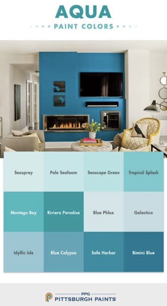
Aquas
Picking an Aqua is easy when you have the Pittsburgh Popular Aqua Palette to help. Aquas range between seaside blue and teal- green. They are considered relaxing colors that bring peace and tranquility to the mind. Aqua is the Latin word for “water.”
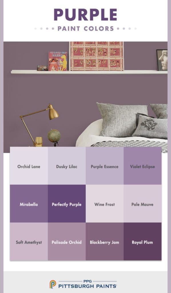
Purple
Purple is a regal hue. It is inspirational and can be used to create a space that nurtures a sense of balance and purpose. Choose these Purples to focus meditation, balanced thought, and convey elegance. Purples are one of the toughest colors to get right. For a grown up purple, choose one with a lot of gray in it to avoid it being too childish on the wall.
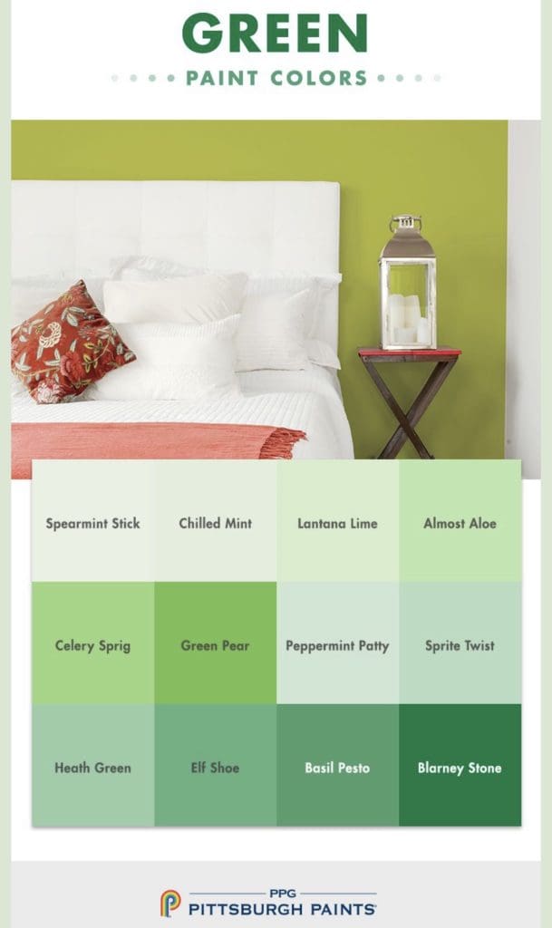
Greens
Greens are surpassing blues as the most popular hue used in homes today. They are appealing because they connect to nature, are restorative, and calm the mind. This Paint Palette has many different shades to choose from. Ranging from bright, super energetic greens to the mossy tones that are stunning in any design scheme.
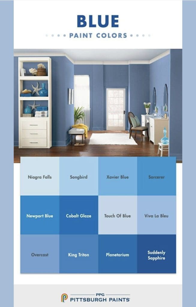
Blues
This Blue Color Palette is perfect for creating a peaceful and relaxing decorating scheme. Blues are especially well-suited for bedrooms, bathrooms, and meditation rooms, and provide many decorating benefits:
Blue is a versatile color that works well in a variety of design styles. Depending on the shade and tone, blue can be calming, soothing, energizing, or sophisticated, making it a great choice for different rooms and moods.
Timelessness: Blue is classic and never goes out of style. While other colors may come and go, blue has enduring appeal and provides a safe choice for homeowners wanting a timeless, elegant look.
It conveys feelings of calm, serenity, and relaxation, which promote mental and physical health. As people increasingly prioritize wellness and self-care, using blue in home design creates a peaceful, soothing environment.
Nature-inspired: Many shades of blue are reminiscent of the sky, the ocean, or other elements in nature, making them popular with designers and homeowners who want to bring the outdoors in. Using blue creates a connection to nature and enhances well-being.
Trust and Focus: Blue is considered a reliable and trustworthy hue. Blue color schemes have traditionally conveyed a sense of dependability and stability. Additionally, it creates focus and clarity. In a room painted blue, it may be easier to concentrate and think clearly.
Creativity: Associated with creativity and imagination, blue color schemes can encourage creative thinking and inspire new ideas. Keep in mind that the effects of color vary based on individual perceptions and cultural associations.