Collecting vintage or retro color charts is a fun and economical way for Americana enthusiasts to enjoy home improvement ephemera. Additionally, they’re a valuable source of decorating inspiration.
Vintage House Paint Color Charts
The best advice, when collecting color brochures, is to buy what you like. Further, make sure that they are in as close to mint condition as possible. Nobody thinks a torn, dirty, or damaged color chart is interesting or collectable. The key is to have perfectly clean color chips on a clean brochure with sharp corners.
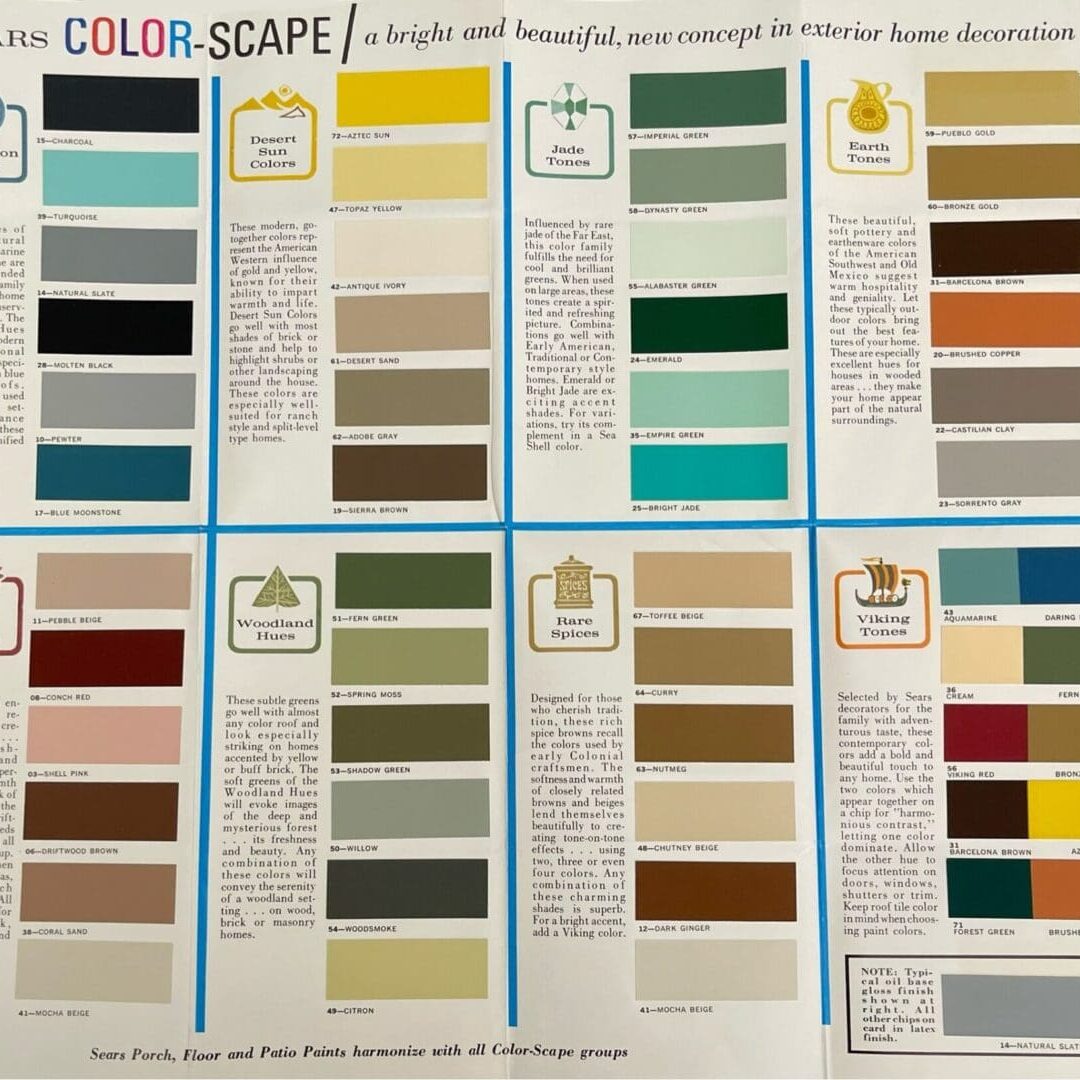
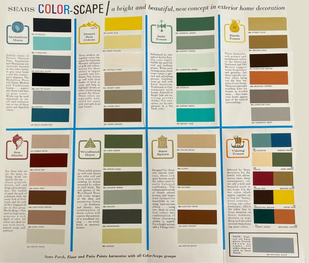
1966 Sears Exterior Colors
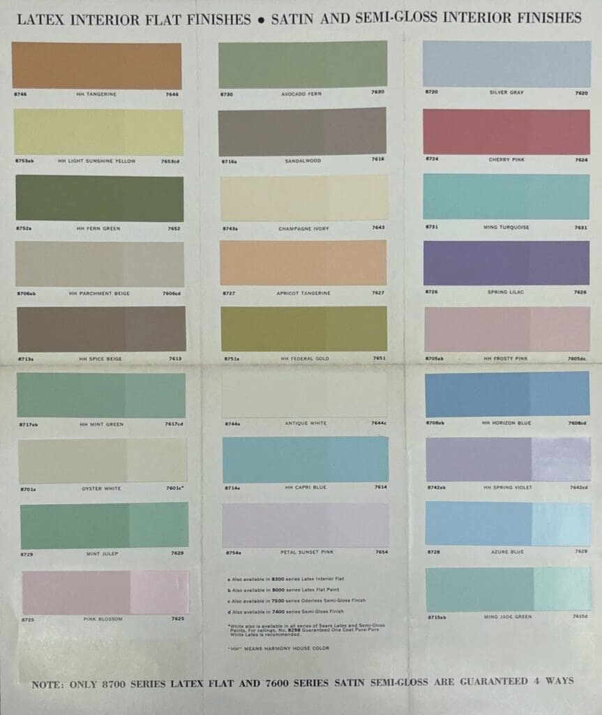
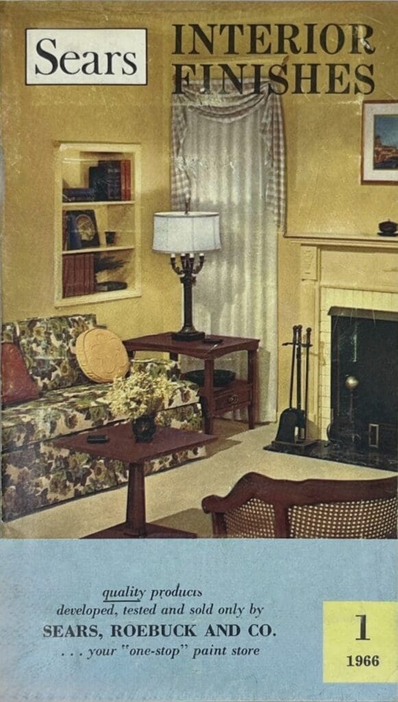
1966 Sears Interior Colors
Collectors tend to focus on a particular theme, like brand, type of paint, or era. Some people mount vintage color charts to use as wall art. Others enjoy strolling down memory lane and connecting with the marketing art, design, furnishings and colors of bygone decades.
Keep in mind, color charts were produced as advertising tools to display trending colors, and they were meant to be in circulation for a year or two at most. Moreover, most have actual painted color chips, so handle them carefully because they are delicate and get dirty easily.
1972 Sears Exterior Color Chart
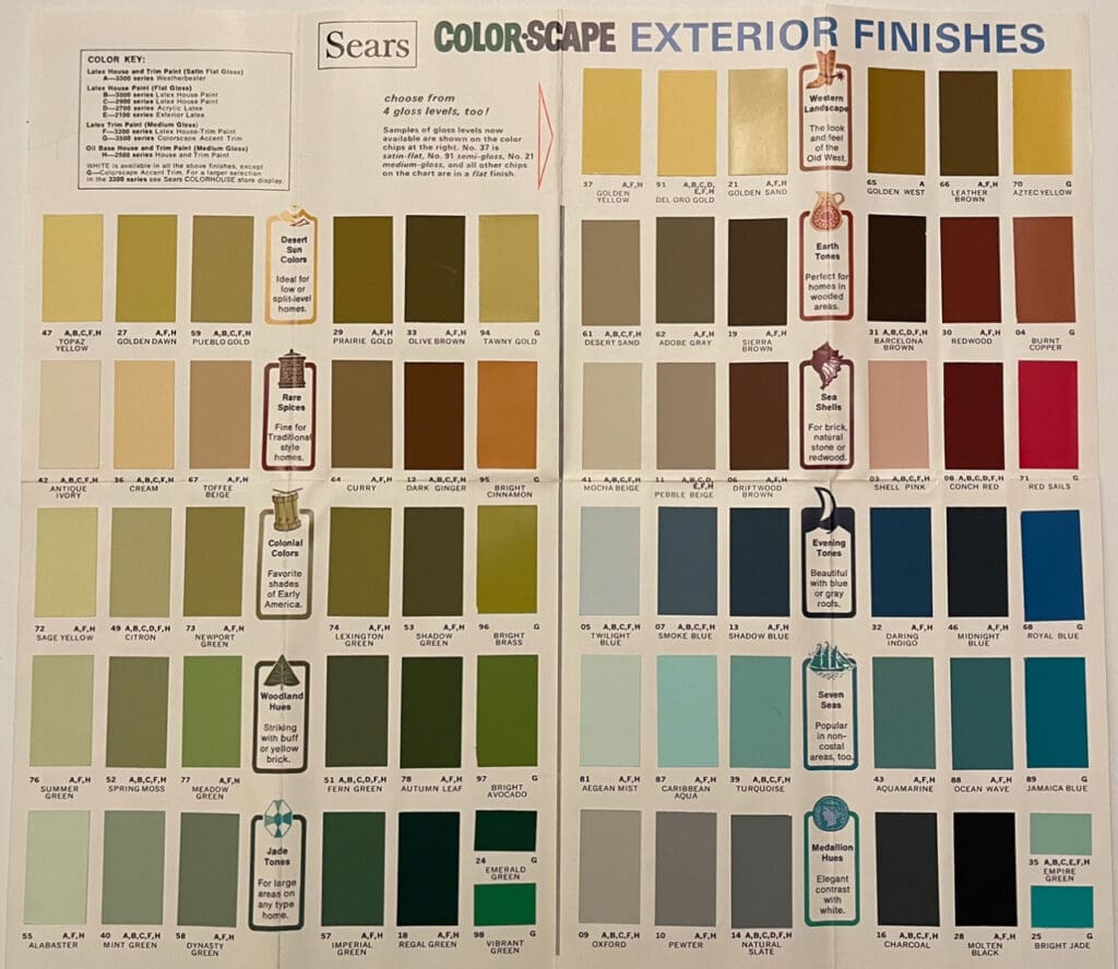
From soft pastels of the 1950s to vibrant hues of the 1970s, vintage paint swatches provide a time machine journey through the decades. This lets designers, homeowners, and collectors tap into the color schemes and popular trends of bygone eras. Pictured here is an immaculately preserved 1966 Sears Color Scape Exterior Color Chart. The chips are bright and clean; and the brochure is crisp. Vintage color charts can be purchased from $10-$60 each depending on condition and paint company.
Pittsburgh Paints Colors of 1971
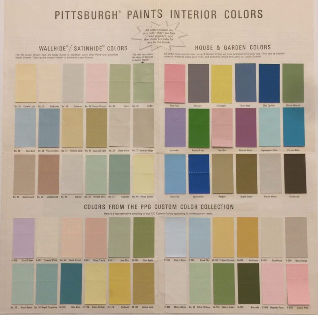
This vintage color card is perfect for those who enjoy mid-century decorating inspiration. It has three color palettes. The House & Garden collection has 18 elegant, trending colors. The upper left palette has the most frequently purchased colors based on store sales. The bottom palette, of 24 colors, were the most appealing hues from the complete Pittsburgh Paints collection of 720 colors.
1956 Sears Harmony House
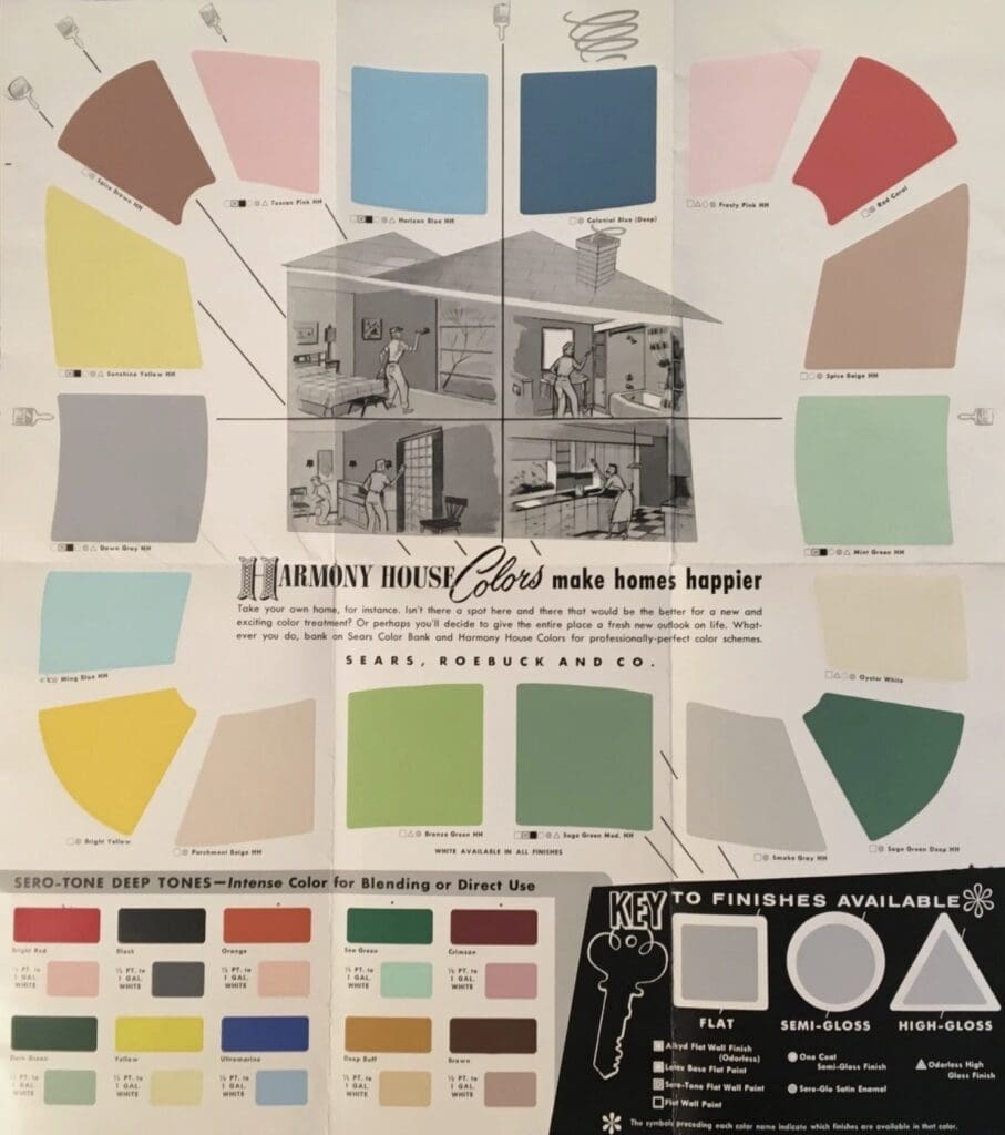
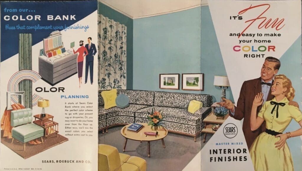
Pictured here are late 1950’s Sears Harmony House Paint store color brochures that can inspire decorating schemes that are classic and on-trend. Vintage color charts are like a time machine letting you travel into bygone eras and history. They can breathe new life into contemporary spaces, adding depth, character, and a sense of nostalgia.
1958 Sears Harmony House
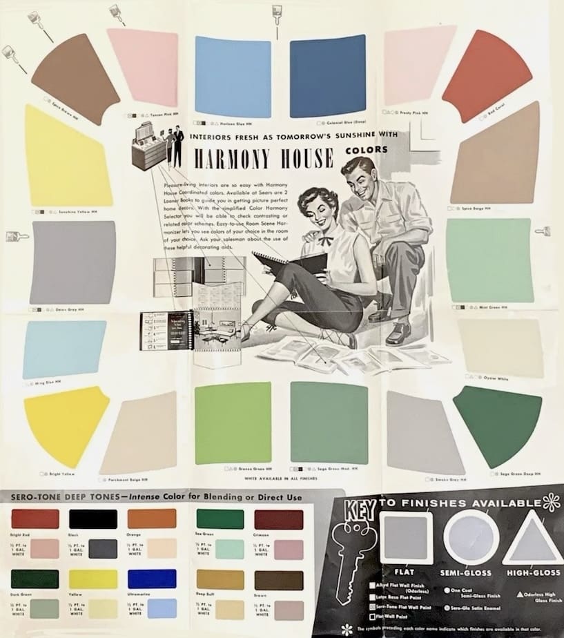
One advantage of using vintage color charts for inspiration is their classic color combinations. Shades that were popular in the past can evoke a sense of nostalgia and comfort, making them a good choice for creating inviting and stylish aesthetics. By incorporating them into a modern color scheme, decorators and consumers create spaces with a fresh take on traditional favorites.
Dunn Edwards 1983
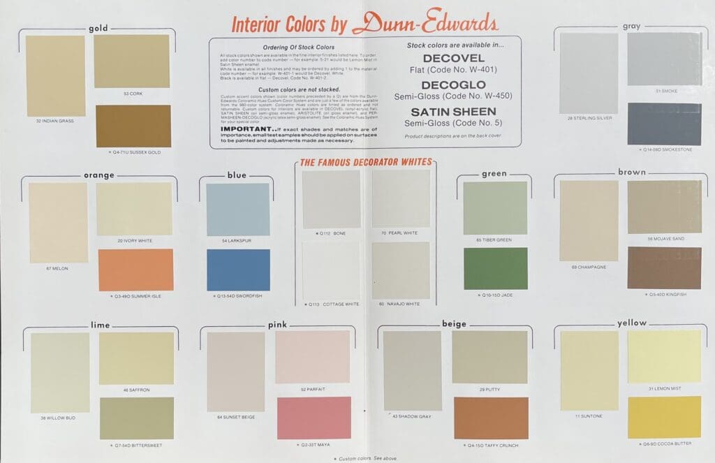
1966 Exterior Colors
Vintage color charts, like this one from Gleem, can help inspire a home color design scheme. These 1966 Exterior Colors are known for their ability to convey warmth and life. Like going back in time, this color chart lets you see the coolest color combinations of the 1960’s. They go well with brick and stone and highlight shrubs or other landscaping around the house. These hues are especially suited for ranch style and split-level homes. Use them to bring out your home’s best features.
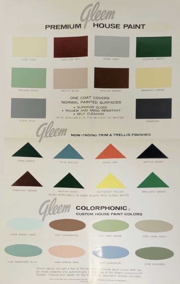
Antique color charts offer a look back at shades that may have fallen out of fashion but still have charm and allure. Whether it’s the soft pastels of the 1930’s-1950s, the earth tones of the 1970s, or the vibrant hues of the 1980s, they provide unique design inspiration that feels both retro and modern. All Los Angeles Painting Company, Inc. 310-470-9218 provides home and office paint color consulting.
https://alllosangelespaintingcompany.com/2020/08/sherwin-williams-1930s-colors/
https://alllosangelespaintingcompany.com/2025/06/sears-mid-century-paint-colors/
