The Dutch Boy Color Trends Palettes simplifies the painting experience for homeowners by providing a selection of trending colors that connect with the social, fashion, and design essence of the time.
Dark & Moody Colors
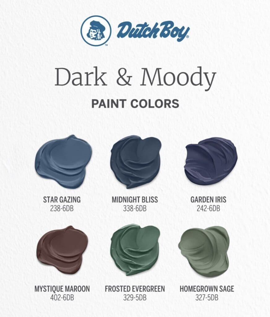
Consider using deep, rich hues in spaces like powder rooms, closets and bathrooms for a dramatic effect.
Autumn and Fall Colors
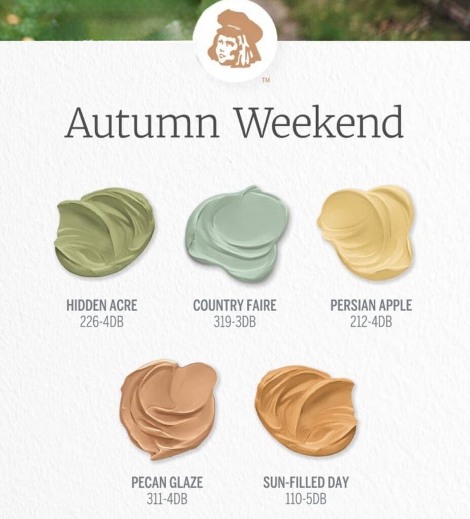
Craft spaces that balance comfort and luxury to create an elegant aesthetic. Pair these trending colors to lend a sense of quiet to any space, while rooting your home in tradition…mixed with a splash of modern.
Warm Whites
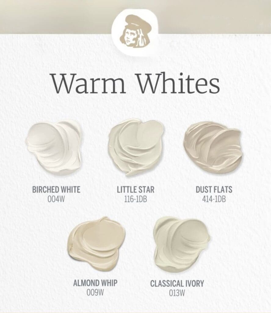
The Dutch Boy Warm Whites Palette evokes a spirit of living in tune with nature through the beauty of earth inspired colors. Use these pleasing hues to create a classic decorating scheme that promotes inner peace and serenity.
Summer Vibes
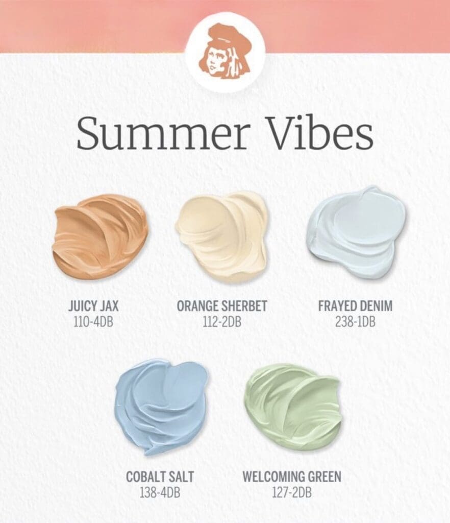
Add a splash of color to your space with these summery shades. Mix and match from this mini palette of warm oranges balanced with calming, watery blues and a pop of gentle green.
Botanic Colors
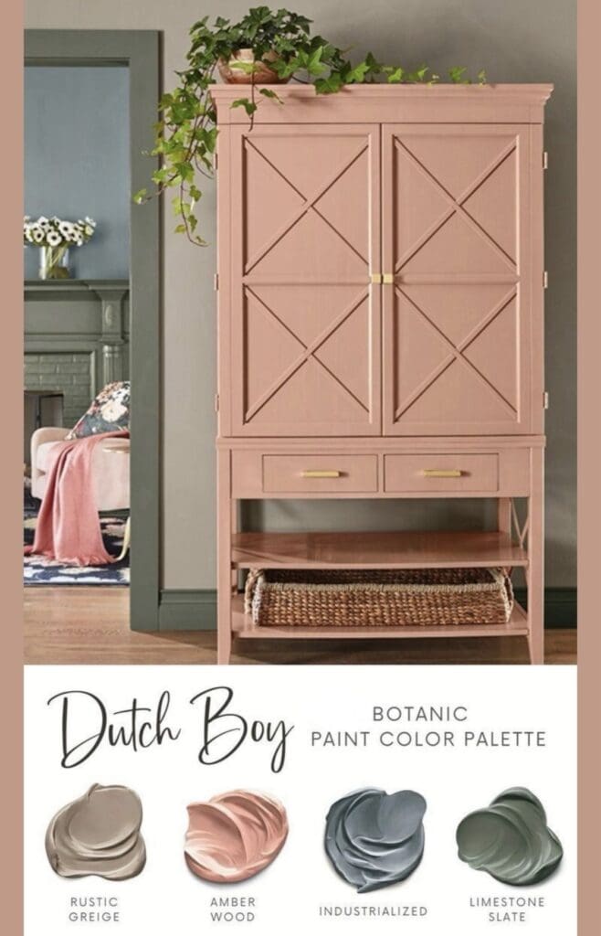
Dutch Boy Botanic Colors blends warm earth, sky and sea hues to create a design palette that brings nature indoors. Rustic Greige is a calming neutral that pairs well with the slate blue of Industrialized, the moody green of Limestone Slate and coziness of Amber Wood.
Bedroom Colors
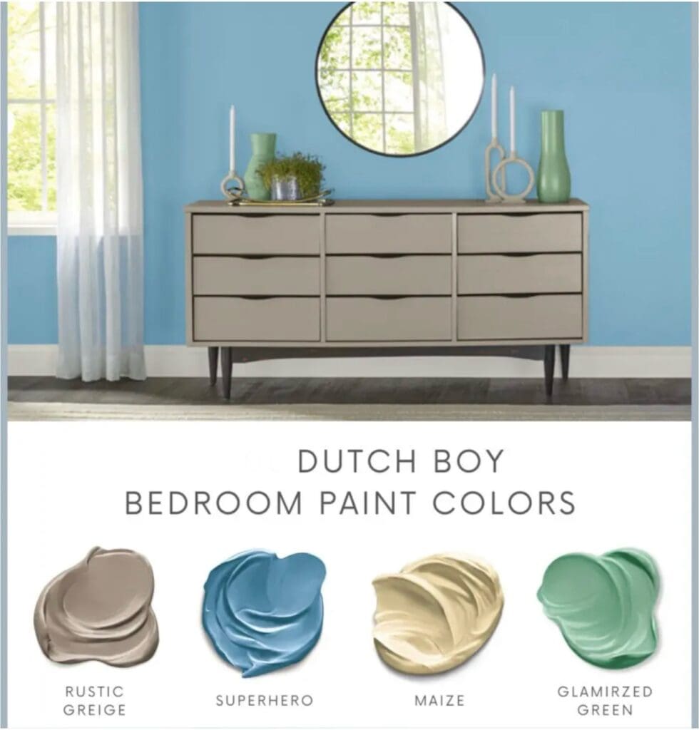
Use Dutch Boy Bedroom Colors to craft a comfortable and elegant bedroom design scheme. Pairing Rustic Greige with tones like Maize, Superhero and Glamorized Green provides a nostalgic, vintage inspired look.
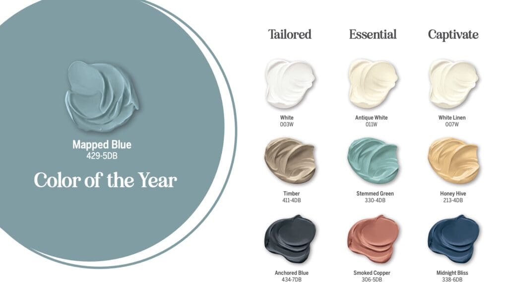
2025 Color Trends
2018
2017
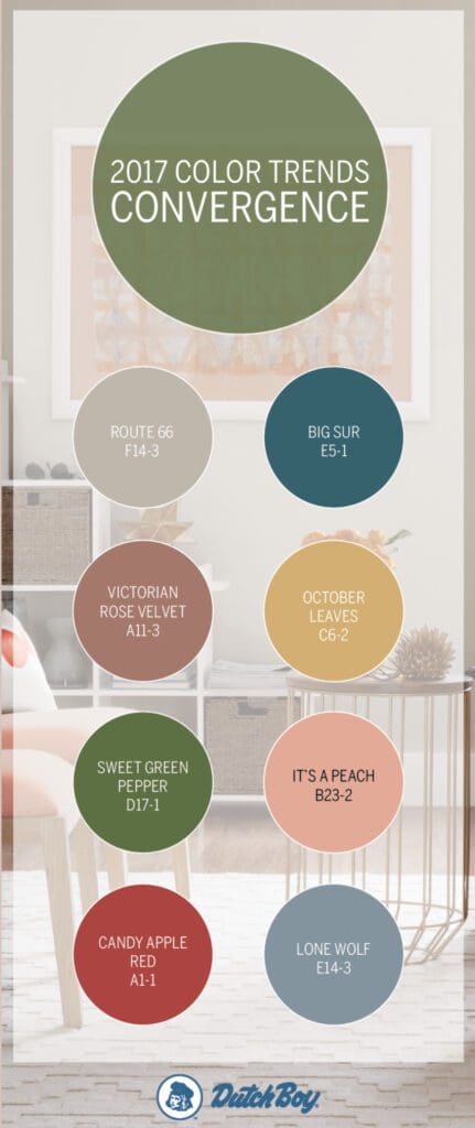
The Dutch Boy Convergence Palette is a collection of soft, soothing hues that create a calm and relaxing aesthetic. The palette features neutral shades, as well as subtle pops of color, such as reds, blues and greens.
These versatile colors can be used in a variety of decorating styles, from modern to traditional. They pair especially well with furnishings and art to create a warm and inviting space.
This collection also provides a cohesive and harmonious look throughout the home. The colors work well together and create a seamless transition from one room to the next. This gives your space a sense of visual symmetry.
In terms of inspiration, the Convergence color palette was inspired by nature. Natural colors, such as the hues of the sky, the sea, and plant life make up the majority of the palette and give it its timeless and enduring feel. Explore the versatile tones of this palette to create a relaxed and soothing color scheme. These soft, subtle hues are great for a variety of decorating styles.
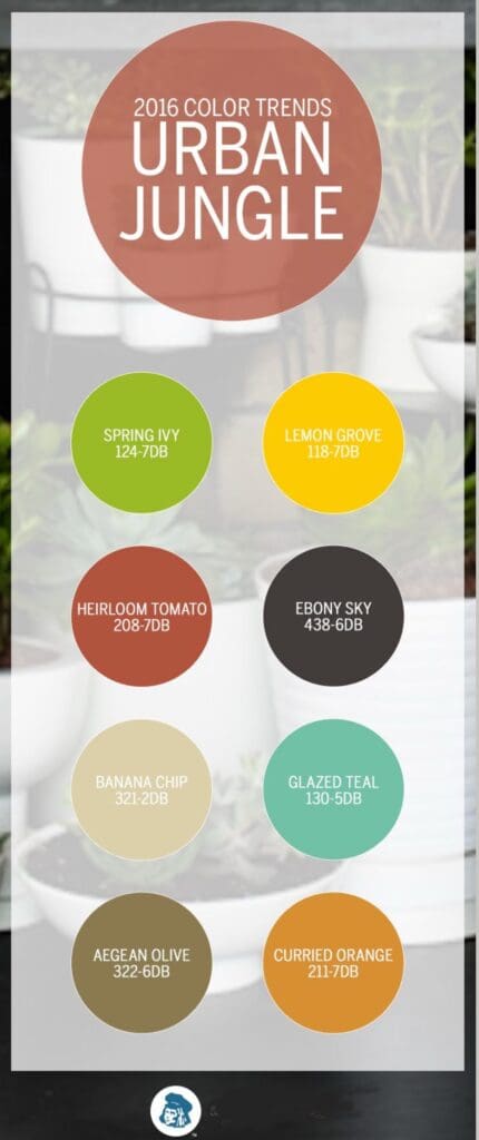
2016
https://alllosangelespaintingcompany.com/2022/09/dutch-boy-paint-colors/ https://alllosangelespaintingcompany.com/2025/02/dutch-boy-color-of-the-year/
