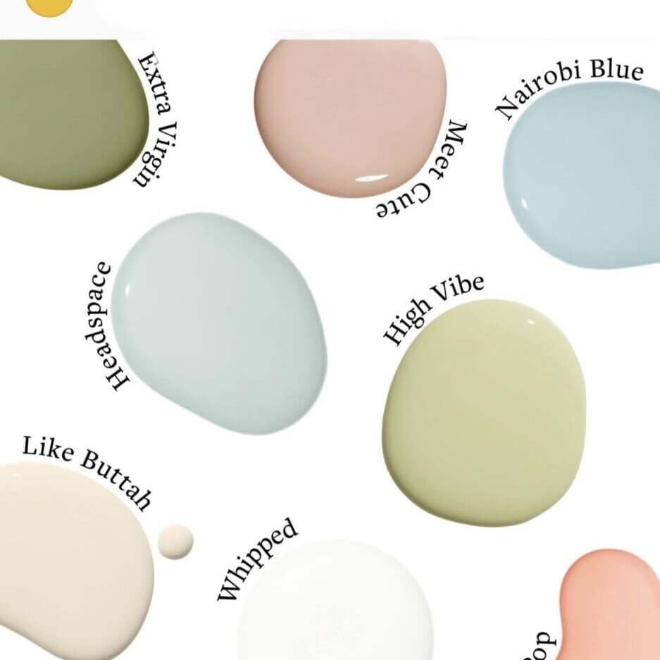
Clare Paint Color Combinations palettes help consumers create cheery decorating schemes. These paint color palettes are useful when designing with color. Each palette has a theme; find the theme you like to create your own unique home styling.
Elevated Retreat Colors
Relax with Clare’s Elevated Retreat Colors. Explore a range of options to create a cohesive, visually appealing aesthetic. Whether you want to create a bold and vibrant look or a softer, more serene aesthetic, these versatile hues allow for effortless coordination and seamless transitions between different areas of your home. Lending themselves to multiple design styles by offering both warm and cool tones, they create a visually captivating and well-balanced space.
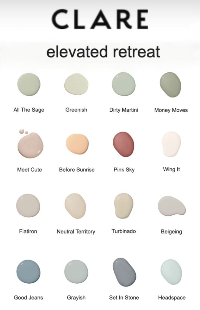
Uplifting tones convey happiness, positivity, and energy. Whether you’re looking to create an inviting living area, a cheerful playroom, or a vibrant home office, these colors can set the desired mood and create a space that feels welcoming and inspiring.
These colors are excellent for creating visually appealing and inviting spaces. Whether you’re revamping your entire home or adding a pop of color to a single room, summer colors create a vibrant and stylish look that reflects your personal taste and style.
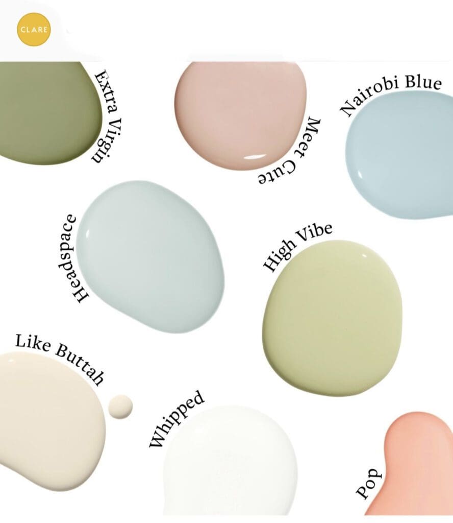
Spring Pastels
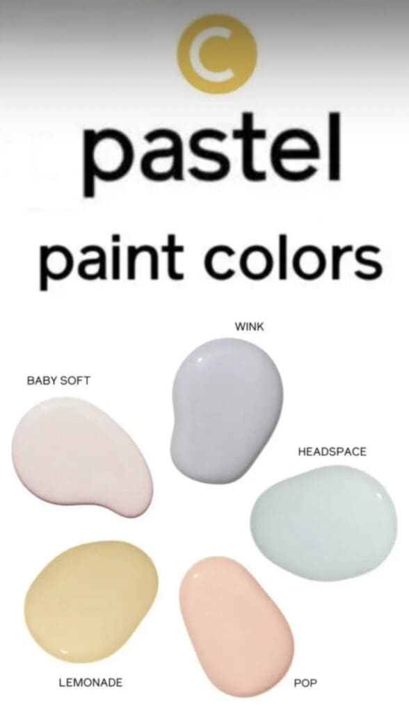
Pastels are often considered spring colors because they convey feelings of freshness and vibrancy. These soft hues can play a significant role in interior design schemes. Incorporating these shades into a decorating scheme infuses it with energy and vitality. Pastels effortlessly make any space feel more cozy.
Spring colors provide a joyful and happy aesthetic. They connect us to nature and its cycle of renewal. Soft pinks reflect the delicate blossoms of cherry and apple trees, while the gentle greens mimic the fresh growth of leaves and grass. Light yellows bring to mind the warmth of sunlight, and shaded gray reminds us of partially cloudy skies and the awakening of nature after a long winter slumber.
Spring hues impact on well-being by making spaces feel more spacious and open, inviting the outdoors in and increasing the sense of connection to nature. When using them, consider transitions from one space to another. Use soft color gradients or complementary hues to create a flow reminiscent of the gradual change of seasons. Incorporate these colors in various elements, such as walls, furniture, accessories, and artwork, to create a cohesive and refreshing look.
Monochromatic
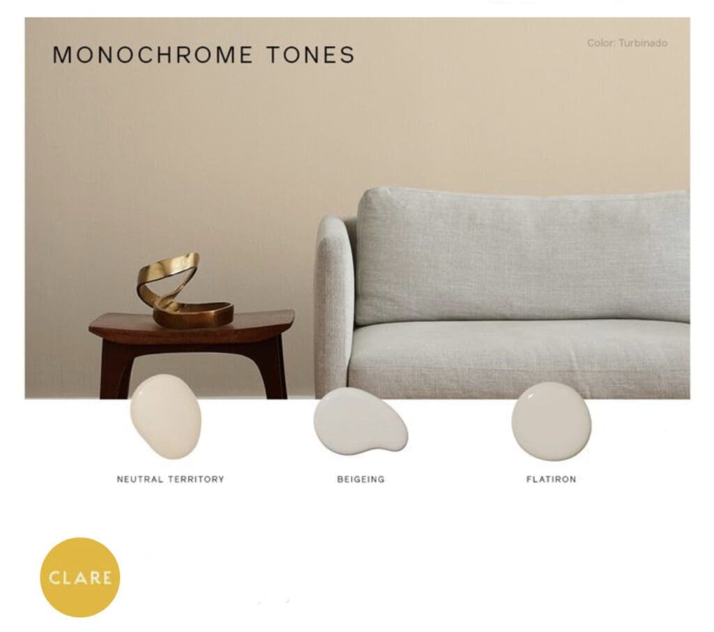
If you’re unsure combining colors, consider a monochromatic color scheme instead. This design approach features variations of similar colors and conveys a sophisticated and harmonious feel. It naturally creates an aesthetic that seamlessly transitions between rooms.
Decorating with a monochromatic color scheme offers several advantages. First, it creates a harmonious look by using shades of the same color, resulting in a cohesive and unified space. Monochromatic color schemes are known for their sophistication and elegance, especially when using neutrals like black, white, and gray. By incorporating different shades of the same color, you create interest in a room without overwhelming it with visual clutter.
One benefits of this color scheme is its versatility. It works well in any style of interior design and can be adapted to suit different moods and seasons. Whether you want a calming and serene atmosphere or a vibrant and energetic vibe, a monochromatic color scheme can deliver.
Monochromatic schemes create a sophisticated and cohesive look for a space. The subtle variations within a single color creates a visually striking and balanced aesthetic. Embrace the beauty of a monochromatic color scheme and enjoy the transformative power it brings to a home.
Limited Color Scheme
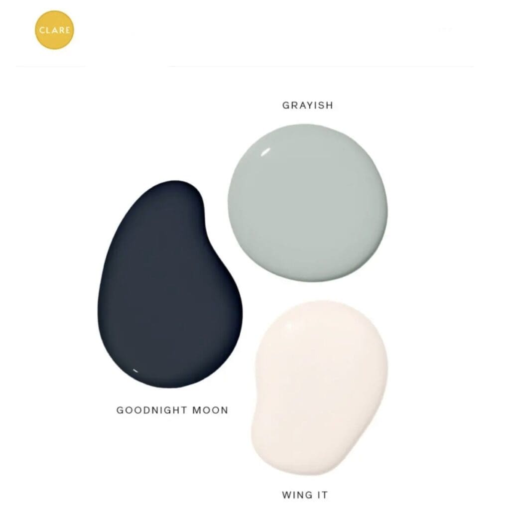
Limited color schemes let you make a bold design statement with just three colors. Using a single main color with accent tones creates a dramatic impact in a room. Whether you choose a bright and bold color or opt for a more subtle and muted shade, this approach ensures a visually striking result.
All Los Angeles Painting Company, Inc. 310-470-9218 is a skilled applicator of Clare Paint Color Combinations.
https://alllosangelespaintingcompany.com/2023/12/warm-paint-colors/
