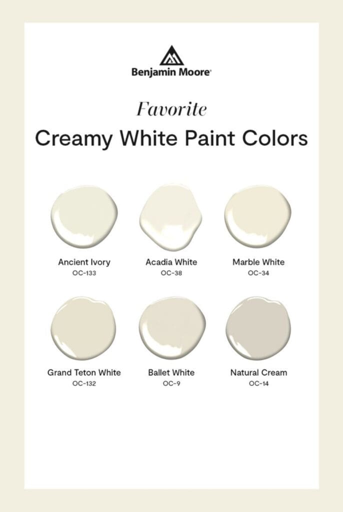
For centuries, creamy White Paint Colors and Designer Whites have been used to produce elegant interiors. These tones are associated with simplicity, stability and tranquility. They provide a perfect neutral background for a variety of decorating schemes and styles.
Unlike stark white, which feels cold and clinical, creamy whites create a warm and comfortable aesthetic. Additionally, it encourages feelings of peace and relaxation, and is ideal for spaces where unwinding is important. In color psychology, creamy whites are linked to mental clarity and freshness.
Design Benefits:
Versatility and Timelessness:
Creamy white harmonizes with decorating styles from traditional to contemporary. These hues are wonderful for allowing furniture and furnishings to stand out. Moreover, their classic appeal never goes out of style, and they’re an intelligent long term color choice for interiors.
Light Enhancing:
Because it reflects natural light, it makes spaces appear larger and more open. Use it to brighten up smaller rooms that have limited natural light for a bright and airy aesthetic.
Pair with Other Colors:
Creamy white pairs well with a range of shades. It balances bold tones like navy blue, emerald green or deep red. Further, it combines effortlessly with neutrals like beige, gray, or soft pastels. Additionally, this flexibility allows for endless color combinations.
These Benjamin Moore Creamy White Paint Colors provide warmth, and elegance to any space. Additionally, they lighten, pair well with other colors, and are considered timeless hues. Furthermore, they’re a valuable addition to any color design scheme.
https://alllosangelespaintingcompany.com/2024/04/eggshell-paint-colors/

Designer Whites
Sherwin Williams designer Whites Color Collection has 40 exquisite white tones that you can use as your go-to decorating choice. These curated colors include shades of white most often recommended and relied on by decorating professionals. You’ll find many contemporary classics and rich, inviting whites among them.
Pure + Pristine Palette
Choosing the exact shade of white to bring design visions to life can be a highly nuanced process. That’s why Sherwin Williams created the Pure + Pristine palette as part of their Designer Color Collection, featuring 40 brilliant whites, sorted to make it easier than ever to find the perfect shade.
Nuanced Shades
These colors are made in Sherwin Williams’ unique 9500 Ultra White base. They are arrayed by light reflective value and divided into warm whites and cool whites. Moreover, this makes it easier to select the perfect one to suit any space. Color designing with white involves analyzing shade nuances to make sure it complements the space and its furnishings.
Color Choices
Considering which white to use also involves understanding a space and taking into account its natural light, furnishings and furniture. Choose shades that produce a calming aura whether the paint is meant to be background or focal point.
Some of the most popular whites are Alabaster 7008, White Snow 9541, and Natural Choice 7011. Mix and match them to produce an unlimited number of unique color combinations.

https://alllosangelespaintingcompany.com/2021/08/sherwin-williams-50-most-popular/
Frosted Whites
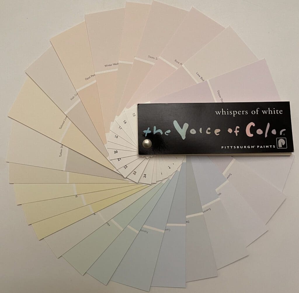
This Frosted Whites Collection from Pittsburgh Paints is designed to provide a subtle backdrop to any design scheme. The palette has 46 creamy whites across the color spectrum.

Off-White Color Collection
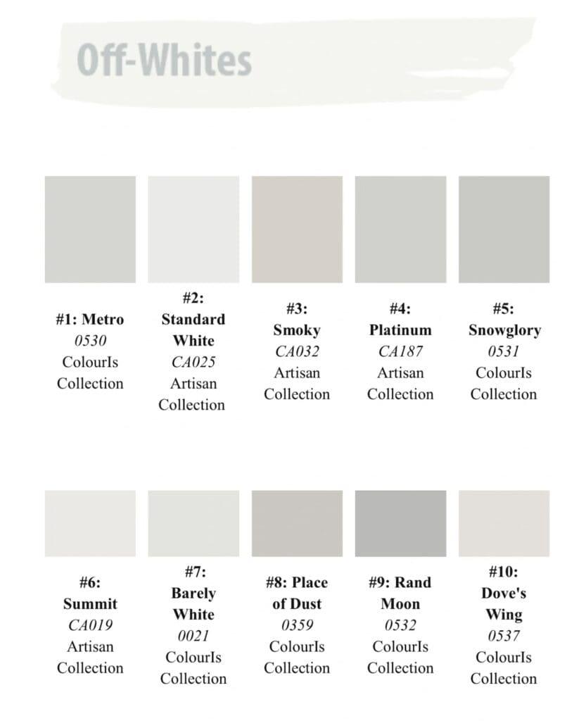
After over a decade as “America’s favorite color,” gray has finally lost its title. The new champion is white. Whites and off-whites are trending in interior decorating schemes and are no longer considered a default color choice. Warm or cool, whites and off-whites create a calm and stabile aesthetic. This Off-White Color Collection has 10 elegant hues that are perfect for your next home or office color refresh.
Reasons Off-Whites are a popular design choice:
- Classic. These timeless, elegant hues never go out of style.
- They’re versatile. Pair with other colors to create a range of aesthetics. Create a warm, inviting ambiance, or a clean, modern and minimalist style.
- White is light reflective and makes a space appear brighter and more spacious. They let you highlight design elements, like artwork, furniture and collections by providing a neutral backdrop that allows each item take center stage.
- Associated with cleanliness and hygiene, it’s a go-to choice for bathrooms, kitchens, laundry rooms and spaces where cleanliness is a priority.

All Los Angeles Painting Company, Inc. 310-470-9218 provides interior and exterior painting services in addition to color consulting.
