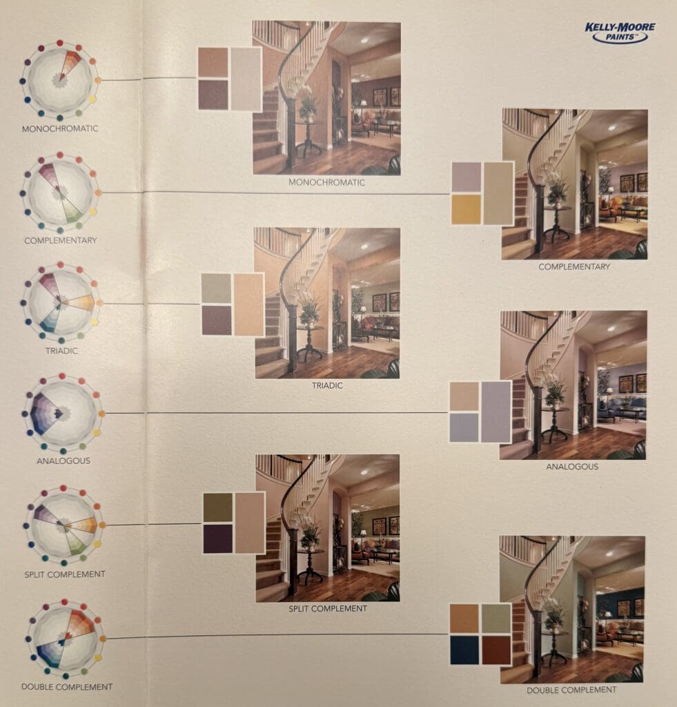
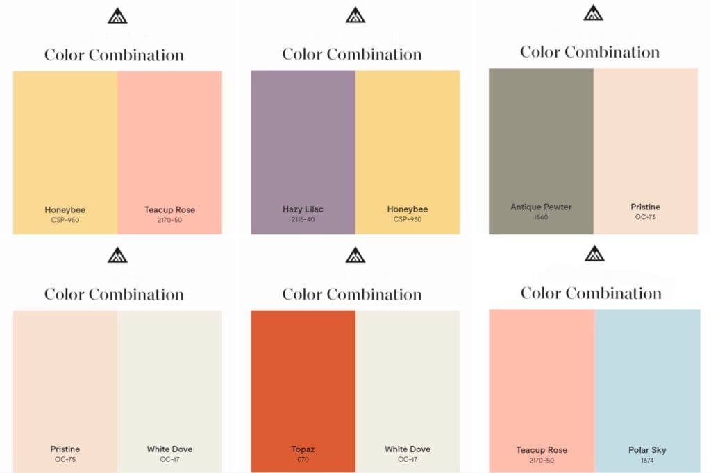
Designer Color Combinations have two, three or four related colors grouped together that let you reimagine your interior or exterior spaces. The benefit of these combinations is that it allows you to see interesting colors next to each other to make visualizing them in your space easier. Use these unique pairings to provide the inspiration for your next color scheme update.
Benjamin Moore Color Combinations
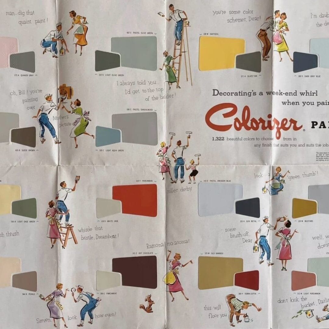
Early 1960’s Color Combinations
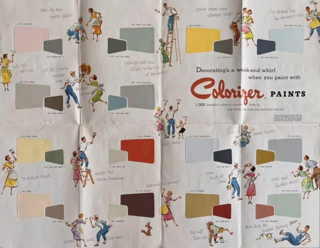
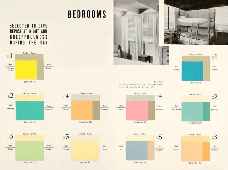
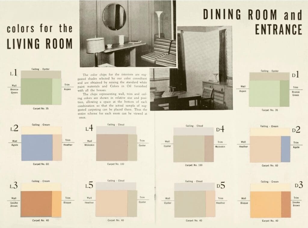
These early 1960’s Colorizer paints parings represent wall, trim and ceiling colors. They show main color and accent colors by relative size and position.
From “Exterior and Interior Color Beauty”
Explore these soothing color combinations; perfect for creating a calm and relaxing color scheme. They come from a 1930’s booklet and are soothing, relaxing color combinations.
Designing with Color
Monochromatic schemes utilize colors from the same family on the color wheel. Additionally, this will include all the light tints, dark shades as well as the clean and muted versions of that color family.
Complimentary color schemes use colors opposite each other on the color wheel. Used together, this combination of warm and cool colors creates excitement and energizes any decorating scheme. Opposite colors are perfect as accents in a neutral décor.
Triadic schemes use three colors that are eqully spaced from each other on the color wheel. Colors can also be arranged in varying degrees with one color dominant, another color as secondary and the third color as an accent.
Analogous schemes use colors of the same temperature near each other on the wheel. these schemes evoke a specific mood, such as calm and tranquil or warm and inviting.
Split complementary color schemes combine the two colors on either side of a color’s compliment. This combination of colors adds a variety to a room in a pleasant but active way.
Double Complementary color schemes are created by using colors that are next to each other and then finding their opposites on the color wheel.
