1970’s House Paint Colors embraced warm, livable hues. From rich, earthy tones to statement making accents, they transformed Disco era dwellings into reflections of the unique personalities in each home. These 70’s era color charts featured mustard yellows, rich oranges, earthy greens, electric pinks, and bold browns.
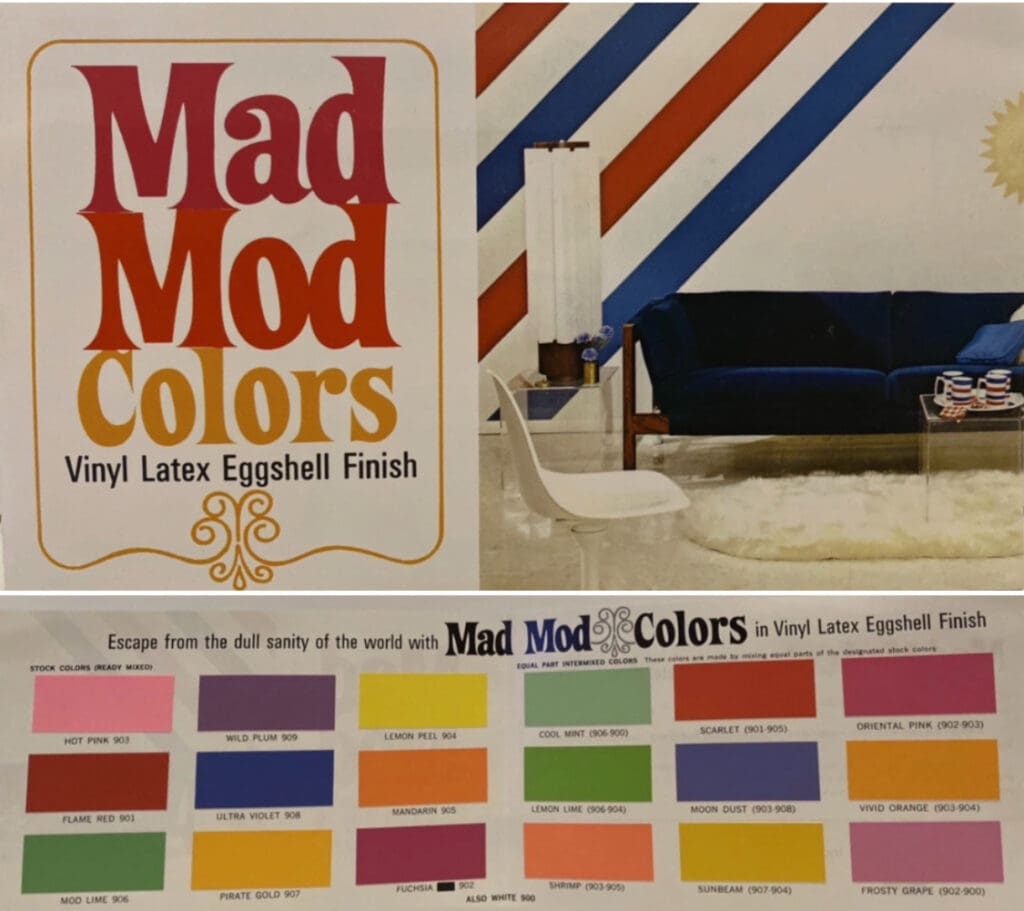
1971 Mod Colors
Tips for decorating with vintage colors:
- Use as an accent: Bold, deep-tone colors like rust, olive green, and avocado green can be used as an accent wall to add a pop of color to a room.
- Combine with natural wood elements: These colors pair well with natural wood elements like wooden furniture and flooring, adding warmth and texture to the space.
- Mix with earth tones: Combine deep-tones with earthy ones like brown and beige to create a harmonious and balanced look.
- Contrast with light colors: Use deep-tone colors in combination with light colors like white or cream to create contrast and visual interest.
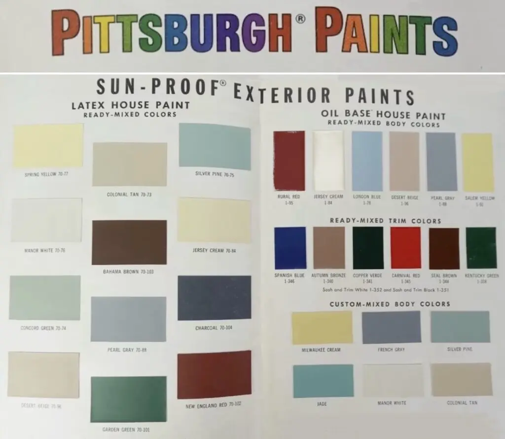
1970 Pittsburgh Paints Exterior Colors
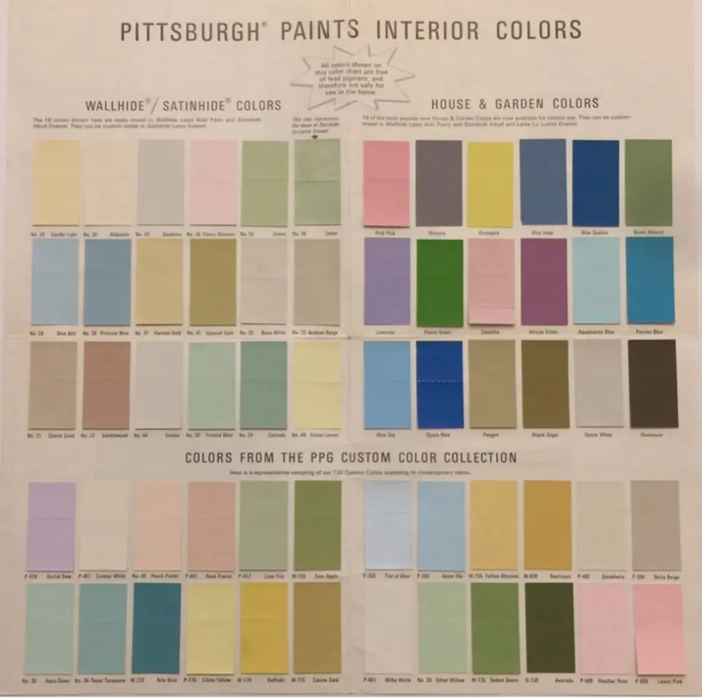
1971 Pittsburgh Paints Interior Color Chart
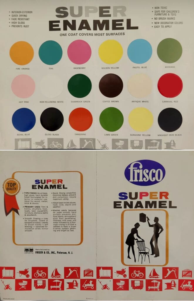
1972 Super Gloss House Paint Colors
These 1970’s colors embody the energy of the era: bright, almost neon hues like Raspberry, Fire Orange and Golden Yellow bring a playful optimism, while earth-inspired tones like Avocado, Lawn Green and Tangerine to keep us grounded and connected to nature.
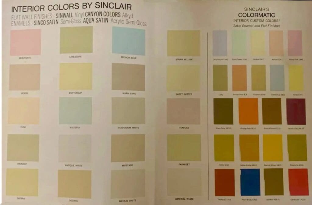
1973 Sinclair Interior Colors
The early 1970’s were a time of change, self-expression and a psychedelic explosion of color. As counterculture movements embraced individuality, design followed suit with vibrant, saturated hues that rejected the norm.
Eye catching bright colors in combination became the accepted style for the first time in the 1970s. The vibrancy and high-energy nature of these retro paint colors leads us to choose carefully; use these bold 1970s paints as highlights paired with neutrals.
Other 1970s colors, that have stood the test of time, are iconic standards in their own right, including Aquamarine, Avocado, and King’s Gold. Rather than pairing these rich shade with neutrals, combine lighter versions in the same family with darker versions to create a monochromatic color scheme.
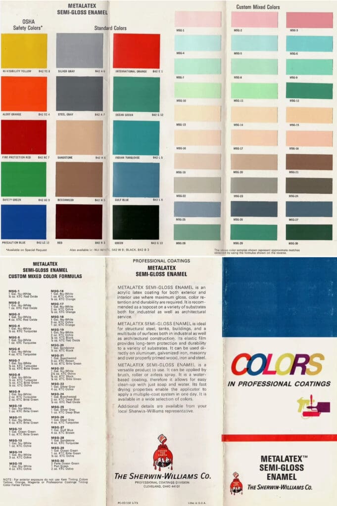
1973 Sherwin Williams Interior/Exterior Semi-Gloss
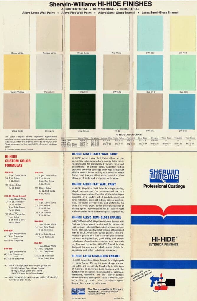
1975 Sherwin Williams Wall Paint Colors
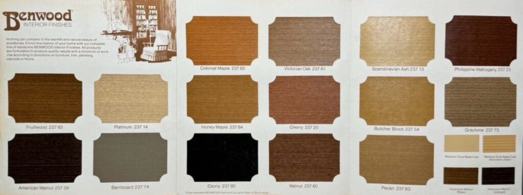
1975 Benjamin Moore Interior Wood Stains
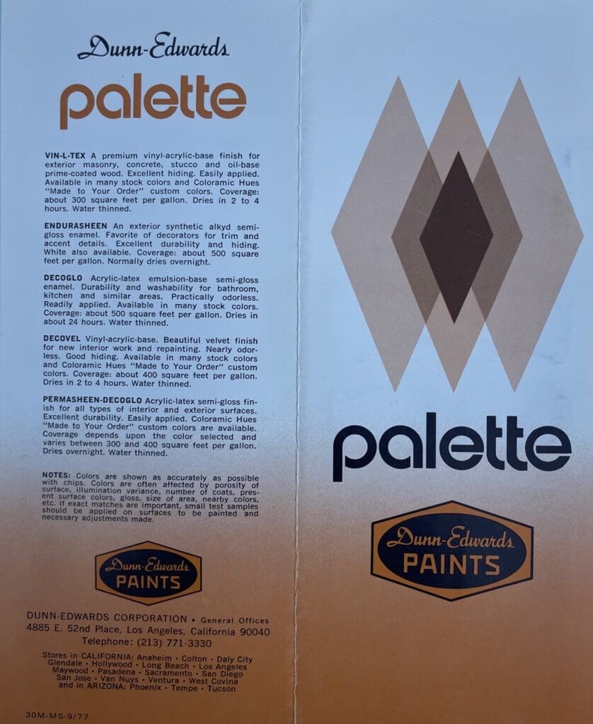
1977 Dunn Edwards Exterior Finishes
The 70s were known for bold, deep-tones; this late 1970’s color chart has some classics.
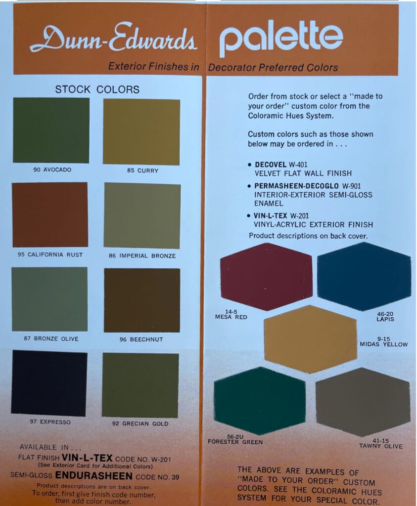
When decorating with deep-tones, balance boldness with sophistication to avoid overwhelming the space. To truly embrace the 1970s aesthetic, incorporate vintage and retro decor like patterned fabrics, funky lighting, and eclectic artwork.
1977 Interior Paint Colors
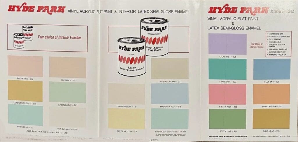
This 1977 Hyde Park color collection is from the Baltimore Paint and Chemical Company. They were purchased by Sherwin Williams in 1980.
Looking for authentic disco era, 1970’s House Paint Colors for your next decorating update? Call All Los Angeles Painting Company, Inc. 310-470-9218 for a color consultation.
