Color + Inspiration
All Los Angeles Painting Company, Inc.
Choosing color is personal and emotional. Multiple factors go into selecting appropriate hues. They include individual preferences, room size, lighting, existing furniture, art, architectural elements and cognitive associations.

Martin Senour Colors of 1968
By All Los Angeles Painting Company, Inc. |
Martin Senour’s stylist colors from 1968.
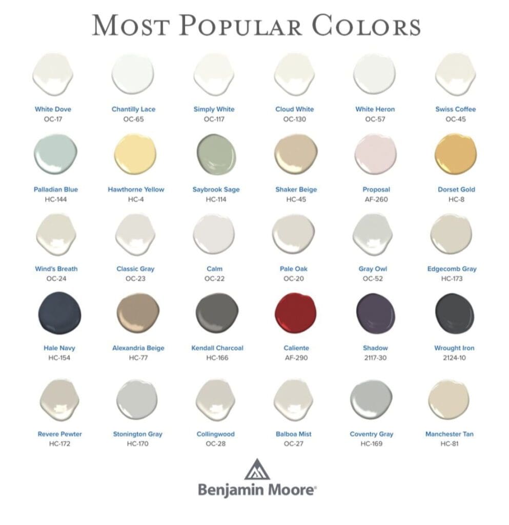
Benjamin Moore Most Popular Colors
By All Los Angeles Painting Company, Inc. |
This the Benjamin Moore Most Popular Color Chart. It contains warm neutrals and accents. Neutrals provide an earthy, natural background for furnishings and art. These colors have the widest universal appeal based on gallons sold. Considered classics, as opposed to trending colors, they will look fresh for many years. Benjamin…
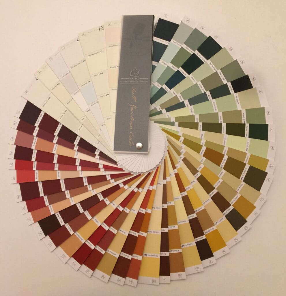
C2 Paint Fan Deck
By All Los Angeles Painting Company, Inc. |
Pictured here are the first 50 pages of the C2 paint fan deck. C2’s curated collection of colors is inspired by hues from the natural world. These pleasing colors are in tune with the soul’s desire to be surrounded by beauty. C2 is a full spectrum paint. It has a…
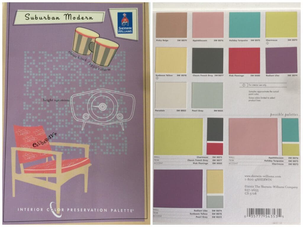
Sherwin Williams Suburban Modern
By All Los Angeles Painting Company, Inc. |
With clear cheerful colors, the 1950’s exhibited a new American outlook. Striking shades like Chartreuse and Apple blossom conveyed the exuberance of the time. Whether you seek to connect with the nostalgia of those optimistic days, or you want to recreate the period decor in exacting detail, this Sherwin Williams…
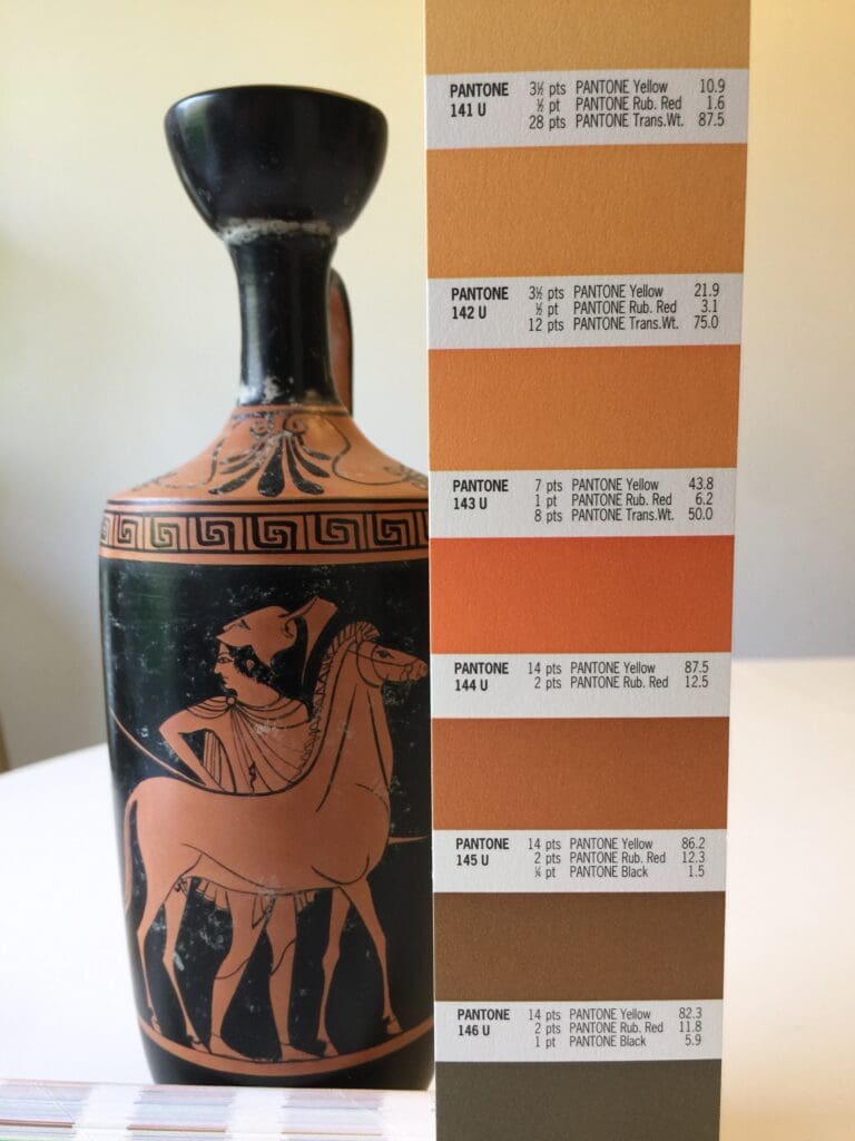
Pantone Oranges
By All Los Angeles Painting Company, Inc. |
Pictured here is a Greek Red-Figure Lekythos color matched to a Pantone Oranges color strip. Orange, a vibrant, social, happy color, pairs well with other members of the orange family along with browns and yellows. This dramatic hue is often used on front doors and accent walls. Orange as an…
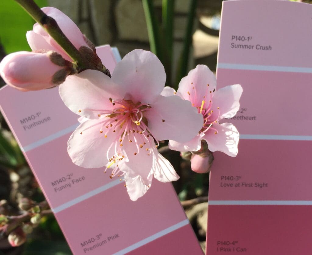
Paint Color Inspiration
By All Los Angeles Painting Company, Inc. |
Paint color inspiration can come from anywhere, but nature often provides the best colors. Consider these flowers matched to fan deck hues for your next home or office color update. Behr These nectarine blossoms were color matched to chips on page 17 & 18 of the Behr Paint fan deck….
- « Previous
- 1
- …
- 33
- 34
- 35