Color + Inspiration
All Los Angeles Painting Company, Inc.
Choosing color is personal and emotional. Multiple factors go into selecting appropriate hues. They include individual preferences, room size, lighting, existing furniture, art, architectural elements and cognitive associations. This page explores the many facets of color inspiration in various design schemes.
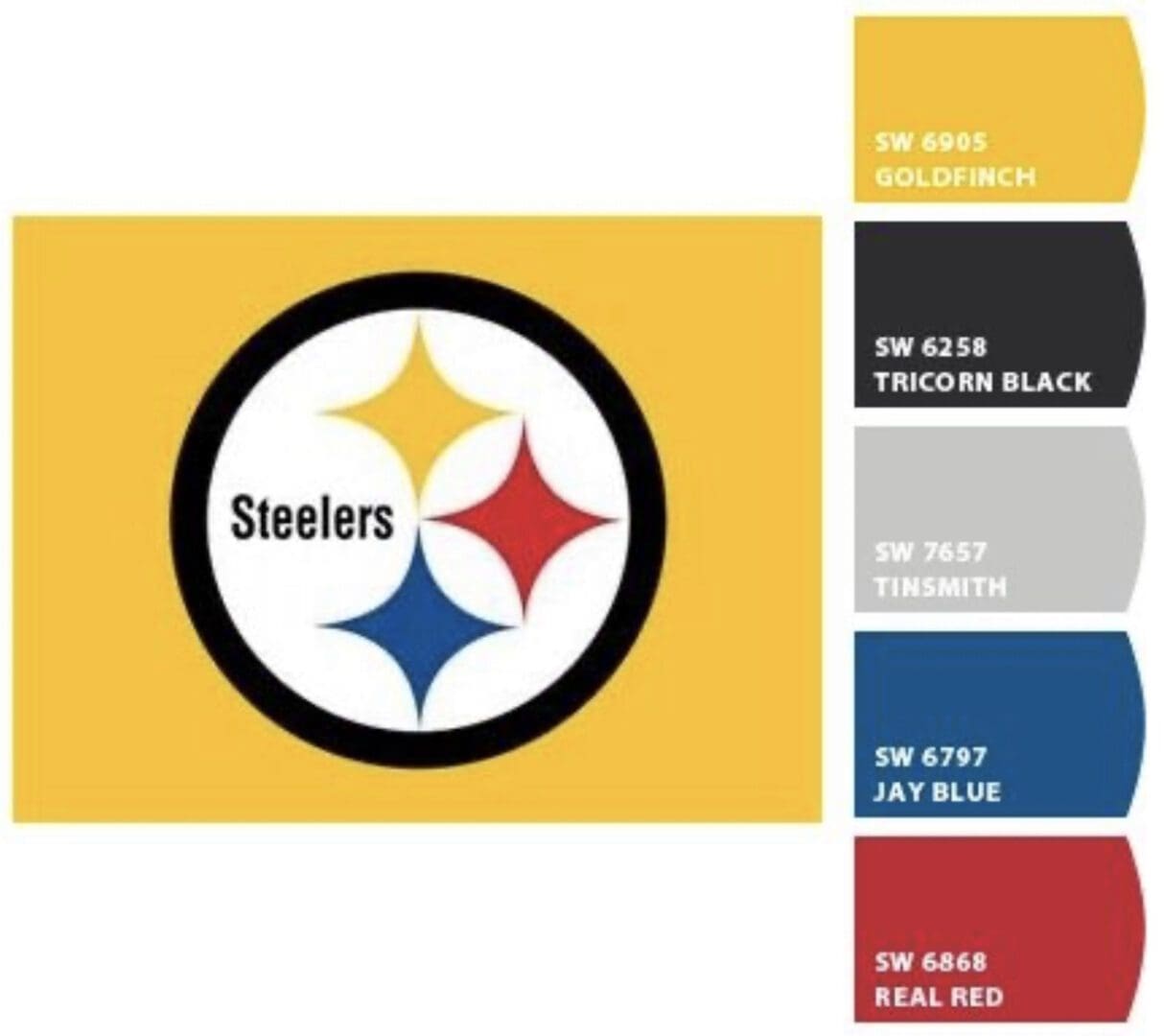
Sherwin Williams | Pittsburgh Steelers Paint Colors
The Pittsburgh Steelers team colors were originally part of the logo for the American Iron and Steel Institute. It features a circle around three four-pointed geometric shapes called hypocycloids in yellow, red and blue.
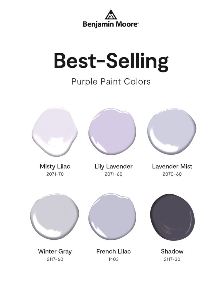
Best Selling Purples
These Benjamin Moore Best Selling Purples give a sense of elegance, and luxury to a space.
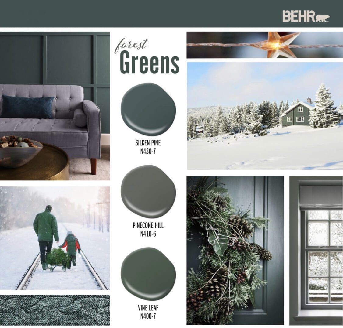
Behr Colors
Behr Forest Greens are the perfect choice for a cozy themed room update.
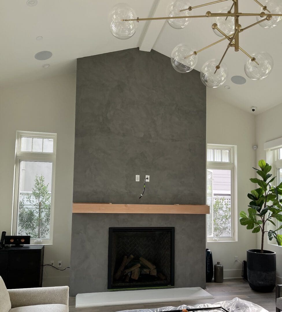
Portola Roman Clay Sasha
Sasha is one of Portola Roman Clay’s 40 standard colors. It is a warm, smoky concrete gray, and a good option for anyone looking to create a sophisticated, modern aesthetic. Here are some benefits of using Sasha in a decorating scheme: Versatility: Sasha is a neutral tone that works well with a variety of colors,…
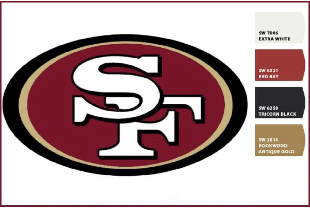
Sherwin Williams San Francisco 49ers Paint Colors
Update any room with Sherwin Williams San Francisco 49ers Paint Colors. Show your NFL pride with this inspired color palette. Each hue has a unique symbolism: Gold symbolizes the power and wealth generated by the gold rush of 1849 that made California famous. The dark red stands for the typical red plaid shirts worn by…
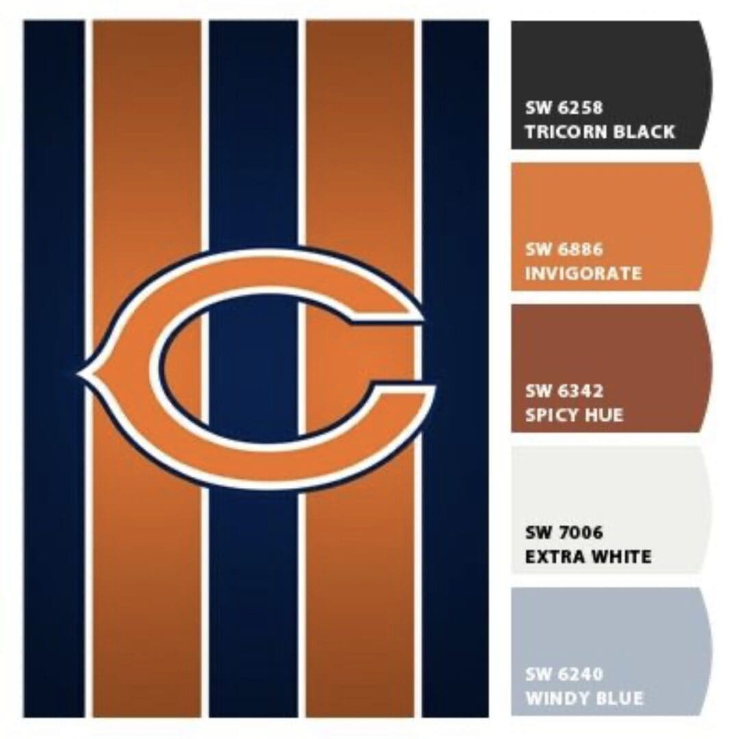
Sherwin Williams | Chicago Bears Paint Colors
The Chicago Bears were founded in 1919, and are one of the NFL’s founding franchises. The team’s colors are navy blue, orange, and white. Use these matching Sherwin Williams | Chicago Bears Paint Colors to update any color scheme. Navy Blue: Established in Decatur, Illinois, the Bears adopted navy blue as a nod to their maritime…
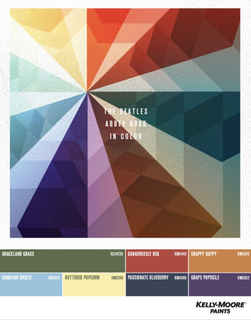
Beatles Inspired Paint Colors
The Beatles cultural influence ranged from fashion, pop art, hair styles, design and beyond. Explore these Beatles inspired colors for your next room, office, or home decorating update. Kelly Moore Paints, Valspar and Portola curated these Beatles Inspired Paint Colors. Use these interpretive and psychedelic colors to turn any room into an extraordinary space. The…
Sherwin Williams 1950’s Colors
The 1950’s stand out for tasteful, down to earth decorating schemes that homeowners were proud of. The design emphasis was on comfort and leisure. Since the Covid lockdowns, Mid-Century themed color styling has become a thing. These Sherwin Williams 1950’s colors can be adapted to any architectural style. Decorating with 1950s inspired colors involves using…

Winter Colors
Neutral tones are becoming increasingly popular choices for home decorating updates. Use these cool neutral winter colors for a classy and calming design scheme. Arctic Colors The world’s most extreme environment inspired these Dutch Boy Arctic colors palettes. Pair Existence with Mapped Blue and Classical Ivory to give any decorating scheme an energy lift. Arctic…
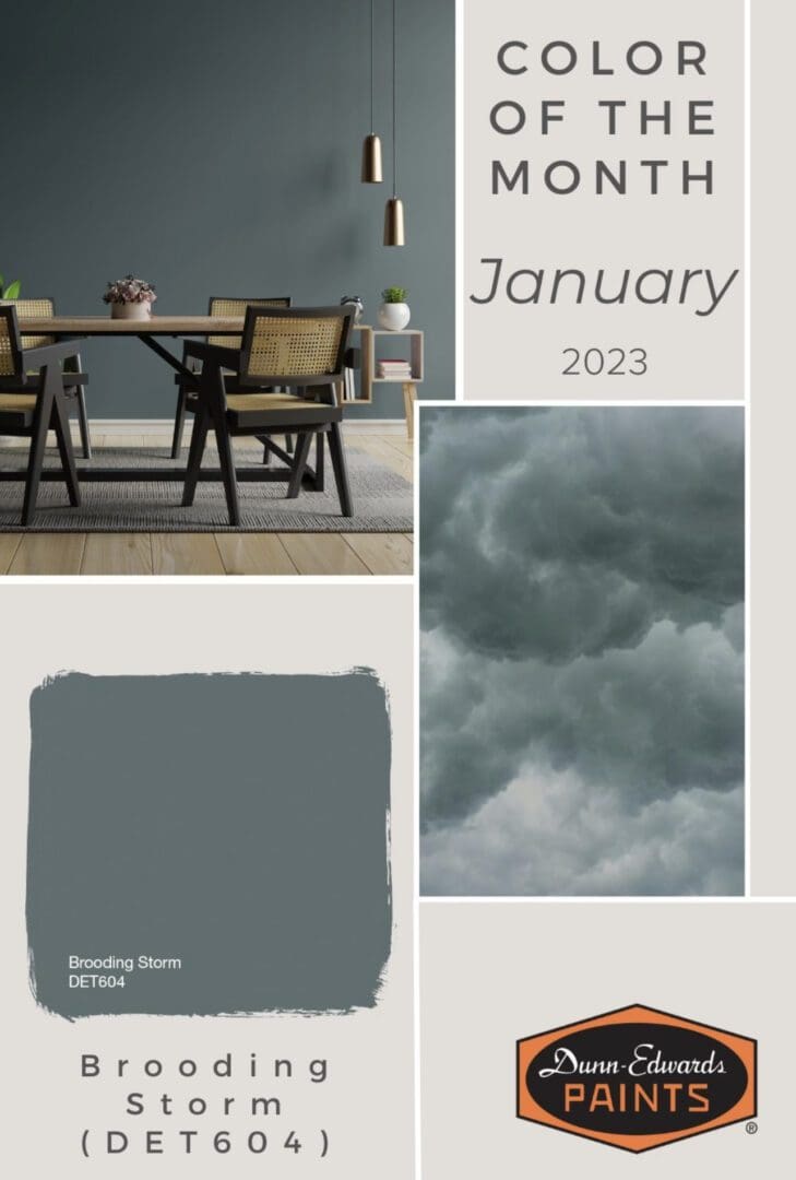
Dunn Edwards 2023
Color forecasters present the latest hues by collating information from the latest trends in architecture, fashion, textiles, home furnishings and the arts. These Dunn Edwards 2023 Colors of the Month are the result of this research. August Beaming Sun is a subtle orange-yellow associated with joyfulness and vibrant energy. It encapsulates the warmth and cheerfulness…
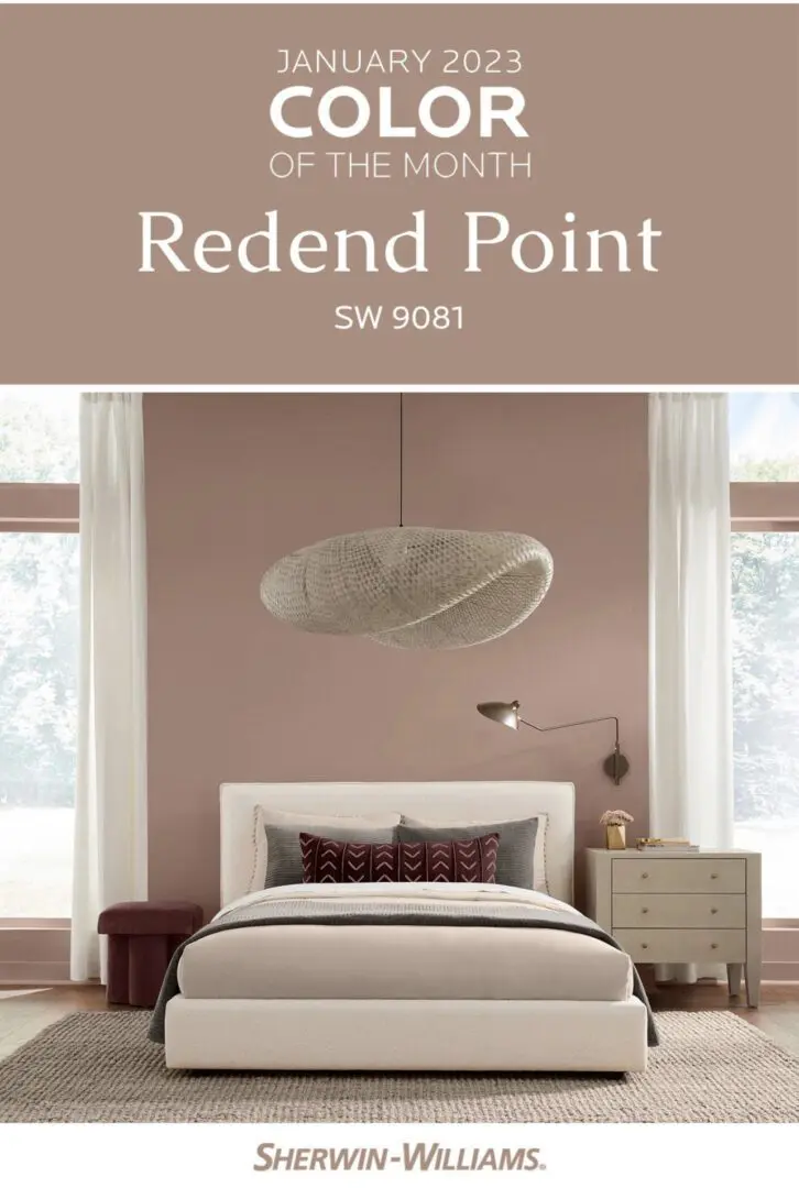
Sherwin Williams 2023
Each month, based on seasonal, fashion, cultural and travel trends, Sherwin Williams color stylists present a monthly color and coordinating hues to inspire consumers’ décor schemes. Here are some Sherwin Williams 2022 Colors of the Month. August Color plays an important role in setting the tone of any decorating scheme. Sherwin-Williams August 2023 Color of…
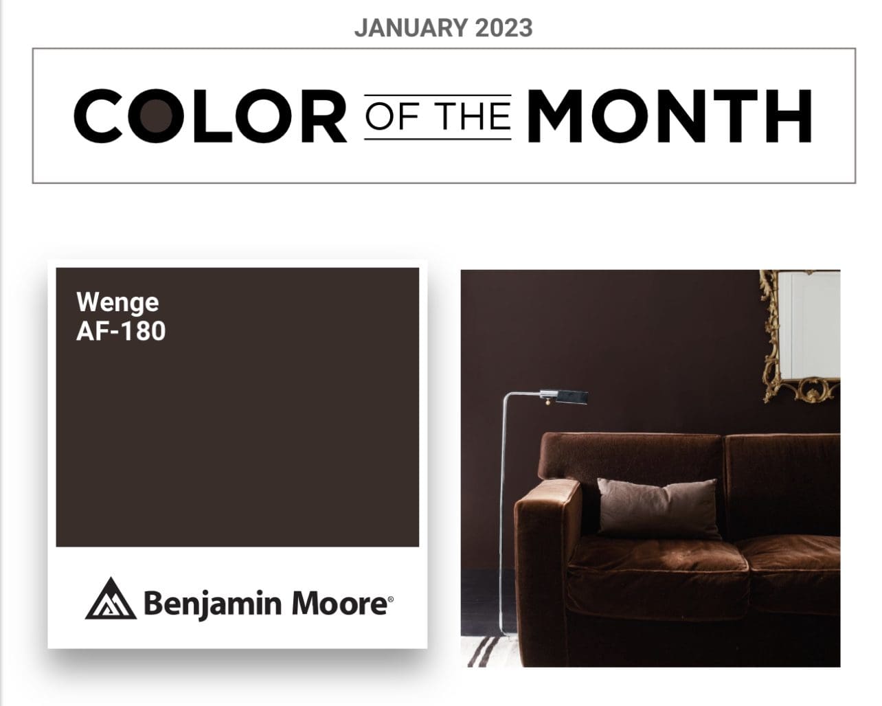
Benjamin Moore 2023 Colors
Trending hues like these Benjamin Moore 2023 Colors of the Month present consumers with the latest color fashions. July Benjamin Moore July 2023 Color of the Month is Starry Night Blue. This rich, deep tone connects to the vastness of the night sky and brings a sense of sophistication to any room. Starry Night Blue…