Color + Inspiration
All Los Angeles Painting Company, Inc.
Choosing color is personal and emotional. Multiple factors go into selecting appropriate hues. They include individual preferences, room size, lighting, existing furniture, art, architectural elements and cognitive associations. This page explores the many facets of color inspiration in various design schemes.
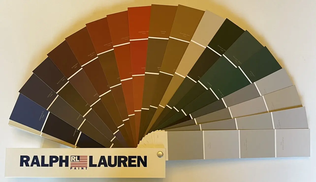
Ralph Lauren Thoroughbred Color Palette
Ralph Lauren colors compliment the aesthetic created by the RL furniture, fabric, and bedding collections. All elements embrace each another and enhance the identity of the space. The Ralph Lauren Thoroughbred Color Palette is but one of many harmonized palettes consumers used to update their home and office color schemes. Ralph Lauren Thoroughbred Colors Thoroughbred…
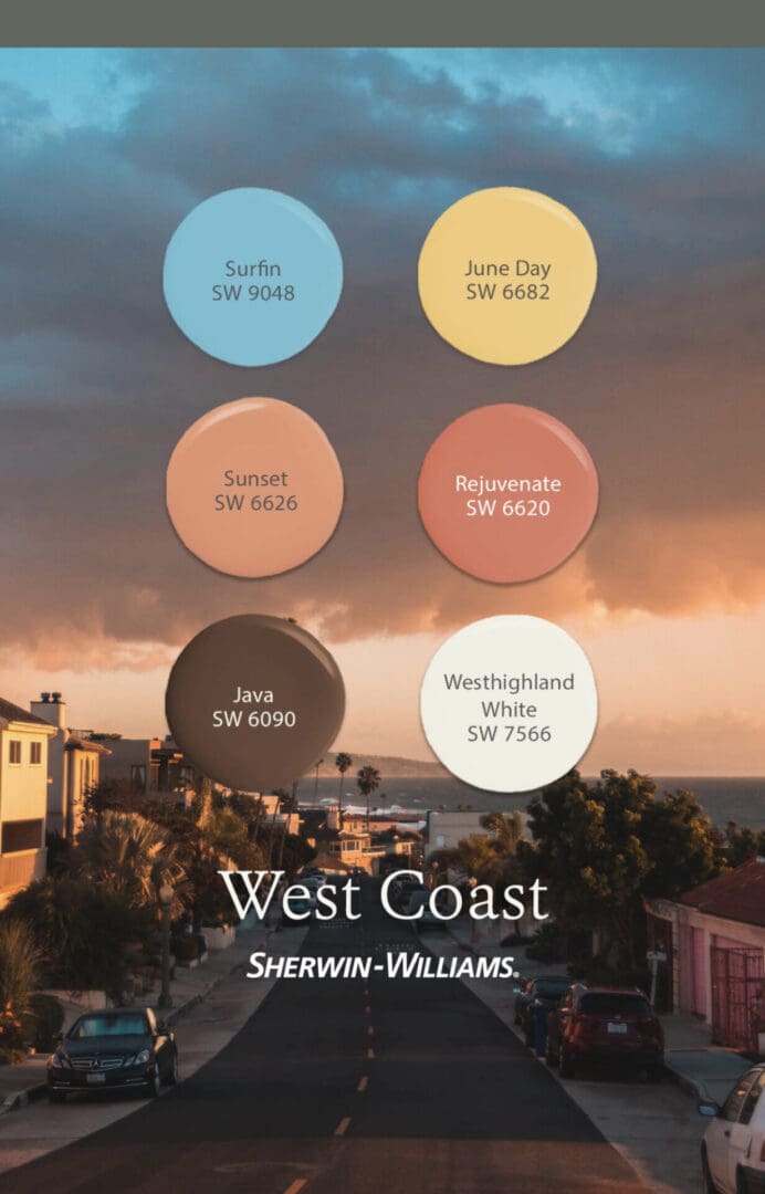
Los Angeles Color Inspiration
Anything you like can inspire a room or house color design update. These Los Angeles color inspiration palettes were curated from the scenery, architecture and sports teams of America’s second largest city. West coast themed colors convey the relaxed, natural beauty of the region. They draw inspiration from the ocean, mountains, and deserts. Some popular…
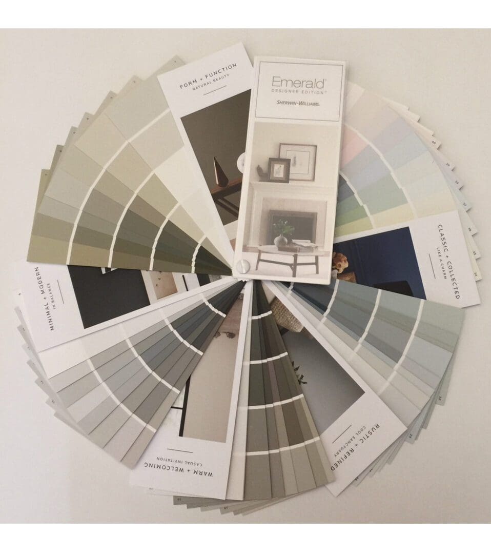
Sherwin Williams Emerald Fan Deck
The Sherwin Williams Emerald fan deck elevates color selection to a new level of sophistication. Its curated range of 200 hues provide endless options to update any space with beauty and style. Each of the collection’s colors was carefully chosen to create unlimited harmonious color combinations. These perfectly proportioned hues are organized into five distinct…
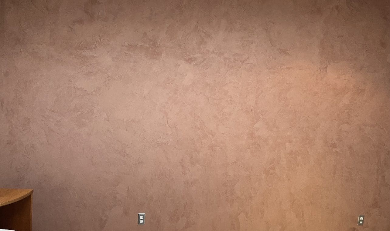
Portola Roman Clay Costes
Costes, one of Portola Roman Clay’s 40 standard colors, is a muted terracotta with a hint of rose, perfect for creating a warm and inviting atmosphere. The smooth, marble-like visual effect of Roman Clay allows for unlimited design possibilities. Whether you prefer a rustic, Mediterranean-inspired look or a more contemporary and refined aesthetic, Roman…
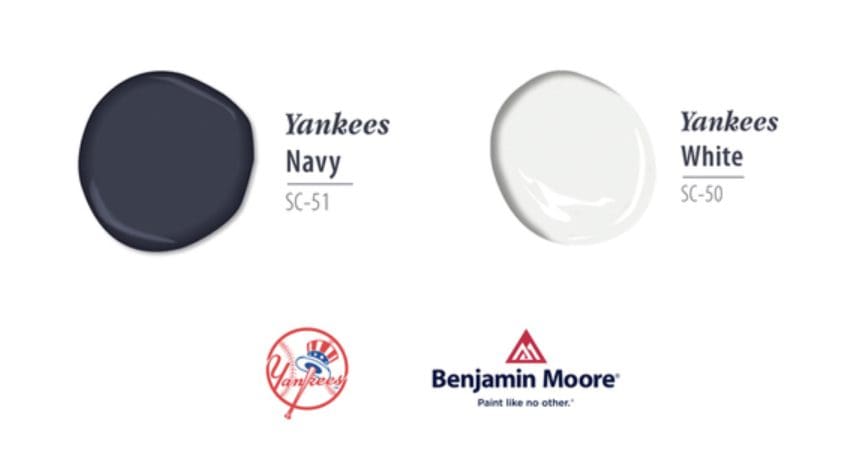
MLB Team Paint Colors
Give your room or home an update with these Benjamin Moore MLB Team Paint Colors. Enjoy showing off your team with these iconic hues. They pair well with a variety of design and architectural styles. New York Yankees Decorating with the classic combination of Yankees blue and white evokes a sense of tradition and timelessness.…
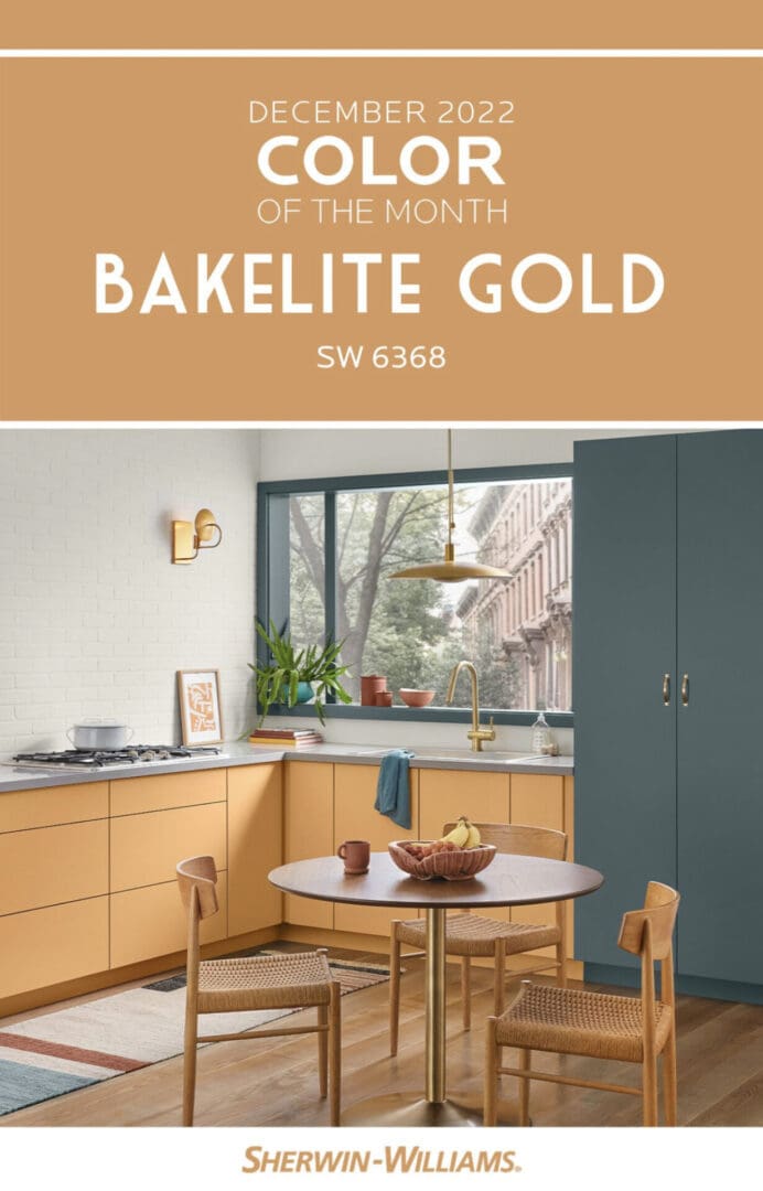
Sherwin Williams 2022 Colors
Every month, the color stylists at Sherwin Williams select a color and coordinating palettes to inspire decorating schemes. These colors are based on seasonal themes and design trends. Here are Sherwin Williams 2022 Colors of the Month. December December’s Color of the Month is Bakelite Gold. Bakelite Gold provides a grounding mid-century feel with a timeless…
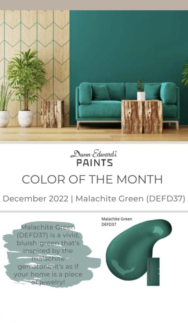
Dunn Edwards Color of the Month
Every month, the color curators at Dunn Edwards promote a trending hue to help consumers decorate. When used in a design scheme, the Dunn Edwdards Color of the month adds a sophisticated, cutting edge touch to a room. Consider using them on an accent wall to create a focal point in the space. December 2022…
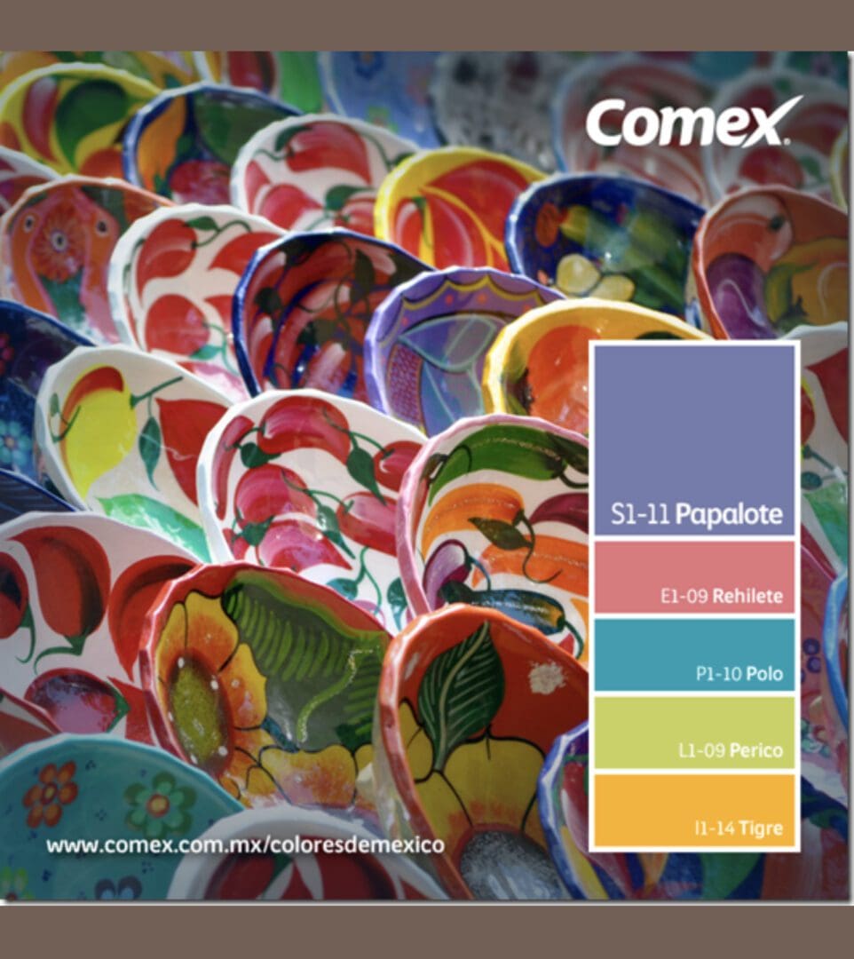
Mexican Talavera Pottery Color Palette
Anything you find beautiful can be brought home and used for a design update. Let the dynamic colors on these plates provide the inspiration for an updated color scheme. The Comex Mexican talavera pottery color palette presents hues that are sure to please. Mexican Talavera Pottery is a traditional ceramic known for its bright and…
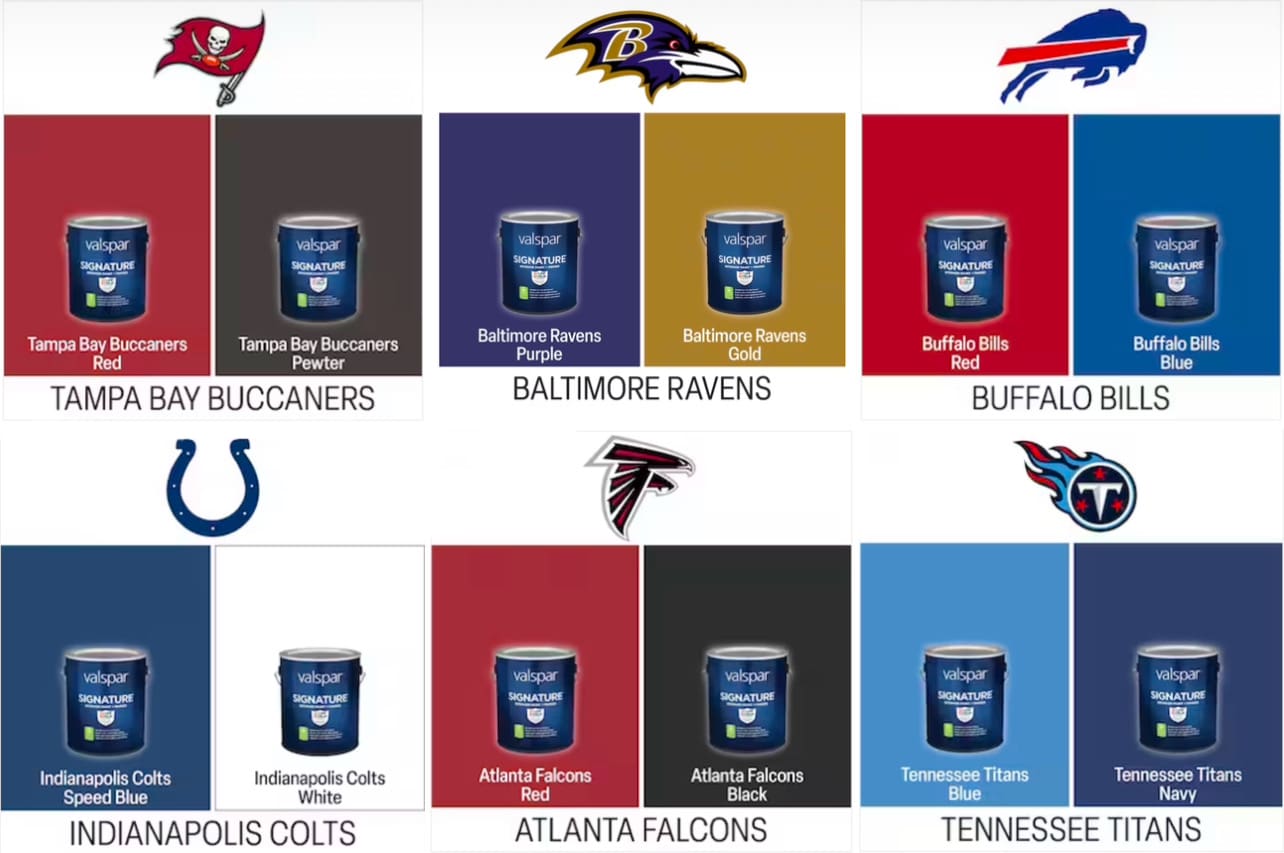
Valspar NFL Team Colors
People enjoy decorating with Valspar NFL team colors for many reasons. Team colors range from bold, bright hues to subdued shades. To use your favorite team’s colors, consider using them on accent walls or for complete rooms. To complement team colors, pair them with neutrals, like beige or gray. Adding team-themed accessories, like flags, banners,…
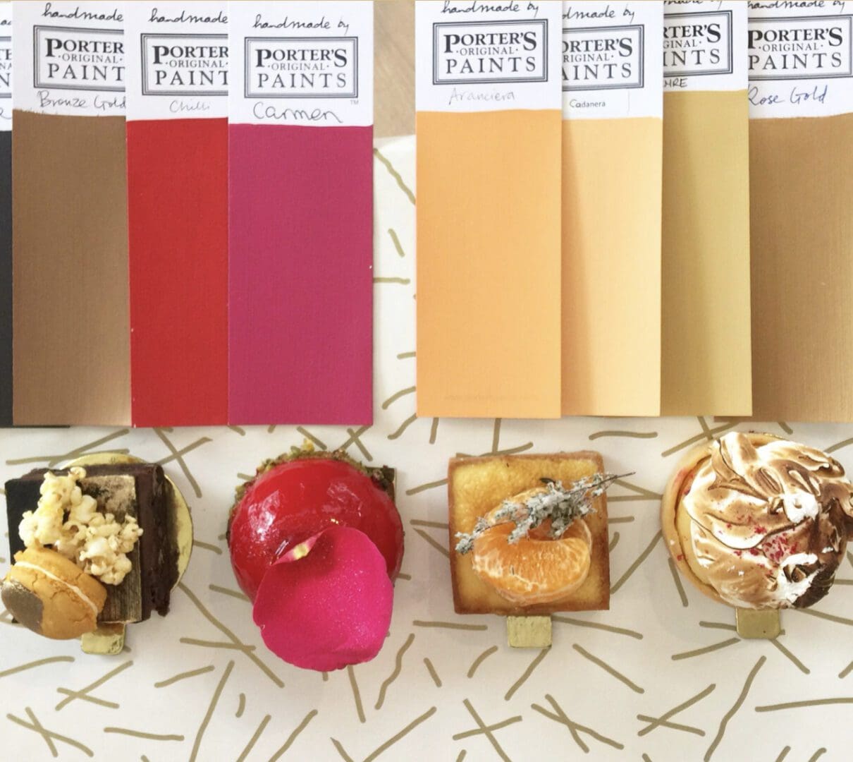
Porter’s Paints
Porter’s Paints is an Australian manufacturer that produces a unique and distinctive color palette inspired by the natural beauty of Australia and the Pacific region. Porter’s colors are rich, complex hues created by using multiple and complicated pigment formulas. This creates deep, dimensional colors that appear to change depending on the ambient lighting and surroundings.…
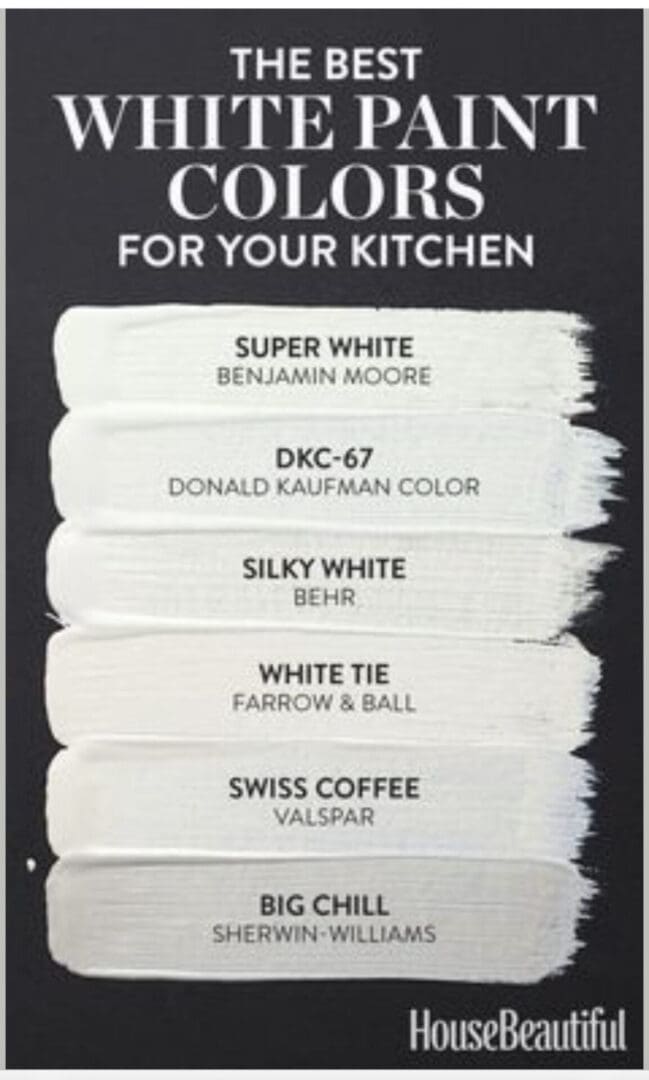
Best Kitchen Whites
This House Beautiful best kitchen whites color palette will help you choose the right white. Not every white works in every kitchen, so consider these perennial favorites to provide you a clean and crisp look that works with most design schemes. White is popular in kitchens because it’s associated with cleanliness. Here are tips for…

Warm Beige Paint Colors
Benjamin Moore’s Warm Beige Paint Colors are versatile and surprisingly complex. These relaxed neutrals are homeowner favorites and pair well with most home furnishings and collections. Here are tips for decorating with Benjamin Moore Warm Beiges: Overall, Benjamin Moore Warm Beige paint colors are a soft, warm, and inviting option for your home. Whether you’re…