Color + Inspiration
All Los Angeles Painting Company, Inc.
Choosing color is personal and emotional. Multiple factors go into selecting appropriate hues. They include individual preferences, room size, lighting, existing furniture, art, architectural elements and cognitive associations. This page explores the many facets of color inspiration in various design schemes.
Pratt & Lambert Trending Colors
Pratt & Lambert Trending Colors are presented annually by a team of color scientists. They study cultural, design, fashion and color trends, and based on these, they come up with a color forecast. 2022 Pratt & Lambert 2022 Color of the Year is Gray Mist. Gray Mist is a gently shaded sage that provides a…
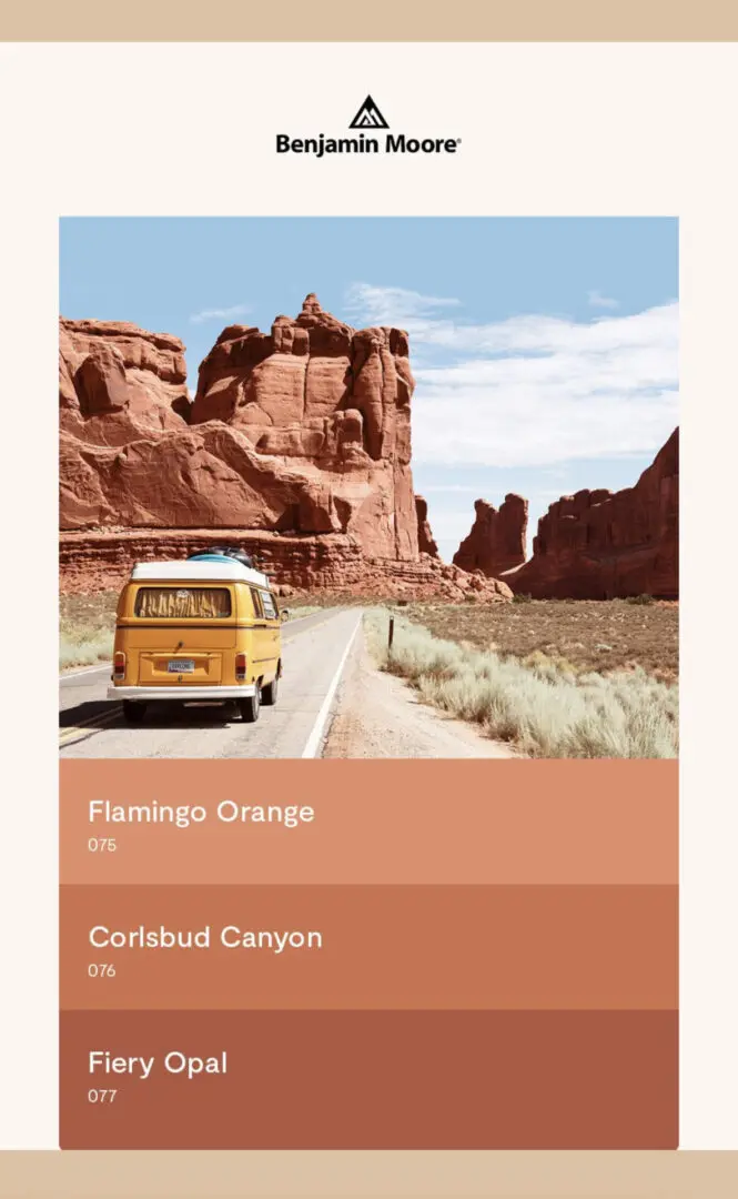
Summer Vacation Inspired Colors
This is Benjamin Moore’s Summer Vacation Inspired Colors Palette. These burnt orange tones, reds, cherry reds, and browns convey the earthy landscapes and sun warmed hues found on vacation road trips. Summer Travel Inspired Oranges Consider these rustic hues for a dining room refresh, an accent feature, or a front door color update. Pictured below…
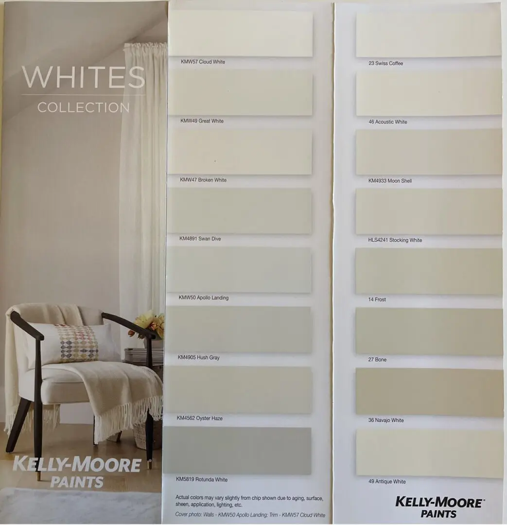
Whites Collection Kelly-Moore Paints
Whites should be intentional and not used as a default color. Warm or cool, whites convey a feeling of security and stability. The whites collection by Kelly-Moore paints has 16 elegant hues to select the perfect hue for your home. The Whites Collection Use Kelly Moore Whites to create a timeless, versatile, and bright look…
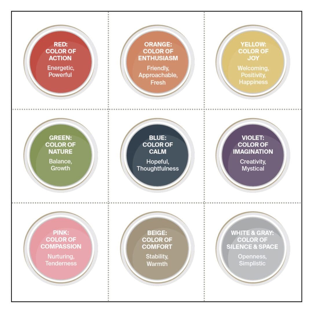
The Positive Impact of Color
Advertisers and marketers recognize the positive impact of color on all our lives. Specific colors affect human emotions and feelings in unique ways. Objects in the natural world send messages to our brain via color; whether it’s a colorful flower, a beautiful sunset, a gold coin, or a red fire engine, each one evokes a…
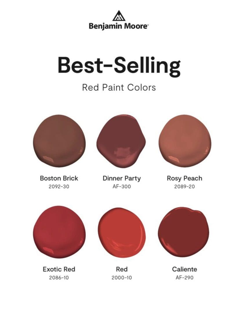
Benjamin Moore Best Selling Reds
Reds come in a variety of tones, from soft rose to deep garnet. Reds can be sharp and sophisticated or warm and soothing. Use these Benjamin Moore Best Selling Reds to bring warmth, energy, and drama to any design scheme. Red can be overpowering when used in large doses. Instead, use it as an accent.…
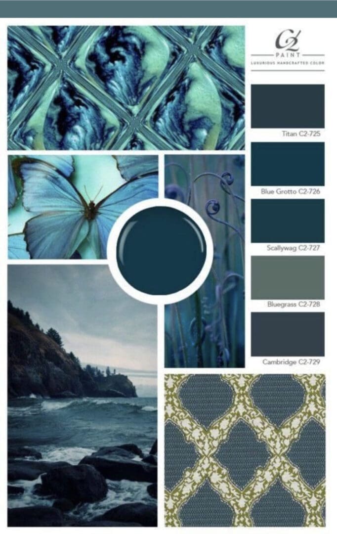
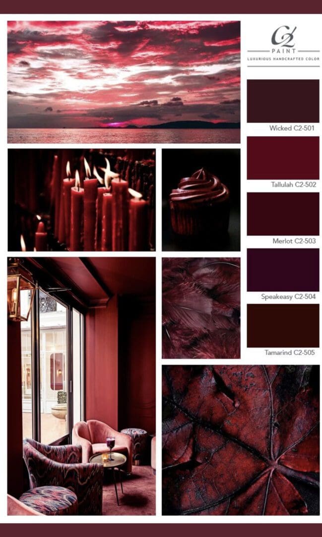
C2 Paint Moody Blue Palette
The C2 Paint Moody Blue Palette, characterized by deep blues with green undertones, creates a unique and captivating ambiance reminiscent of rainy days and cozy reading hours. Discover the benefits of moody blue paint colors in a decorating scheme. Moody blues have a calming effect that contribute a soothing energy to a space. Whether you’re…
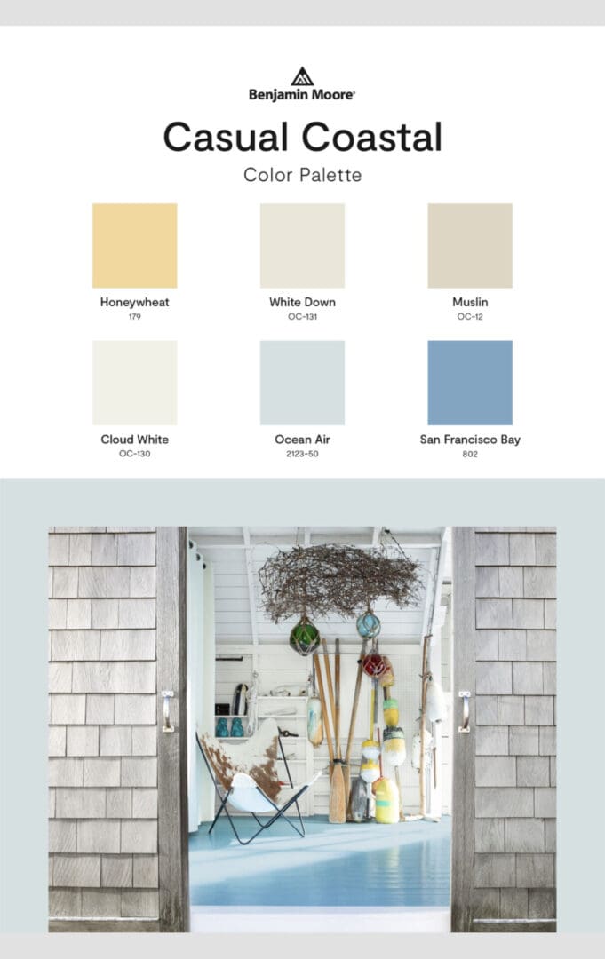
Casual Coastal Colors
Use the Benjamin Moore Casual Coastal Palette to inspire a summer beach themed color update. These hues add a carefree, seaside vibe to any room in your home. Use them alone, or mix and match them for your own unique design scheme. https://alllosangelespaintingcompany.com/2022/05/popular-whites-for-trim-ceilings/
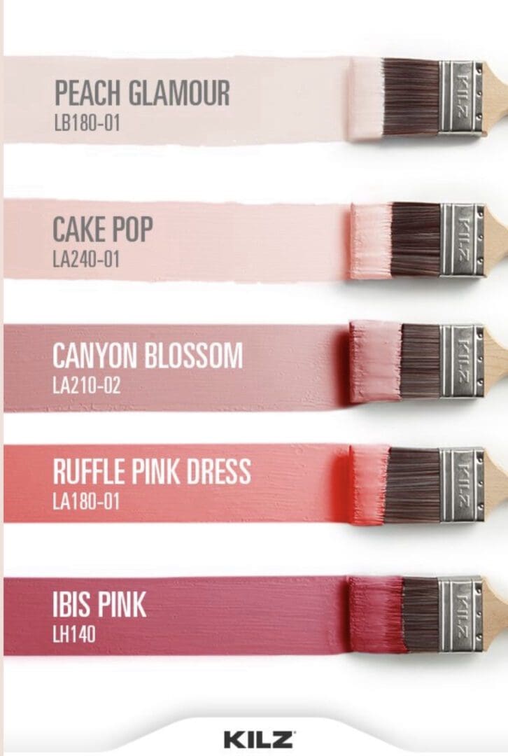
Kilz Pink Palette
Whether you prefer rich, jewel-like tones or soft and subtle hues, the Kilz Pink Palette has something for everyone. It’s a dynamic hue that evokes a variety of emotions depending on the shade and how it’s used in a space. Consider this when decorating with pinks: First, decide which shade of pink you want. Soft…
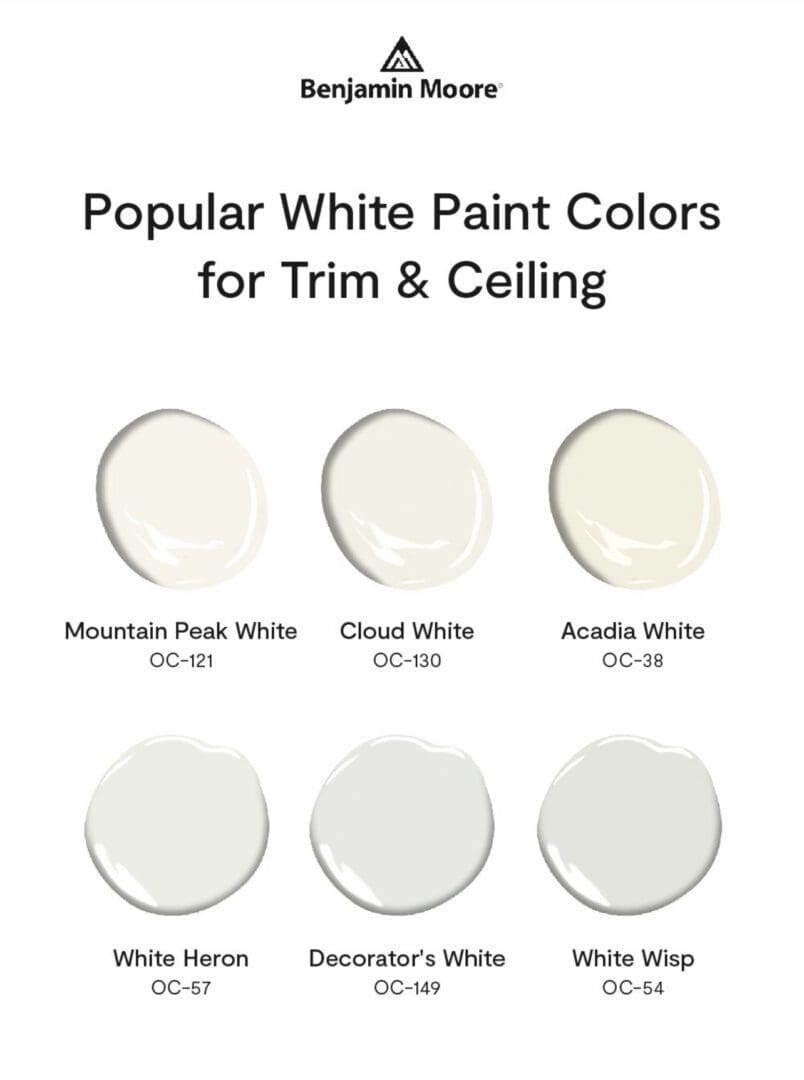
Popular Whites for Trim & Ceilings
White is an easy color choice for those concerned with commitment, those who don’t have time to make detailed design decisions, or those considering the market value of their home. White is the most popular shade for trim and ceilings because it works well with any wall color, and in most design schemes. This Benjamin…
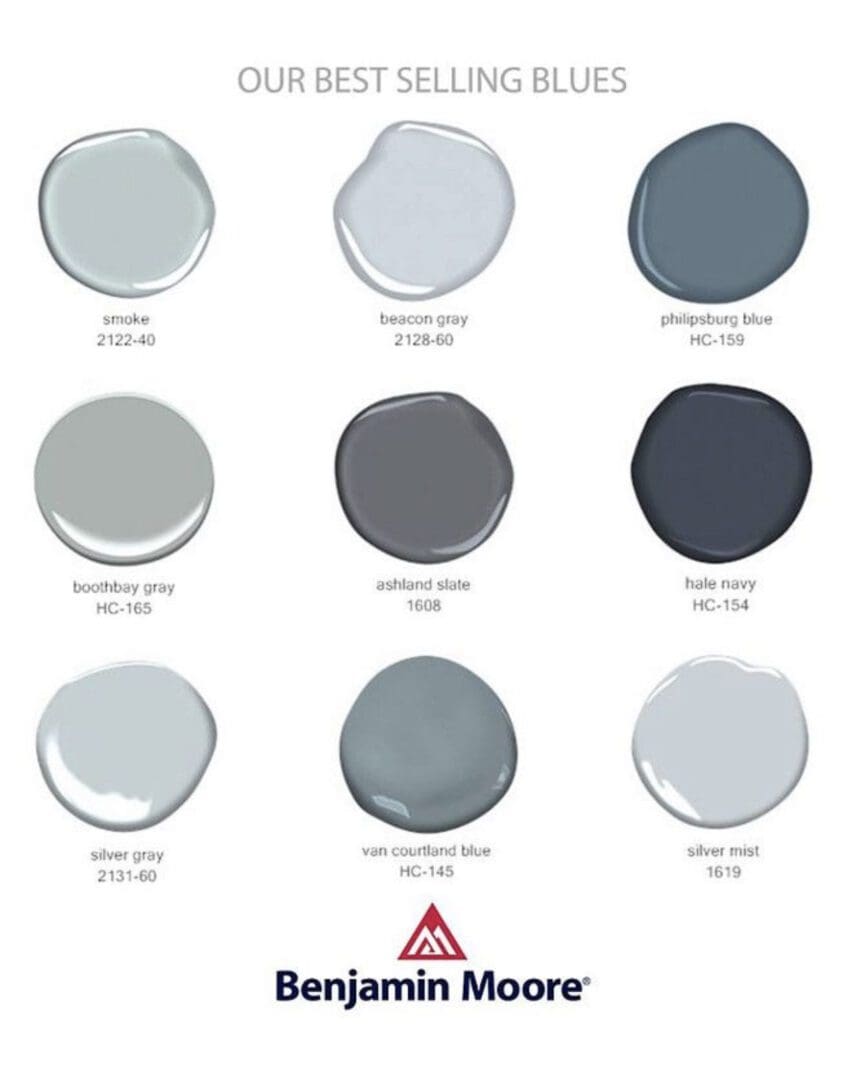
Best Selling Benjamin Moore Blues
These best selling Benjamin Moore blues have a gray tonality that harmonize well with natural materials like wood, brick and stone. Additionally, they can be paired with metallic accents to add a glamorous touch to a color update. Gray Blues Benjamin Moore’s Best Selling Blues can be used in a variety of decorating schemes: All…
C2 Paint Deep Reds
C2 Paint Deep Reds pack a powerful punch and always excite. Red, a potent and stimulating hue, works well alone or when paired with subtle neutrals. Red is an excellent choice for dining room walls, a feature accent wall, or a front door because of its lively nature. Luxurious and opulent, reds can update a…
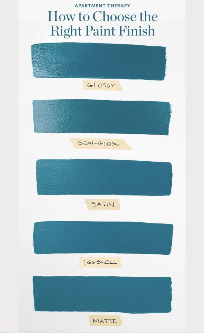
Choosing the Right Paint Finish
Choosing the right paint finish is important because paint color is affected by its gloss level or sheen. The same color will appear lighter as it increases in gloss level and darker, or duller, as decreases in gloss. This Apartment Therapy paint finish chart displays one paint color in five different sheens to illustrate this…