Archive for September 2022
Front Door Painting
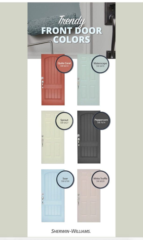
Looking for a low cost way to upgrade your curb appeal? This Sherwin Williams Color Palette offers bright, trending pastels and bold neutrals that will transform the look of your home. Use them to give your front door a look that is both modern and classic. Simple and effective: Front door painting is a simple,…
Read MoreDutch Boy Paint Colors
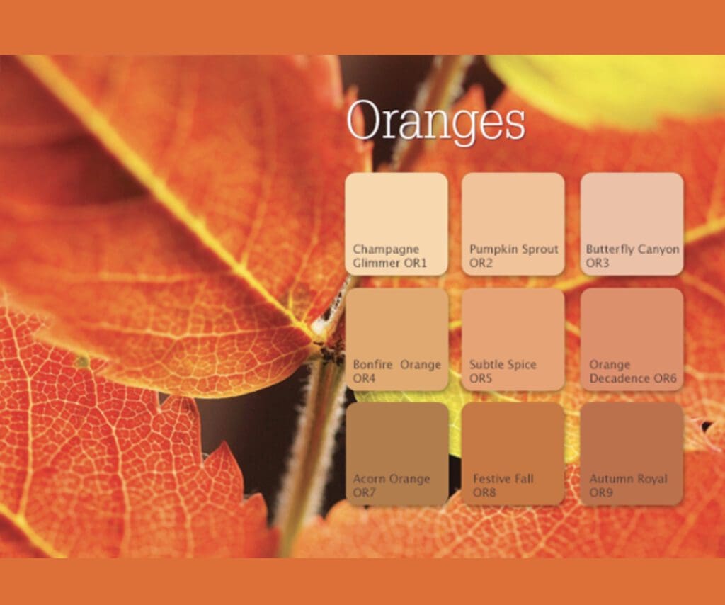
Dutch Boy Paint Colors seamlessly ground natural beauty in functionality when used in a home. Use these hues to create calming oases with pops of color. Each one tells a unique story that gives consumers the opportunity to express themselves through color in ways that they may not have previously considered. Orange Orange tones have…
Read MorePopular Dining Room Colors
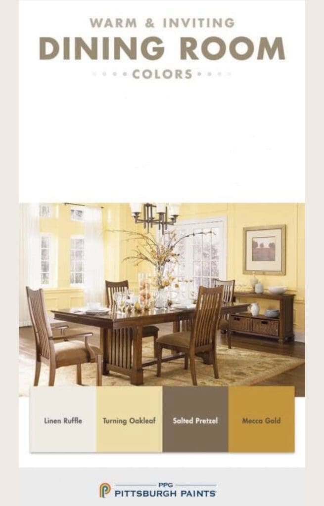
Dining rooms are where families and friends come together to enjoy meals and spend time with each other. Choosing the right color is key to creating a warm and inviting design scheme. Popular dining room colors that inspire most people are those conveying the essence of opulence and trust. Warm hues create a comfortable atmosphere.…
Read MoreMid Century Paint Colors
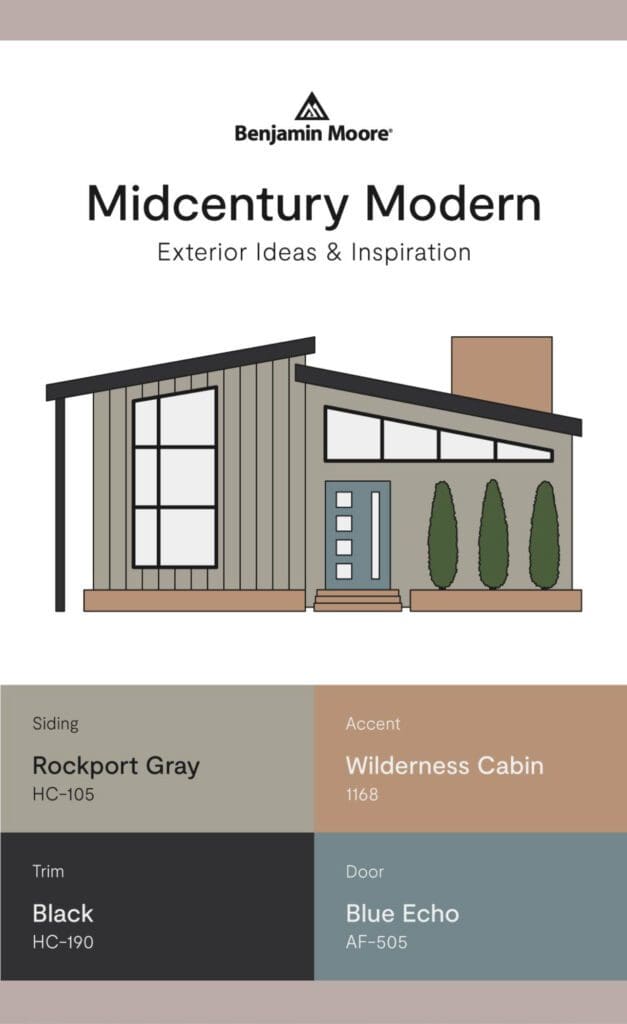
Mid-century architecture is characterized by clean lines, simple shapes, and a focus on functionality. Use these Mid Century Paint Colors to enhance the look and feel of your exterior and make your home a neighborhood standout with this cohesive aesthetic. Benjamin Moore Mid Century Colors These Benjamin Moore Color Palettes provide four harmonized tones to…
Read MoreSunset Inspired Hues
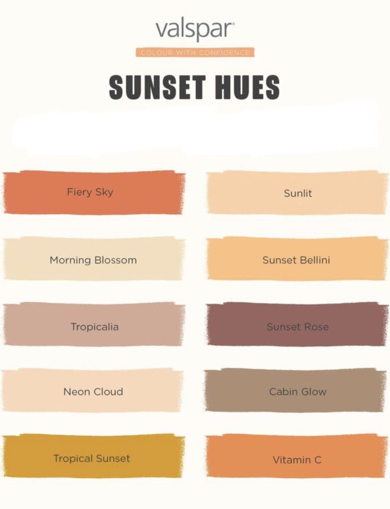
Valspar’s Sunset inspired hues bring warmth and energy to any home design scheme. These tones draw from the warm, vibrant hues of the sun setting sky. They range from deep oranges, pinks, and purples to soft yellows, peaches, and reds. Use them in a variety of ways to create a warm and inviting aesthetic. …
Read MoreWine Inspired Paint Colors
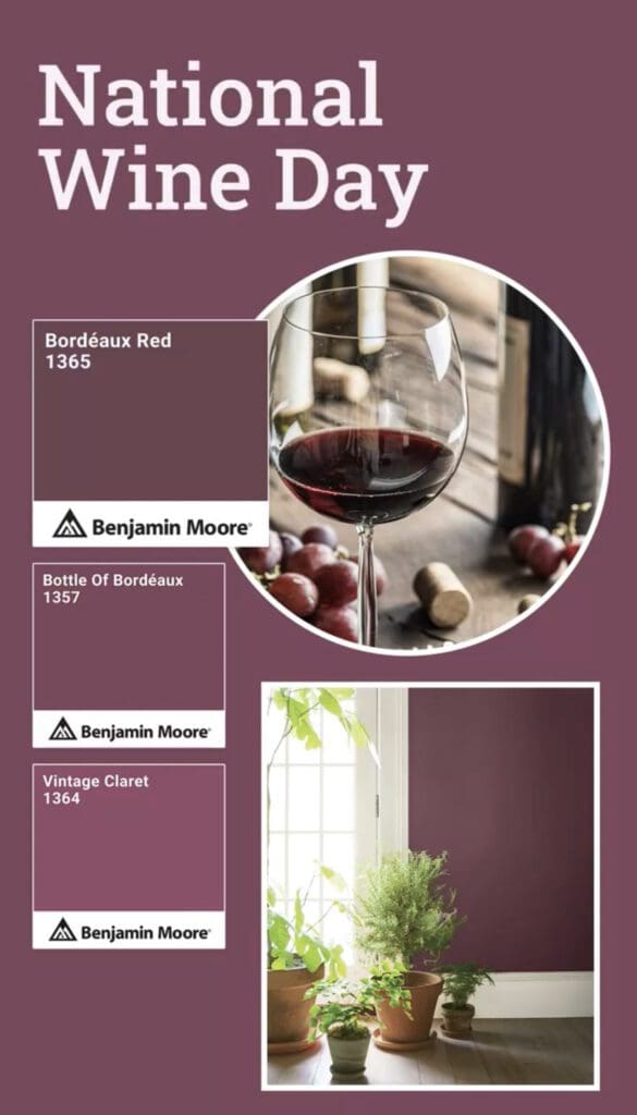
Anything you like can provide the theme for a room or house decor refresh. Add a touch of sophistication to your bedroom, dining room, or front door with these rich Wine inspired Paint Colors. National Wine Day is celebrated annually on May 25. Benjamin Moore Wine Grape Inspired Colors Behr’s Sip and Savor Tones are…
Read MoreC2 Paint Luxurious Colors
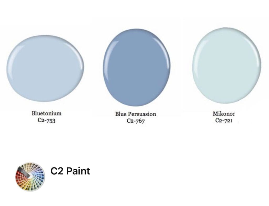
Incorporate C2 Paint luxurious colors into your decorating scheme to create an opulent aesthetic. With C2 Paint’s luxurious blue palette, you can transform any space into an elegant haven of style. C2’s full spectrum paint is formulated with multi-dimensional light reflecting hues, which produce dynamic colors. These blues harmonize well with collections and furnishings. Whether…
Read MorePratt & Lambert Color Journeys
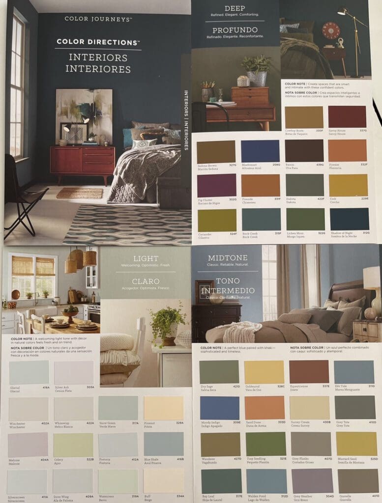
The Pratt & Lambert Color Journeys collection is organized into three categories: light, mid-tone, and deep hues. This categorization allows for easy navigation and selection of colors that suit individual preferences and design goals. Whether you prefer a subtle, airy ambiance or a bold, dramatic statement, this collection offers a range of hues to choose…
Read MoreNature Inspired Paint Colors
While design magazines offer valuable ideas, there is no better color guide than nature inspired paint colors. By drawing from the greens, blues, grays, and earth tones found in nature, these tones bring the beauty of the outdoors into your home. Incorporate nature inspired colors as the primary color for walls to create a serene…
Read MoreC2 Pretty Pastels
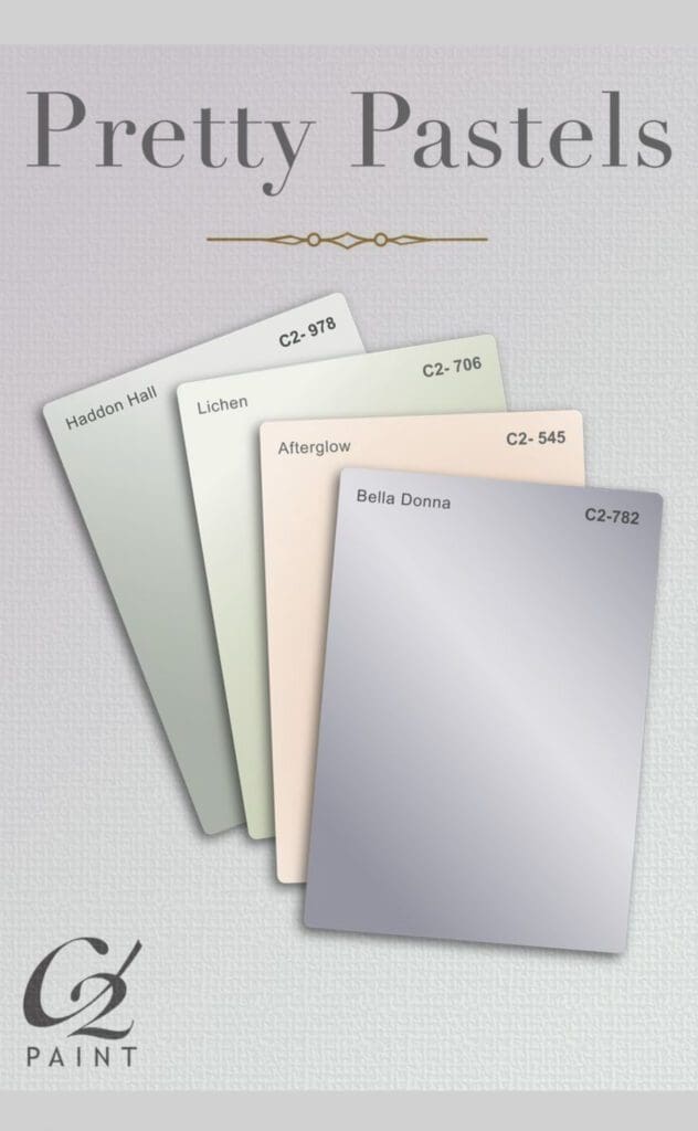
Take a break from bright and bold colors with soothing C2 Pretty Pastels. Pastels are soft, muted hues that evoke a gentle, soothing design aesthetic. They are used bedrooms, bathrooms, or living rooms to create a sense of tranquility and calm. When decorating with pastels, it’s important to balance the softness of the hue with…
Read More