Color + Inspiration
All Los Angeles Painting Company, Inc.
Choosing color is personal and emotional. Multiple factors go into selecting appropriate hues. They include individual preferences, room size, lighting, existing furniture, art, architectural elements and cognitive associations.
Choosing the Right Paint Color
By All Los Angeles Painting Company, Inc. |
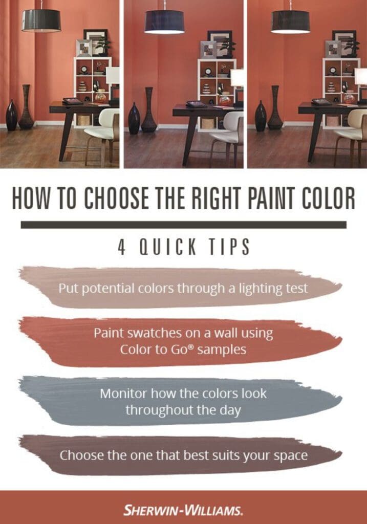
Choosing the right paint color can be difficult because colors appear one way in morning light and differently in evening light. When picking a color, put it through the lighting test. Room lighting can dramatically change the way a paint color appears. It’s important to see your color in different…
PPG Best Blues, Greens & Violets
By All Los Angeles Painting Company, Inc. |
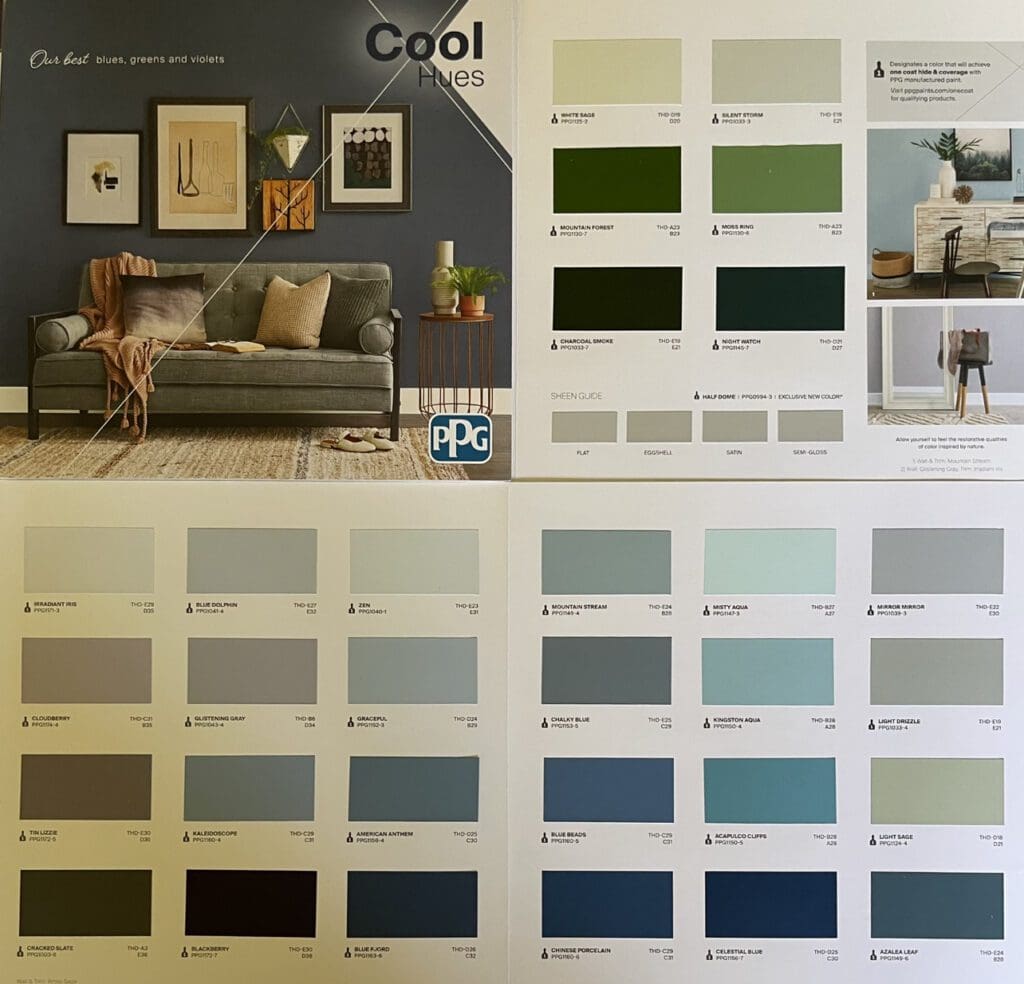
The PPG Best Blues, Greens, and Violets color chart provides calm, tranquil, and creative colors for any decorating scheme. These hues were inspired by the beauty of nature, as well as the rich and diverse history of art and design. Blues, greens, and violets are known as cool tones. This…
Glidden Paint Catalina Island Colors
By All Los Angeles Painting Company, Inc. |
Catalina Island, located off the coast of California, is known for its beautiful landscapes and laid-back atmosphere. When choosing a design scheme, consider these Glidden Paint Catalina Island Colors. Glidden Catalina Colors Some tones that can be part of a Catalina Island decorating scheme include: Glidden Terracottas Terracottas are warm,…
Little Greene Colors of England
By All Los Angeles Painting Company, Inc. |
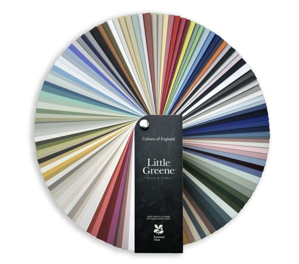
The Little Greene Colors of England Collection has a range of hues inspired by different periods in England’s history, as well as its architecture, landscape, and cultural heritage. From the warm and earthy tones of Georgian-era brick and stone, to the soft, muted hues of the English countryside, each color…
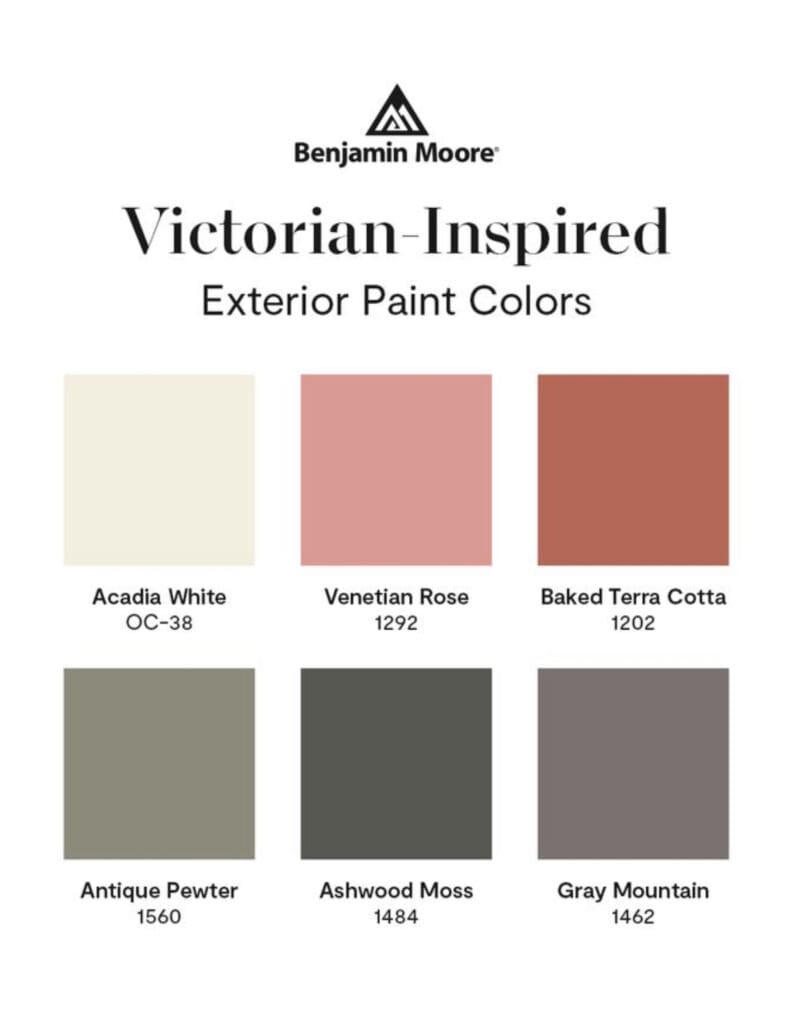
Victorian Paint Colors
By All Los Angeles Painting Company, Inc. |
Give your Victorian home the look it deserves with these Victorian Paint Colors. Victorian homes are known for their ornate and decorative style, and this palette reflects that with a range of rich, warm colors. Sherwin Williams Exterior Victorian Style Colors Here are some key Victorian House Colors: Greens: Mid-tone…
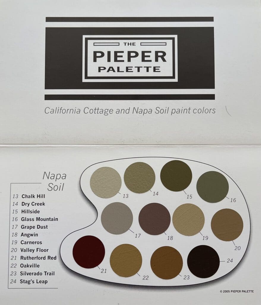
Napa Soil Color Palette
By All Los Angeles Painting Company, Inc. |
Most people think of soil as brown and uninteresting, but samples taken from areas just a short distance from each other display a stunning variety of colors. Moreover, just as watering turns dusty looking grayish brown soil into a rich brownish black, environmental conditions can affect soil’s appearance. Soil color…
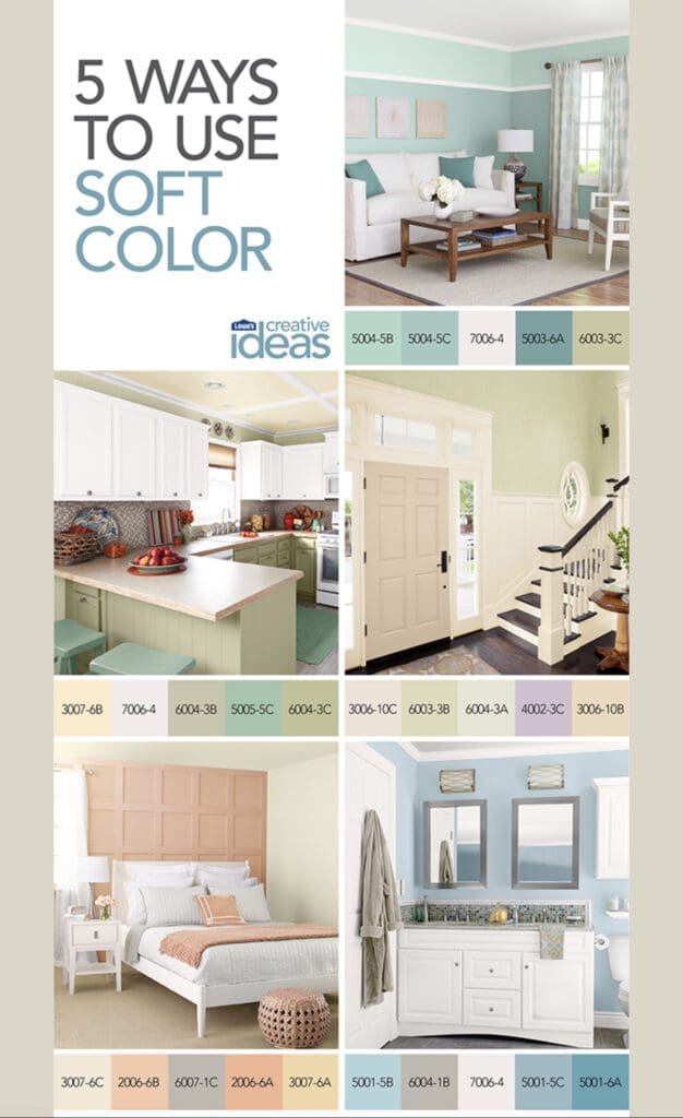
Valspar Colors
By All Los Angeles Painting Company, Inc. |
Create a peaceful aesthetic in any space with these Valspar Colors palettes. Soft Tones Valspar Soft tones create a calming and soothing atmosphere in any room. They are ideal for bedrooms, living rooms, and other spaces where relaxation and comfort are key. Soft colors can also be used as a backdrop…
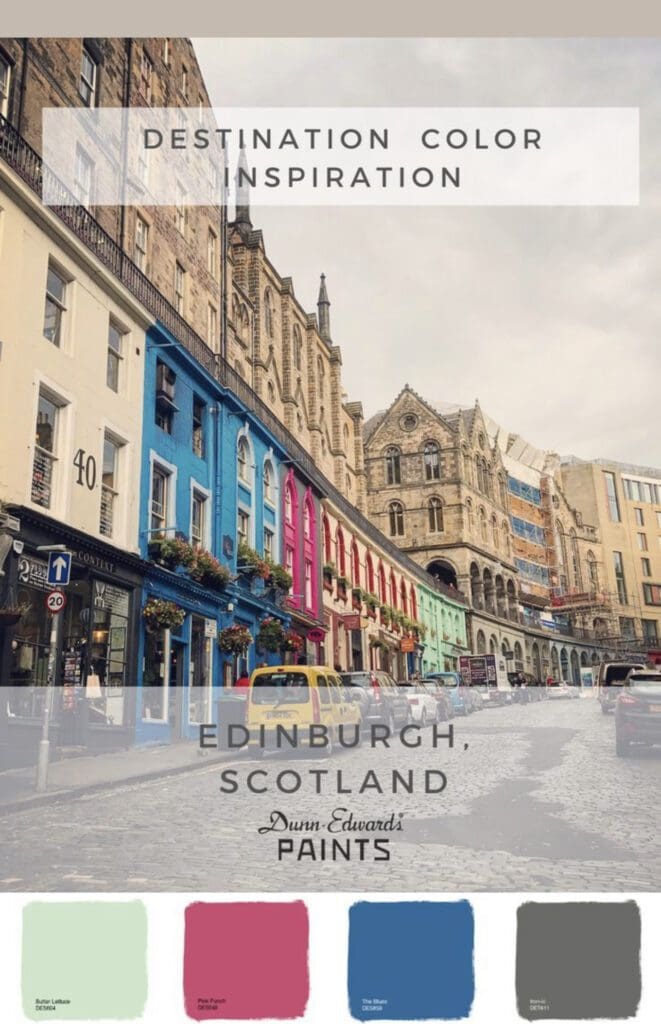
Travel Destination Colors
By All Los Angeles Painting Company, Inc. |
Decorating with Travel Destination Colors conveys a city’s historic charm. Every locale is known for its architecture, history, and unique character. Incorporating these elements into a space through color creates a warm, inviting design scheme. Dunn Edwards Scotland Edinburgh Scotland is associated with the deep blues of its buildings, particularly…
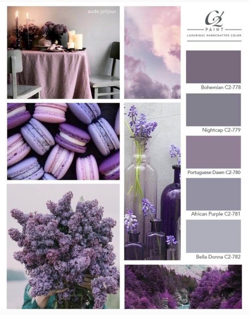
C2 Paint Purple Grays
By All Los Angeles Painting Company, Inc. |
Inspired by flowers, C2 Paint Purple Grays are delicate and subtle. These enigmatic hues inspire reflection and meditative thoughts. Because they are pastels, they combine well with stronger hues. Purple gray shades combine the calming effect of gray with the mysterious allure of purple. Whether in traditional or contemporary settings,…
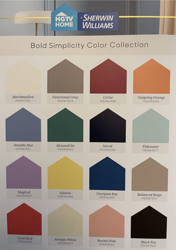
HGTV Bold Simplicity Palette
By All Los Angeles Painting Company, Inc. |
HGTV/Sherwin Williams Bold Simplicity Palette Colors add energy and drama to a space. Use them to create a focal point, or add a pop of drama to an otherwise neutral room. These bold hues are especially effective in modern or contemporary spaces, where the use of bright, vivid colors creates…