Color + Inspiration
All Los Angeles Painting Company, Inc.
Choosing color is personal and emotional. Multiple factors go into selecting appropriate hues. They include individual preferences, room size, lighting, existing furniture, art, architectural elements and cognitive associations.
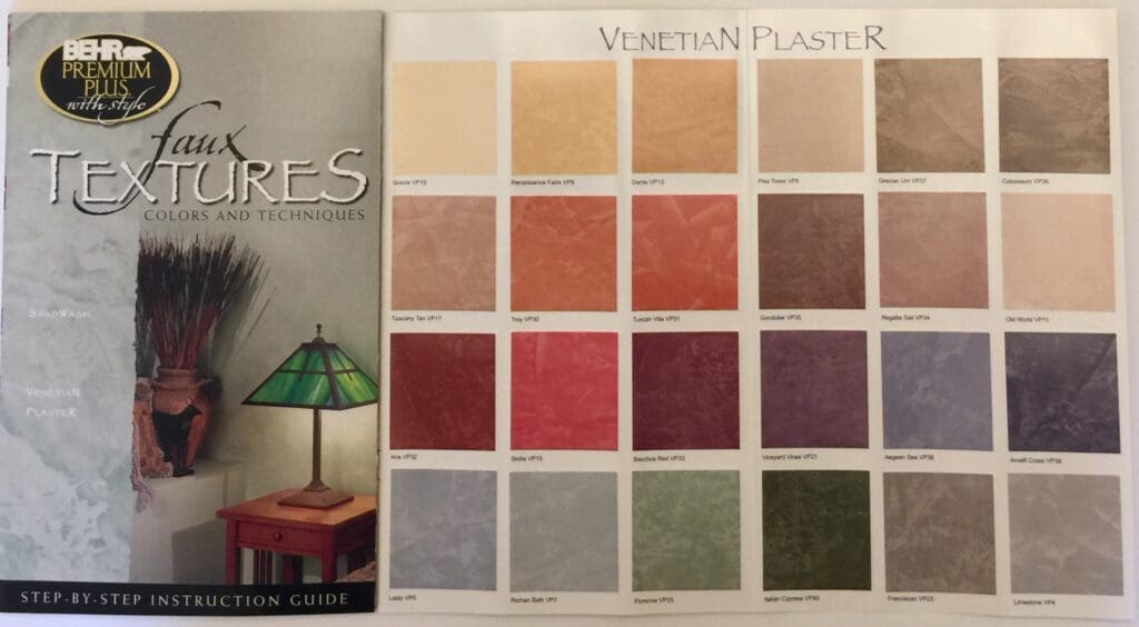
Behr Venetian Plaster Palette
By All Los Angeles Painting Company, Inc. |
Wall textures are one of the easiest ways to add an elegant, decorative touch to your home. The Behr Venetian plaster palette provides a three dimensional finish with light and dark tones of the same color that conveys a marble like appearance. SandWash produces a subtle, slightly textured look. Its…
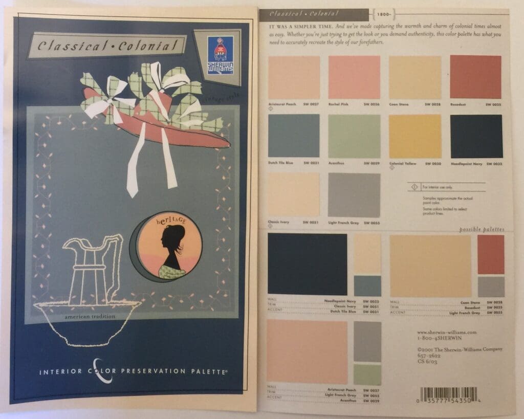
Sherwin Williams Classical Colonial
By All Los Angeles Painting Company, Inc. |
This 2001 Sherwin Williams Classical Colonial Interior color palette is a collection of historically accurate hues popular during the American Federalist Period. There was little color in the lives of early colonists. Even after simple frame houses had replaced log cabins, interior walls were usually painted with homemade white-wash mixed…
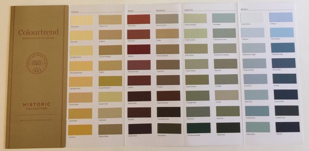
Colourtrend Colors
By All Los Angeles Painting Company, Inc. |
Colourtrend Colors were inspired by the rich hues of the Irish countryside and historic architecture. These luxurious tones will give your walls timeless sophistication while providing a beautiful background for furniture and art. These classic, harmonized colors work well in a variety of design aesthetics. Pancake Inspired These Colourtrend National…
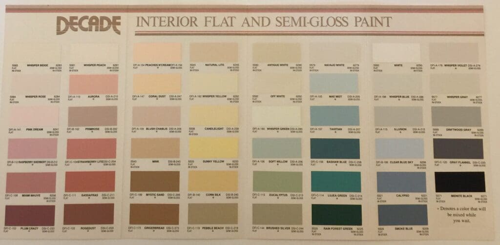
Standard Brands Paints
By All Los Angeles Painting Company, Inc. |
These Standard Brands color charts are from the late 1980’s and early 1990’s. Standard Brands Paints was a Los Angeles manufacturer of commercial and discount grade paints that went out of business in the mid 1990’s. Looking for vintage color inspiration? Use 1980’s color brochures like these to reconnect with…
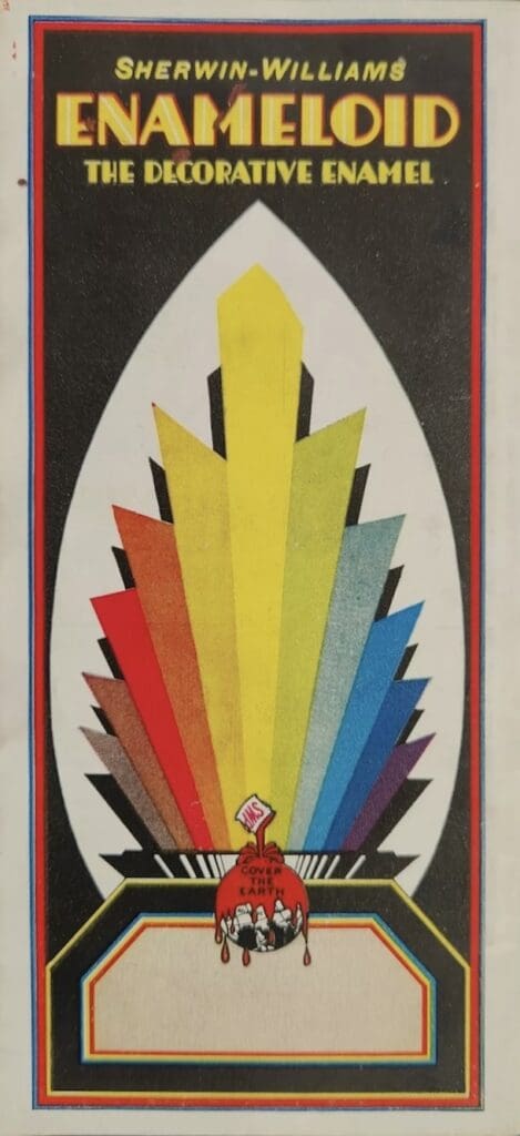
Sherwin Williams 1930’s Colors
By All Los Angeles Painting Company, Inc. |
Pictured here is a sampling of Sherwin Williams 1930’s Colors. Vintage paint store color brochures, like these, provide easy inspiration for creating color schemes that are classic and on-trend. Some of these colors are truly beautiful and would be stunning in any of today’s decorating schemes. Historical color charts are…
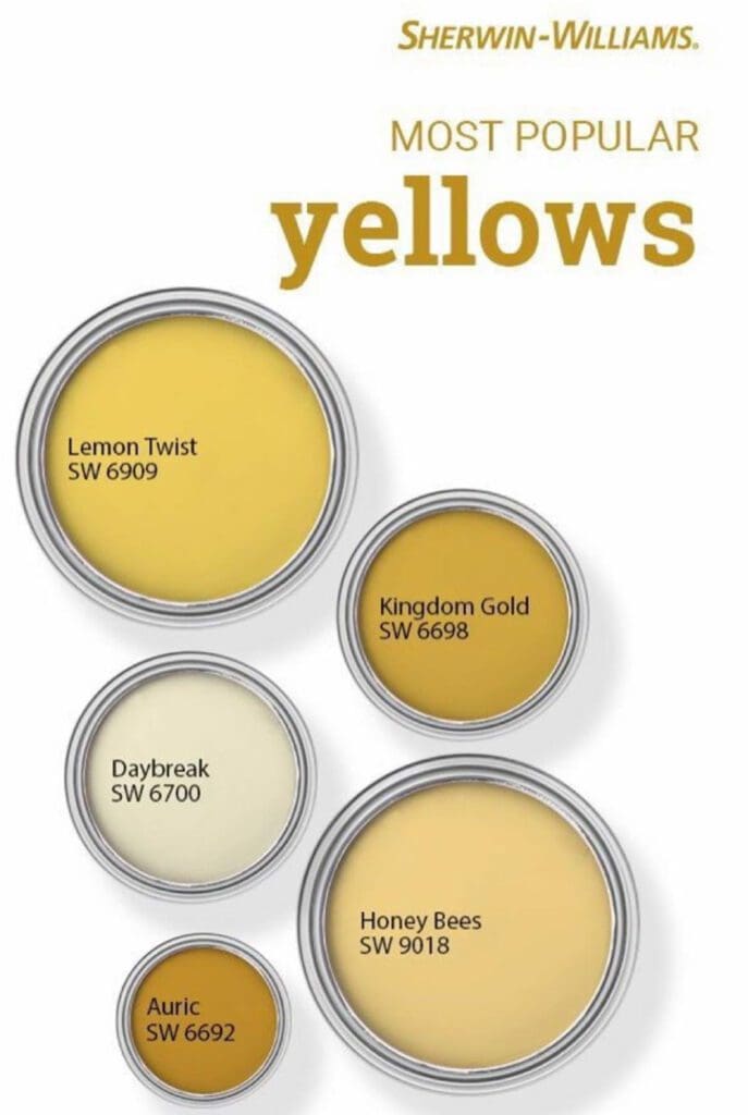
Sherwin Williams Popular Yellows
By All Los Angeles Painting Company, Inc. |
Picking the right yellow is easy when you have access to the most frequently purchased colors. The Sherwin Williams yellow palette displays the most popular yellows based on sales volume across the United States. Yellows stimulate health, patience and wisdom. Sunrise Yellows Design magazines are a great resource for decorating,…
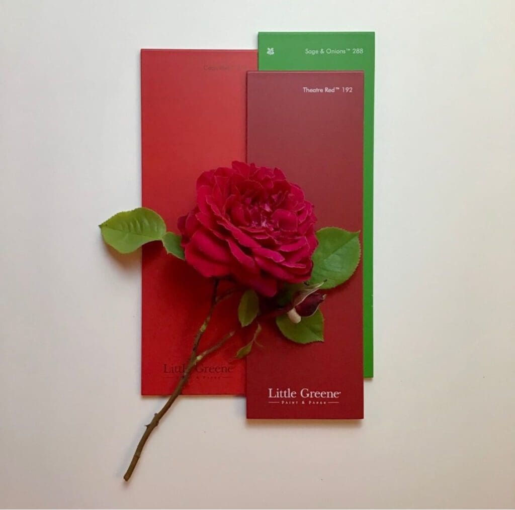
Decorating With Little Greene
By All Los Angeles Painting Company, Inc. |
To create a unique, personalized decorating scheme, look for inspiration in nature’s generous array of hues. Fruits, vegetables, flowers and landscapes convey a sense and connection with the outside world. Decorating with Little Greene colors is a practical way to personalize your home or office with nature’s lovely hues. When…
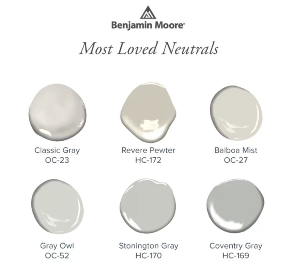
Benjamin Moore’s Popular Neutrals
By All Los Angeles Painting Company, Inc. |
Consumers choose neutrals to either create a serene aesthetic, or as a background to let their furniture and accessories take the spotlight. Whatever reason, picking the right neutral isn’t always that simple, because every neutral has an identifiable undertone. Many designers and consumers choose Benjamin Moore’s popular neutrals to make…
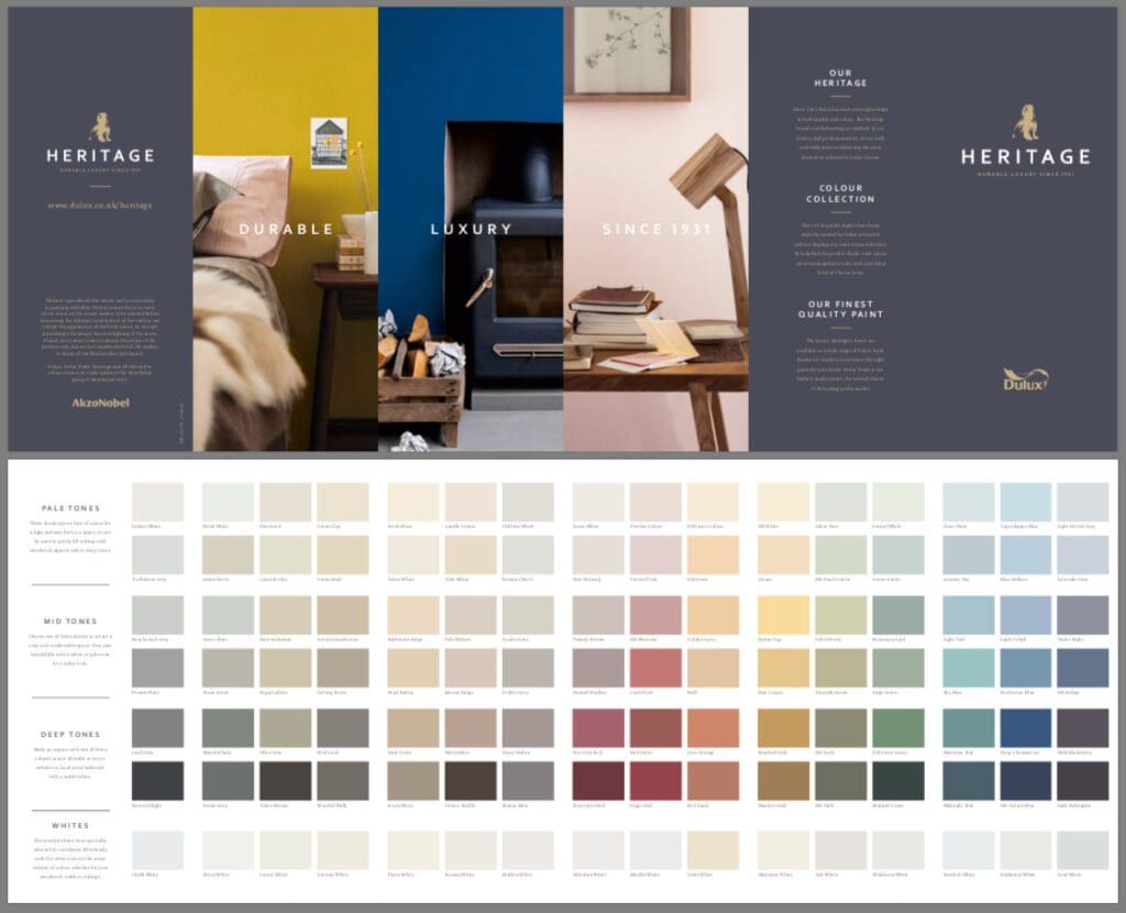
Dulux Heritage Paint Collection
By All Los Angeles Painting Company, Inc. |
The Dulux Heritage palette is a color collection from the defining periods of British history. The curated palette presents colors from the Georgian (1714-1837), Victorian (1837-1901) and Art Deco (1901-1939) periods. The colors are faithful to their original era but work equally well in modern homes.
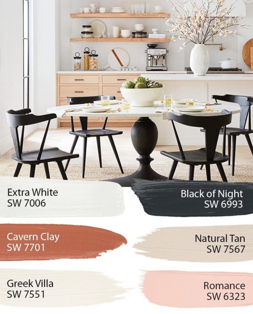
Pottery Barn Paint Colors
By All Los Angeles Painting Company, Inc. |
Pictured here are Sherwin Williams’ Pottery Barn Paint Colors. These hues range from subtle to bold and provide stunning design possibilities. Mix and match the colors from each palette to create your own unique design scheme. Sherwin Williams partnered with Pottery Barn to create color palettes that coordinate with their…