Color + Inspiration
All Los Angeles Painting Company, Inc.
Choosing color is personal and emotional. Multiple factors go into selecting appropriate hues. They include individual preferences, room size, lighting, existing furniture, art, architectural elements and cognitive associations.
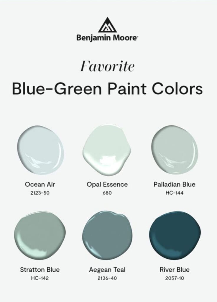
Blue-Green Paint Colors
By All Los Angeles Painting Company, Inc. |
Blue-green paint colors blend of the calmness of blue and the refreshing vibrancy of green. This versatile hue provides decorating benefits and psychological effects that enhance various spaces within a home. Decorating Benefits Versatility: Blue-greens harmonize with range of decorating styles, from contemporary to coastal, and from traditional to eclectic….
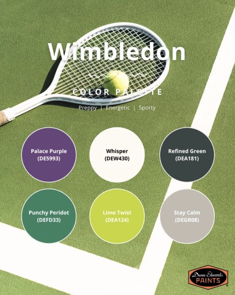
Wimbledon Paint Colors
By All Los Angeles Painting Company, Inc. |
Anything you like can inspire a room or house design update. Wimbledon paint colors bring the excitement and fun of this storied tournament into your home. Wimbledon is the oldest tennis tournament in the world. Held at the All England Lawn Tennis and Croquet Club since 1877, it remains the…
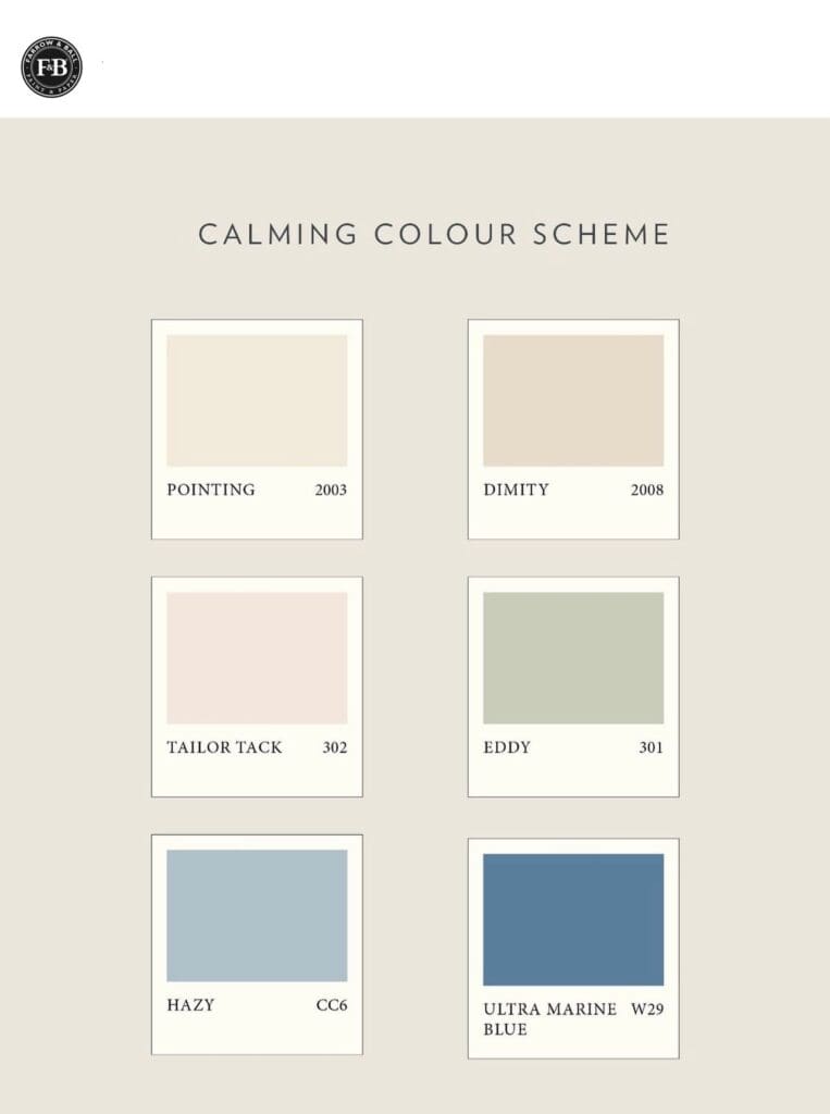
Farrow & Ball Paint Color Consult
By All Los Angeles Painting Company, Inc. |
Picking colors is often hardest part of any decorating project. A Farrow & Ball paint color consult helps to select and coordinate the best tones for your space. Good colors go beyond mere aesthetics; they transform spaces. Farrow & Ball is a luxury paint known for dramatic and rich colors….
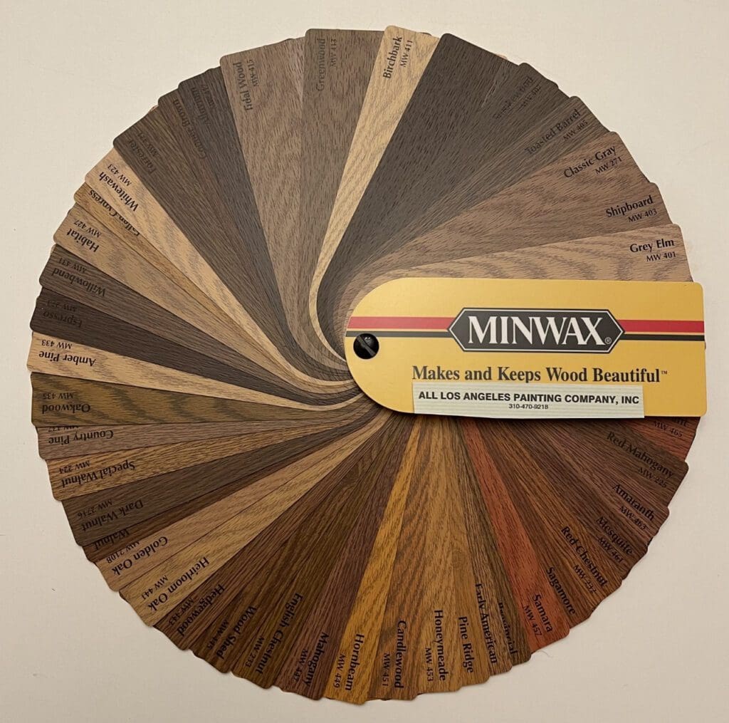
Minwax Stain Colors
By All Los Angeles Painting Company, Inc. |
This Minwax Stain Fan Deck offers 48 standard colors to enhance the natural grain of wood. Use these colors to enrich the beauty of wood furniture, cabinets, paneling, doors, and windows. Wood’s power and beauty contributes a vital element to decorating schemes for both office and home. Minwax offers a…
Magnolia Paint Color Collections
By All Los Angeles Painting Company, Inc. |
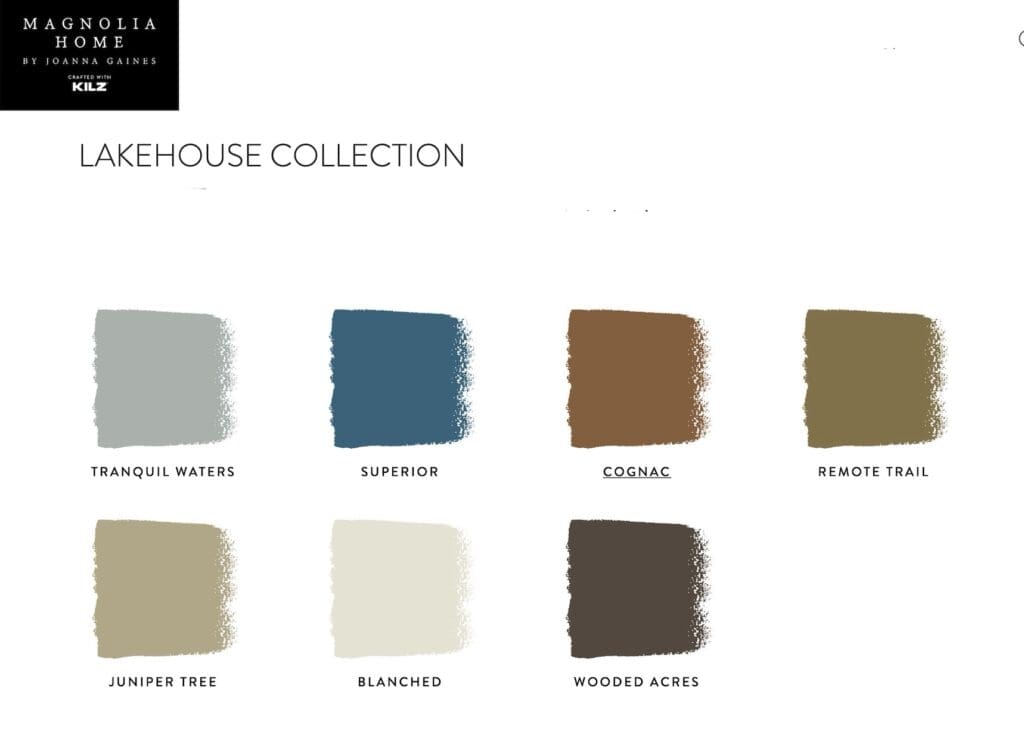
There are several Magnolia Paint Color Collections to choose from. These colors are appropriate for interior or exterior color decorating. Lakehouse Color Collection Inspired by the Lakehouse project in Lake Waco, these seven curated Magnolia Lakehouse paint colors have biophilic tonalities that connect with the beauty of lakeside living. This…
Trending Colors in Los Angeles
By All Los Angeles Painting Company, Inc. |
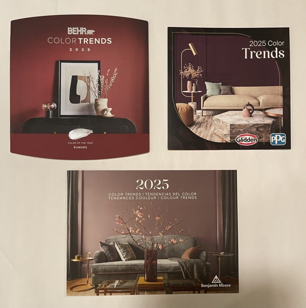
How does one know what the trending colors in Los Angeles will be each year? Luckily, paint color scientists develop trend forecasts to present to the public; and paint stores provide these brochures free of charge to consumers. All the year’s trending colors are inside. Several variables affect the annual…
Mustard Paint Colors
By All Los Angeles Painting Company, Inc. |
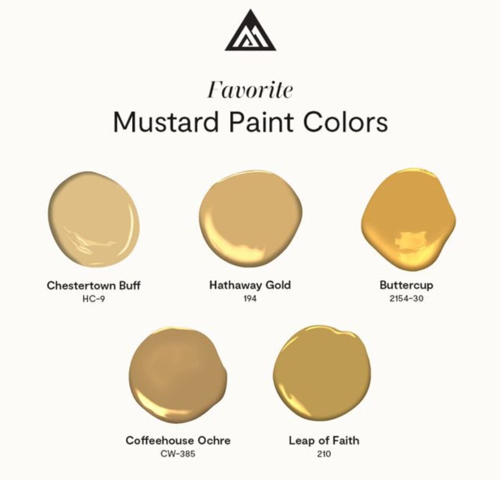
Mustard and associated yellows are top designer colors right now. If you like trendy mustard paint colors and want to incorporate them into your home or office color scheme, here’s what you need to know. WHY MUSTARD YELLOW IS POPULAR IN INTERIOR DESIGN Yellow has always been associated with energy…
Backdrop Paint Colors
By All Los Angeles Painting Company, Inc. |
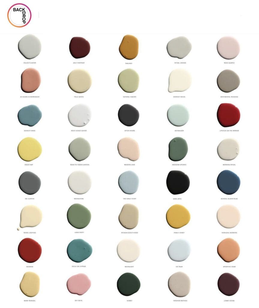
Use Backdrop paint colors to create trending, cohesive, and appealing decorating schemes. Trending Colors Neutrals, like soft grays, muted beiges, and classic whites, provide the balanced that allow furniture, artwork, and accent pieces to stand out and shine. This versatility makes these hues ideal for those seeking an adaptable look…
Rust-Oleum Colors of the Year
By All Los Angeles Painting Company, Inc. |
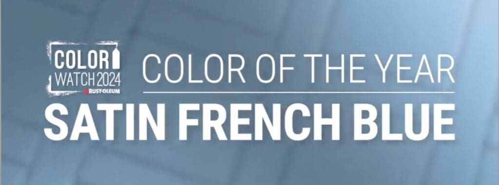
Every year, Rust-Oleum’s color consultants research upcoming social, design and fashion trends to come up with a specific hue that captures the essence of the year. Here are recent Rust-Oleum Colors of the Year. Rust-Oleum 2024 Rust-Oleum’s 2024 Color of the Year is Satin French Blue. This captivating hue exudes…
House Painting in Angelino Heights
By All Los Angeles Painting Company, Inc. |
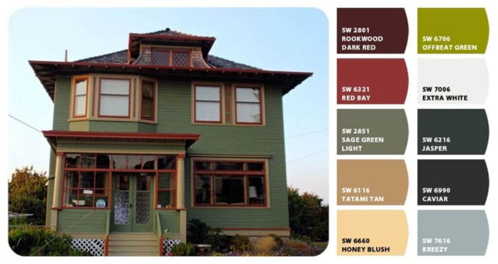
Vintage house painting in Angelino Heights is a special type of work that requires an experienced restoration crew. Before the painting begins, these homes often need wood repair, paint stripping, and light handyman work. All Los Angeles Painting Company, Inc. has the skill and ability to restore old houses properly….
