Posts Tagged ‘los angeles painter’
Decorating with C2 Colors
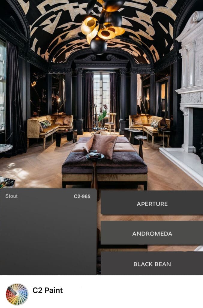
C2’s full spectrum paint colors offer valuable design and psychological benefits. From classic and elegant to deep and mysterious, decorating with C2 colors lets you create sophisticated interior and exterior color schemes. Their timeless appeal allows them harmonize easily with traditional and contemporary aesthetics. All C2 colors come in a range of sheens including matte,…
Read MoreTuscan Paint Colors
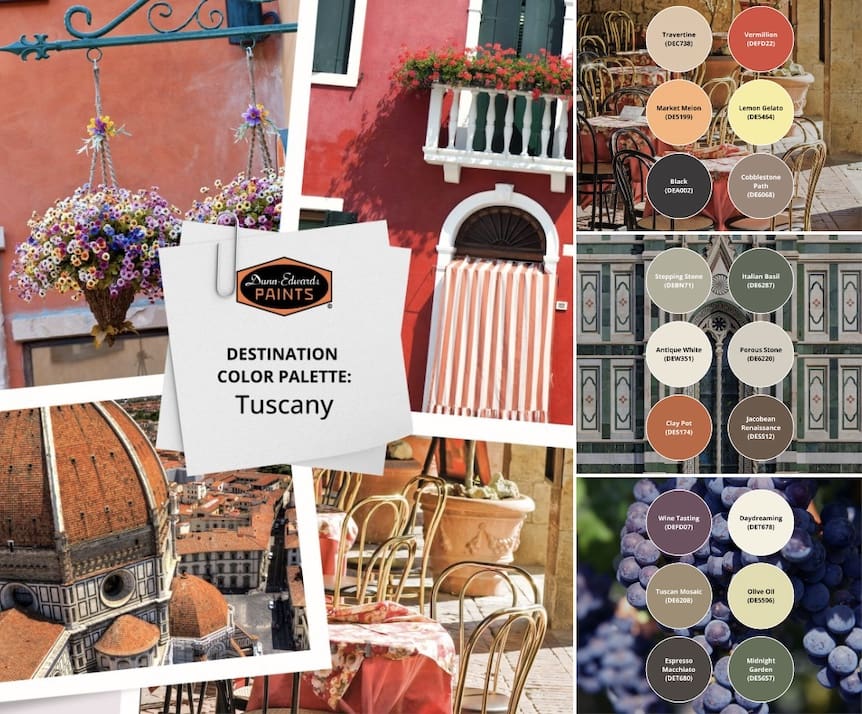
Do you enjoy the warm, earthy tones, sun-drenched landscapes and lush, rolling hills of Tuscany? If so, consider a decorating scheme inspired by Tuscan paint colors. Rich and earthy, they create a relaxed and cozy aesthetic that instantly puts you, your family and guests at ease. Tuscan hues have a muted shading; as if they’ve…
Read MoreStylish Kitchen Colors
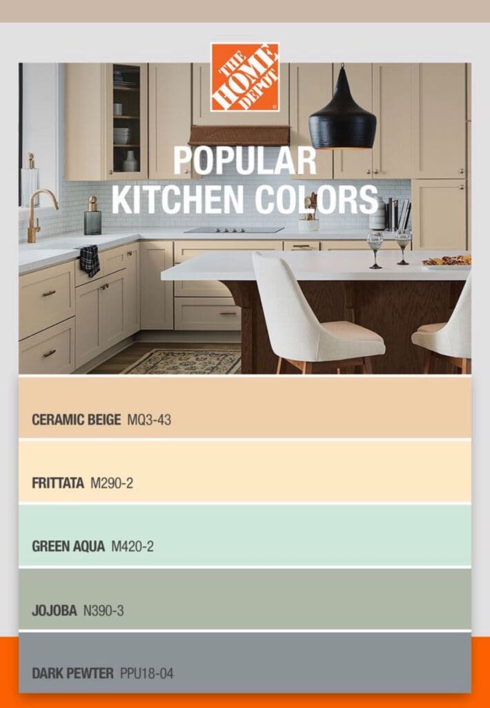
Repaint your kitchen and breathe new life into one of the busiest rooms in a home. Choose Stylish kitchen colors to upgrade the feel and value of any space. Here are key benefits of repainting your kitchen with popular colors: Modern and Stylish: Trending colors are a cost effective way to modernize a space without…
Read MoreLos Angeles Pro-Active Code Enforcement
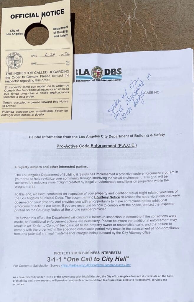
Homeowners with run down looking homes are receiving Department of Building and Safety DBS Official Notices of Los Angeles Pro-Active Code Enforcement (P.A.C.E). The city has implemented a code enforcement program and inspectors are on the lookout for violators. Los Angeles Municipal Code 91.8104.1 – 91.8104.13 requires houses to be painted and maintained in good…
Read MoreTropical Oasis Colors
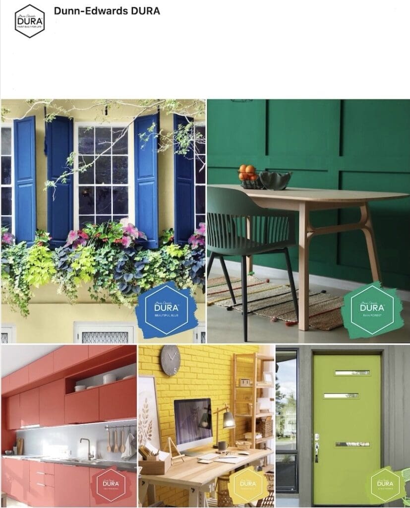
Looking to decorate your home or office with tropical oasis colors? Try one of Dura’s electric hues, they were inspired by the beauty of a lush exotic paradise: Beautiful Blue If you’re looking for a wow-factor, this is it. Beautiful Blue is a vivid, saturated cobalt blue with a bold and playful feel. Rain Forest …
Read MoreChoosing Paint Colors in Los Angeles
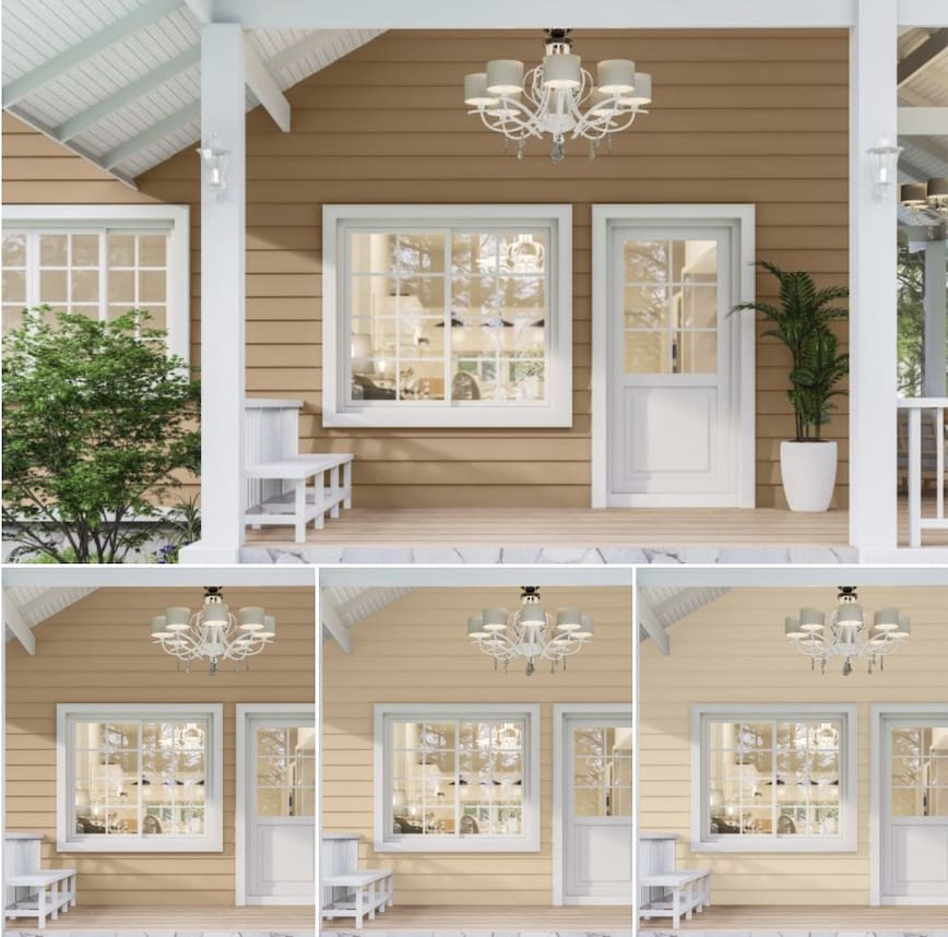
Choosing paint colors in Los Angeles for an exterior painting project can be stressful. With countless options, how do you pick the right one? One way is sampling and there are many ways to sample colors. Renderings are easy to make and provide a realistic depiction of what your house will look like with varying…
Read MoreLate 1950’s Interior Paint Colors
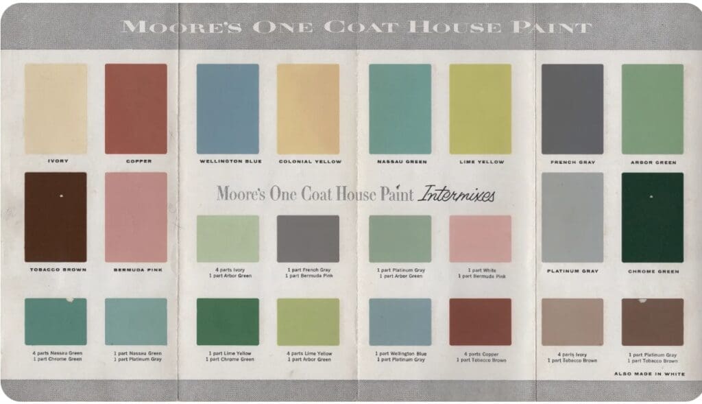
Color enthusiasts enjoy perusing vintage color charts. Late 1950’s interior paint colors ranged from soft pastels to bold, saturated hues and provided homeowners with a variety of color options. Soft shades of pink, turquoise, and buttery yellow were popular for creating cheery spaces. They were often paired with white trim to enhance their visual impact…
Read MoreCinco de Mayo Inspired Colors
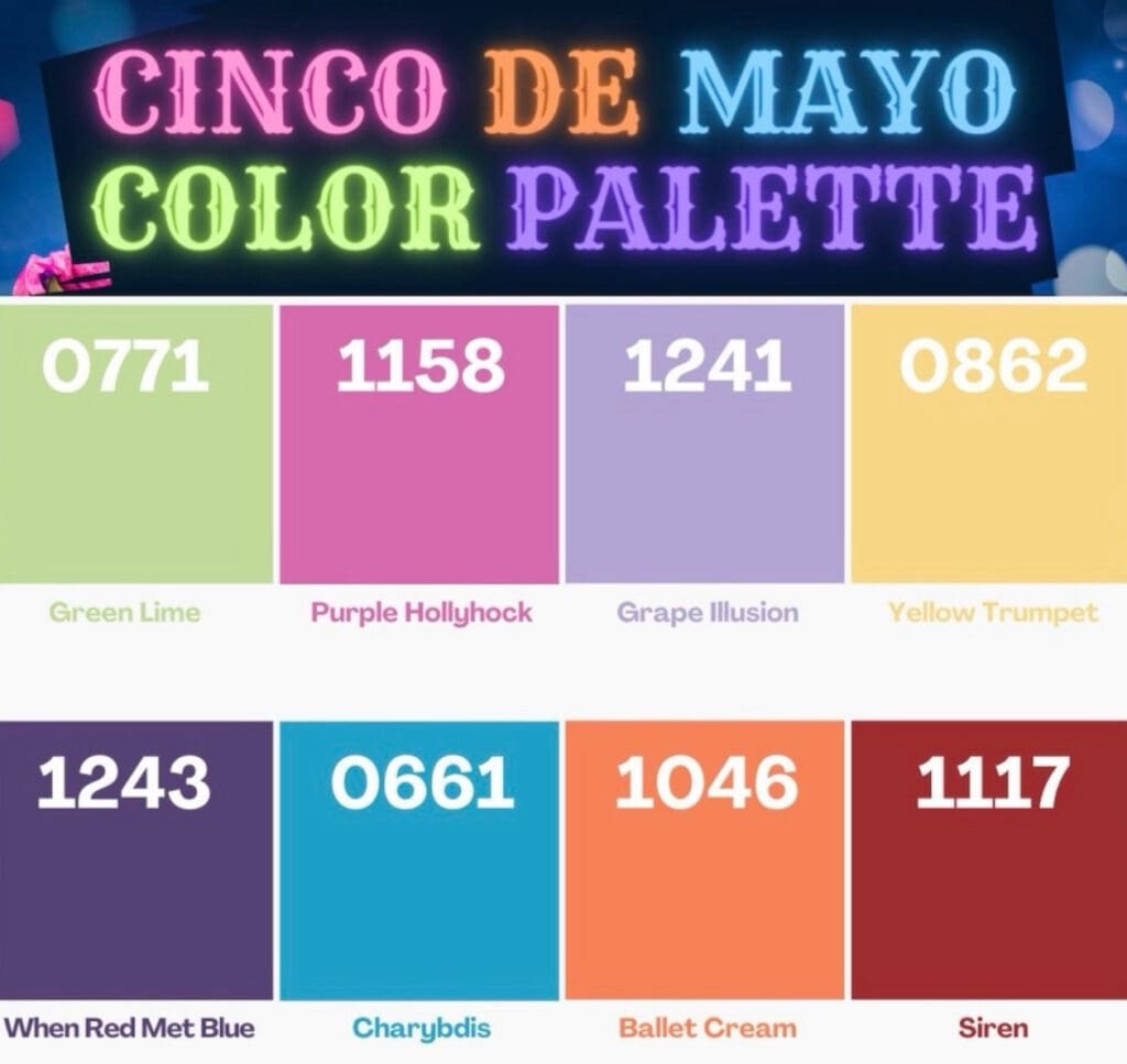
Decorate with Cinco de Mayo inspired colors for the joy, warmth, and tranquility they bring. Vibrant reds, sunny yellows, rich oranges, and deep blues and purples evoke the soothing feelings associated with Mexican history and culture. Incorporating them into your design scheme enhances the aura of any room; creating a festive atmosphere that encourages conversation and…
Read MoreJapandi Style Paint Colors
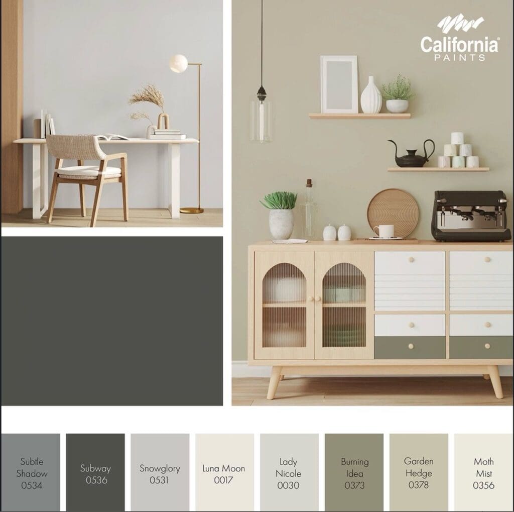
Japandi style paint colors are a new, trendy aesthetic. Japandi is a fusion of Japanese serenity and Scandinavian simplicity that produces beautiful monochromatic color schemes. Drawing from the refined elegance of both cultures, these colors produce clean lines and a soothing aesthetic. Japandi Style Colors This cultural fusion makes use of neutrals and an emphasis…
Read MorePortola Roman Clay Oatmeal
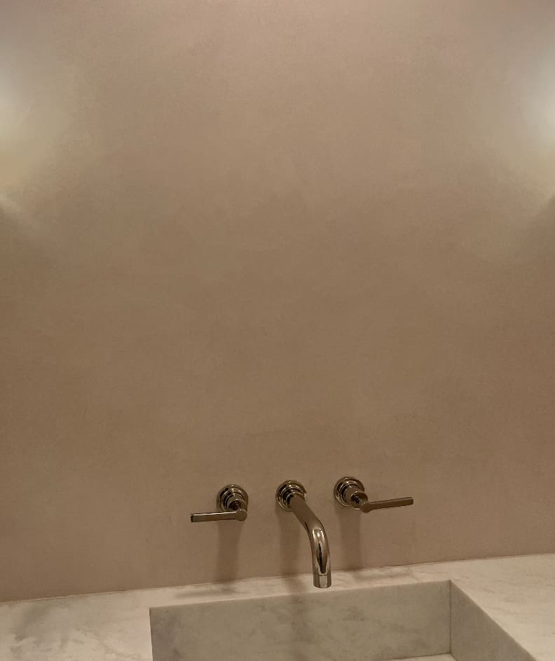
Portola Roman Clay Oatmeal is a soft hue that turns any space into an oasis of quiet calm. This shade’s easy ability to shift its character with the light gives it a clean minimalist look while also conveying a feeling of comforting warmth. What better way to blend impressions than with this truly versatile, neutral…
Read More