Color + Inspiration
All Los Angeles Painting Company, Inc.
Choosing color is personal and emotional. Multiple factors go into selecting appropriate hues. They include individual preferences, room size, lighting, existing furniture, art, architectural elements and cognitive associations.
Dunn Edwards Designer Colors
By All Los Angeles Painting Company, Inc. |
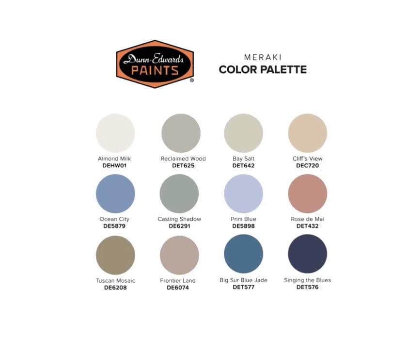
With clean, comfortable, sophisticated and delicate tones, Dunn Edwards Designer Colors satisfy the desire for visual simplicity and freshness. Dunn Edwards Elysian Elysian palette colors combine playfully saturated tones and their overexposed harmonies, representing a blend of creativity with science to create a palette that is bursting with freshness. Grown-up…
Periwinkle Colors
By All Los Angeles Painting Company, Inc. |
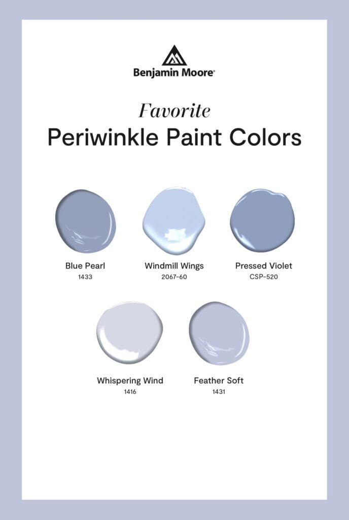
When planning a design update, consider including periwinkle colors in your color scheme. This delicate shade, with its blend of blue and purple, conveys a sense of tranquility and harmony. Periwinkle has the ability to reduce stress and anxiety. Its soothing qualities make it an excellent choice for bedrooms, relaxation…
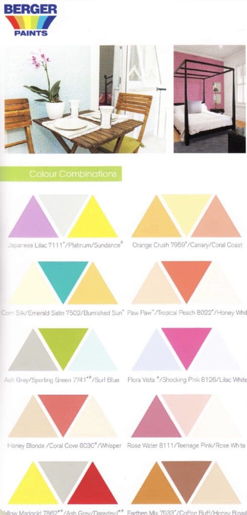
Clare Paint Color Combinations
By All Los Angeles Painting Company, Inc. |
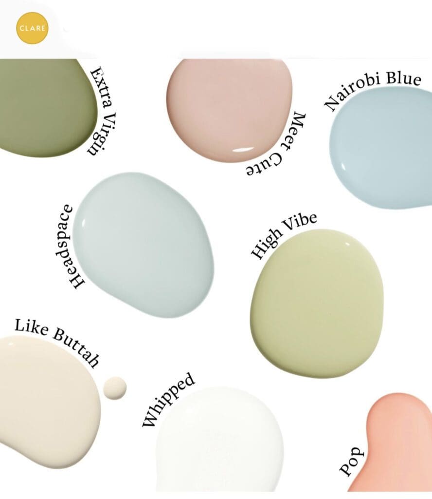
Clare Paint Color Combinations palettes help consumers create cheery decorating schemes. These paint color palettes are useful when designing with color. Each palette has a theme; find the theme you like to create your own unique home styling. Elevated Retreat Colors Relax with Clare’s Elevated Retreat Colors. Explore a range…
Best Selling Whites
By All Los Angeles Painting Company, Inc. |
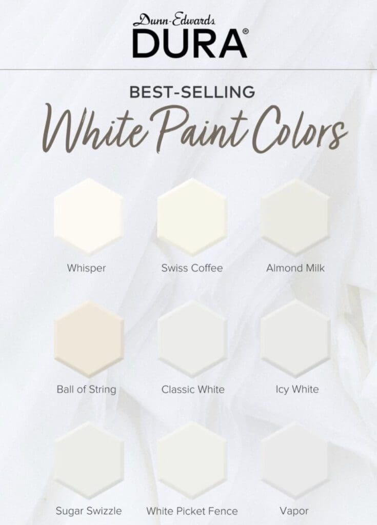
White has long been a staple in the interior and exterior design world. Timeless, versatile, and universally liked, white brings a sense of purity, simplicity, and sophistication to any space. Among the many options available, Dunn Edwards Dura Best Selling whites stand out for their styling and versatility. Whites make…
Tropical Paint Colors
By All Los Angeles Painting Company, Inc. |
Breathe new life into any decorating scheme with vibrant, tropical paint colors. By incorporating exotic color combinations, you create an aesthetic that exudes energy, relaxation, and a sense of calm. Generally, tropical color combinations are inspired by the lush landscapes, breathtaking sunsets, and vibrant flora and fauna found in these…
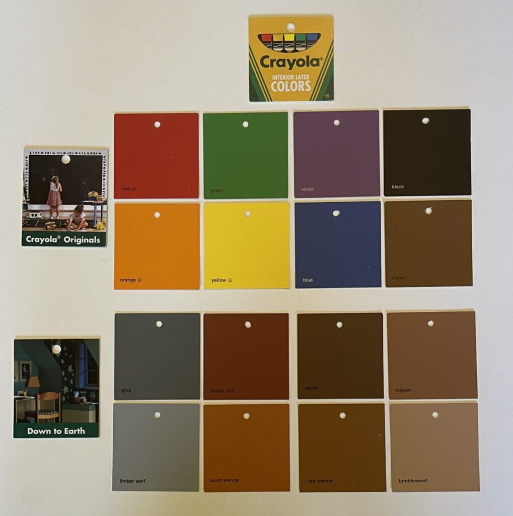
Benjamin Moore Crayola Colors
By All Los Angeles Painting Company, Inc. |
Colors come alive with the Benjamin Moore Crayola Crayon paint collection. Drawing inspiration from the iconic Crayola crayon box, Benjamin Moore curated an assortment of hues that evoke nostalgia and unleash unlimited decorating possibilities. Originals & Down to Earth Palettes The complete collection showcases 144 colors that capture the essence…
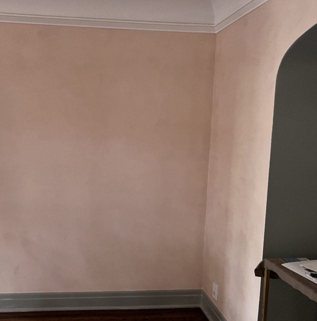
Portola Roman Clay Persona
By All Los Angeles Painting Company, Inc. |
Portola Roman Clay Persona is a warm, elegant, sophisticated, beigey blush. With its soft, earthy undertones and subtle variations, it creates a visually pleasing aesthetic. Roman Clay is a modern wall finish that mimics ancient Roman plasterwork. It offers a range of space enhancing design benefits. First, its texture adds…
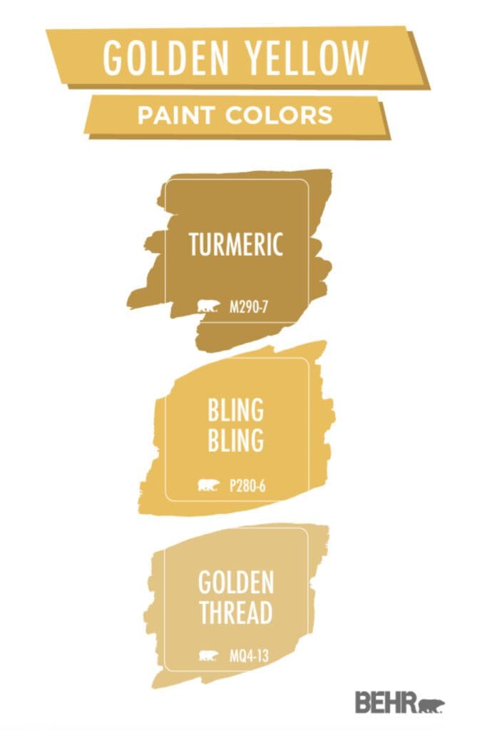
Golden Yellow Paint Colors
By All Los Angeles Painting Company, Inc. |
Use Behr Golden Yellow paint colors to enhance your decorating scheme with a warm, vibrant, and luxurious touch. This captivating hue is appropriate for a variety of personalities and architectural styles. Golden Yellows are ideal for areas of social interaction and creativity. Moreover, whether used as an accent or applied…
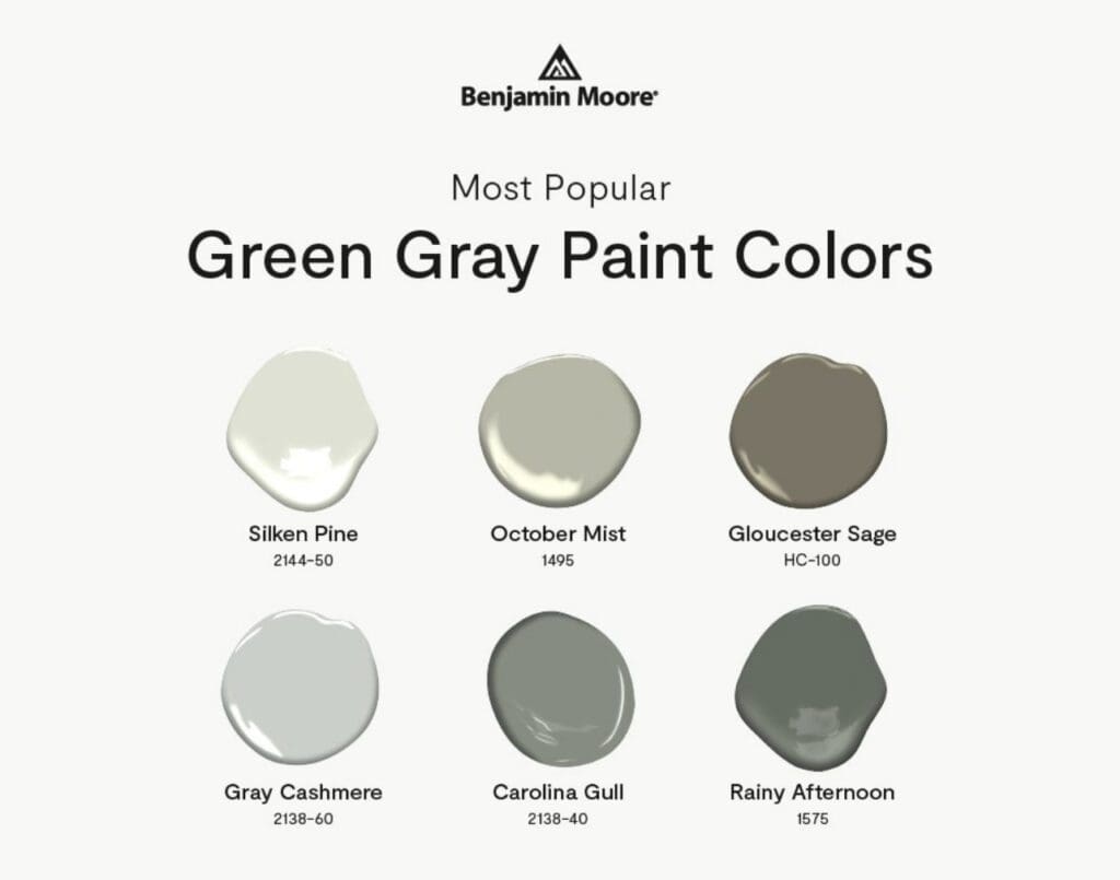
Green Gray Paint Colors
By All Los Angeles Painting Company, Inc. |
Color plays a crucial role in establishing the mood and ambiance of any space. Consider using Benjamin Moore’s Green Gray paint colors to bring balance, versatility, and sophistication to your design scheme. Here’s how Green Grays enhance spaces and appeal to individual preferences and styles. Green: Green, symbolizing growth and…
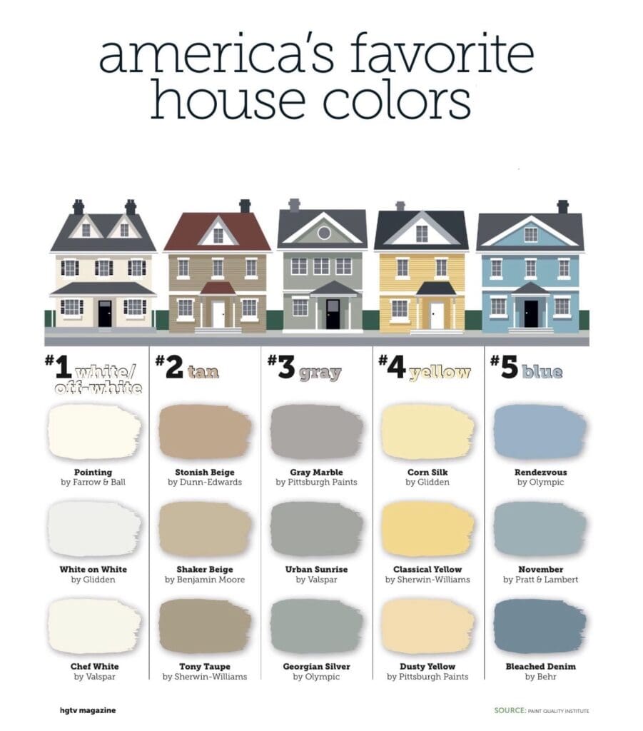
America’s Favorite Exterior Colors
By All Los Angeles Painting Company, Inc. |
Drive down Any Street, USA, and you’ll notice the nearly identical five shades on almost every house. These classic, timeless hues are America’s favorite exterior colors. Homeowners from coast to coast showcase their personal style with these popular shades. White First on the list is white. This versatile, classic color…