Color + Inspiration
All Los Angeles Painting Company, Inc.
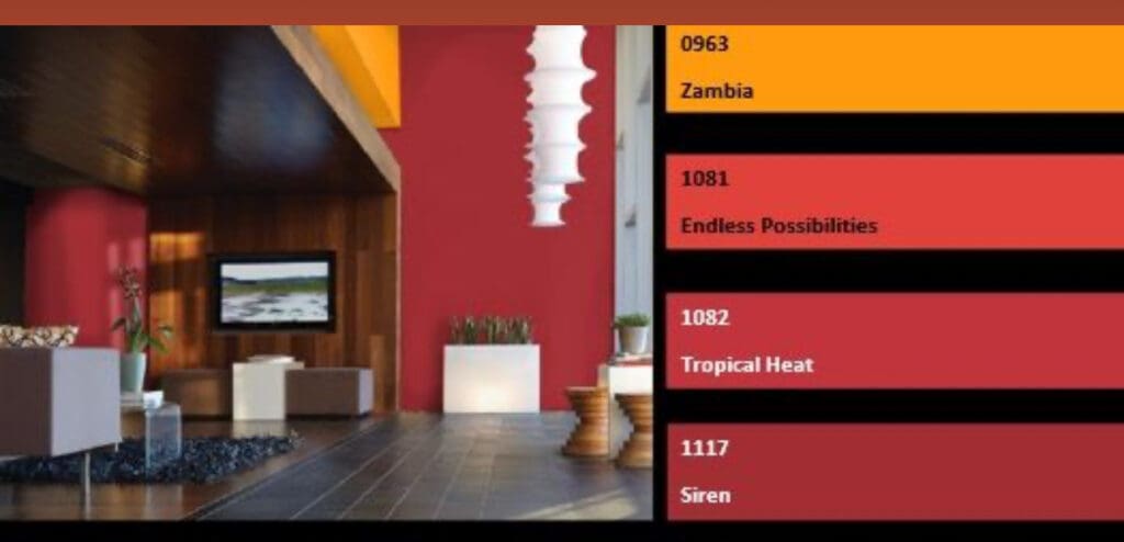
Choosing color is personal and emotional. Multiple factors go into selecting appropriate hues. They include individual preferences, room size, lighting, existing furniture, art, architectural elements and cognitive associations.
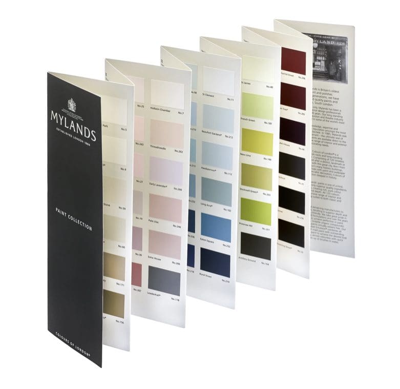
Philosophy of Mylands Paint Colors
By All Los Angeles Painting Company, Inc. |
At the heart of Mylands Paint colors is a philosophy that goes beyond mere pigment—it’s a color journey into self-expression and timeless elegance. The 120 curated hues in the Mylands collection combine tradition with contemporary aesthetics. Heritage-Inspired Hues: Mylands draws inspiration from its rich heritage, curating a palette that conveys…
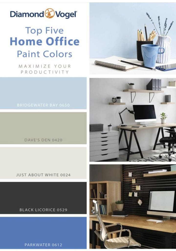
Top Five Home Office Paint Colors
By All Los Angeles Painting Company, Inc. |
Maximize your productivity with these top five home office paint colors. Certain colors can boost productivity. Calming shades reduce stress, and enhance concentration. Energizing hues inspire creativity and motivation. Neutrals contribute to a clean, organized space. The right paint color not only lifts your spirits but also creates an aesthetic…
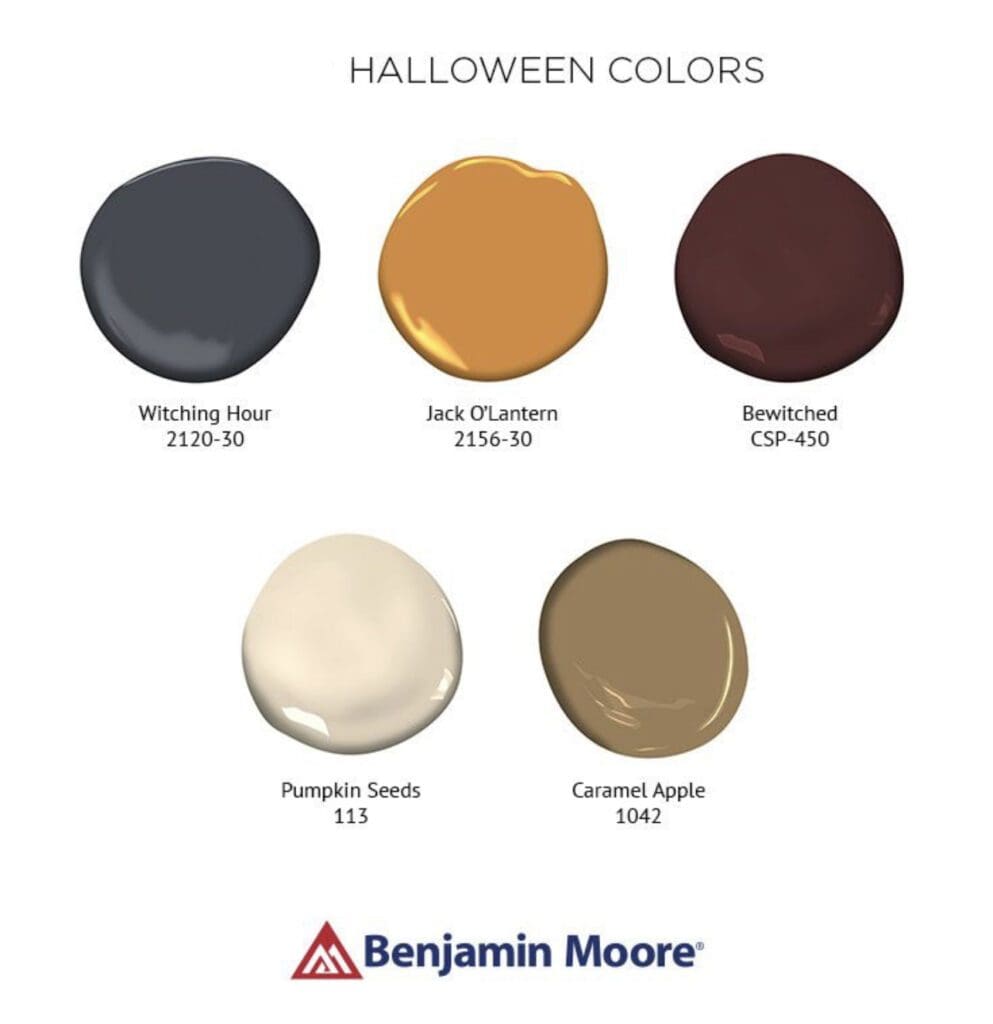
Benjamin Moore Halloween Colors
By All Los Angeles Painting Company, Inc. |
Halloween is the official start of Fall – the season of change and preparation. Outside turns from green to soft yellows, oranges, and browns before going shades of gray. Autumn is when we start heading indoors. Its hues are warm and vibrant, Reds, Oranges, Yellows, and Browns. Consider these Benjamin…
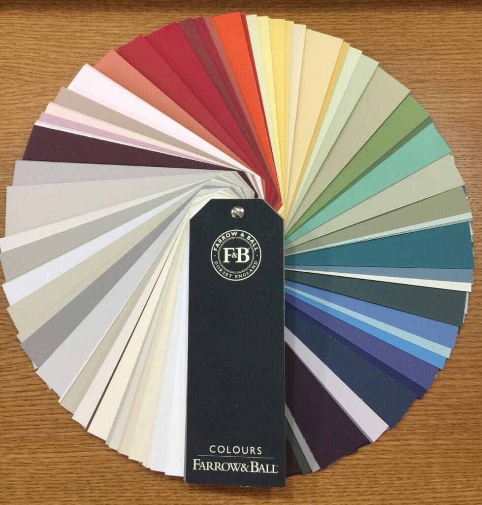
Farrow & Ball Color Collection
By All Los Angeles Painting Company, Inc. |
This standard Farrow & Ball Color Collection contains 132 harmonized colors that can be mixed and matched to create unlimited, unique decorating schemes. The fan deck was inspired by the historic architecture, gardens and countrysides of England. Each chip comes with its own descriptive story on the reverse explaining the…
C2 Paint Color of the Year
By All Los Angeles Painting Company, Inc. |
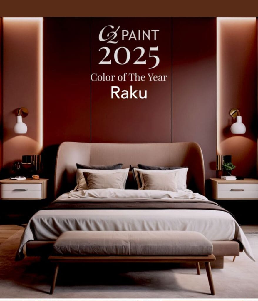
C2 Paint Color of the Year is determined by color stylists and design experts who travel the world looking for design inspiration. They explore current societal and environmental influences, cultural shifts and emerging design trends and pick a color that conveys the spirit of all that through color. Here are some…
Benjamin Moore Color of the Year
By All Los Angeles Painting Company, Inc. |
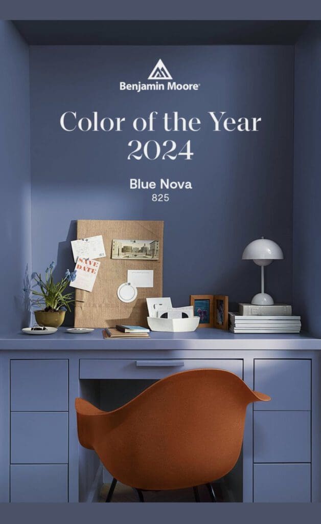
Each year, color scientists scour the world for the latest design, fashion, social and color innovations. After much research, they produce the Benjamin Moore Color of the Year. Benjamin Moore 2025 Cinnamon Slate is a mix of rich plum and velvety brown that brings a soothing warmth and balance to…
Little Greene Colors
By All Los Angeles Painting Company, Inc. |
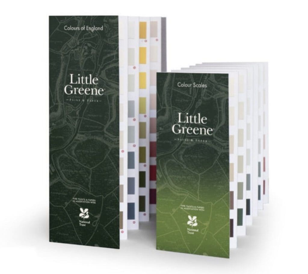
Little Greene Colors come in a wide range of hues, including classic shades. The collection has carefully researched and recreated from historic palettes, as well as contemporary hues. These colors are on-trend and versatile. Here are some reasons to choose these colors for interior decorating schemes: Offering over 300 paint…
Pasadena Showcase House Colors
By All Los Angeles Painting Company, Inc. |
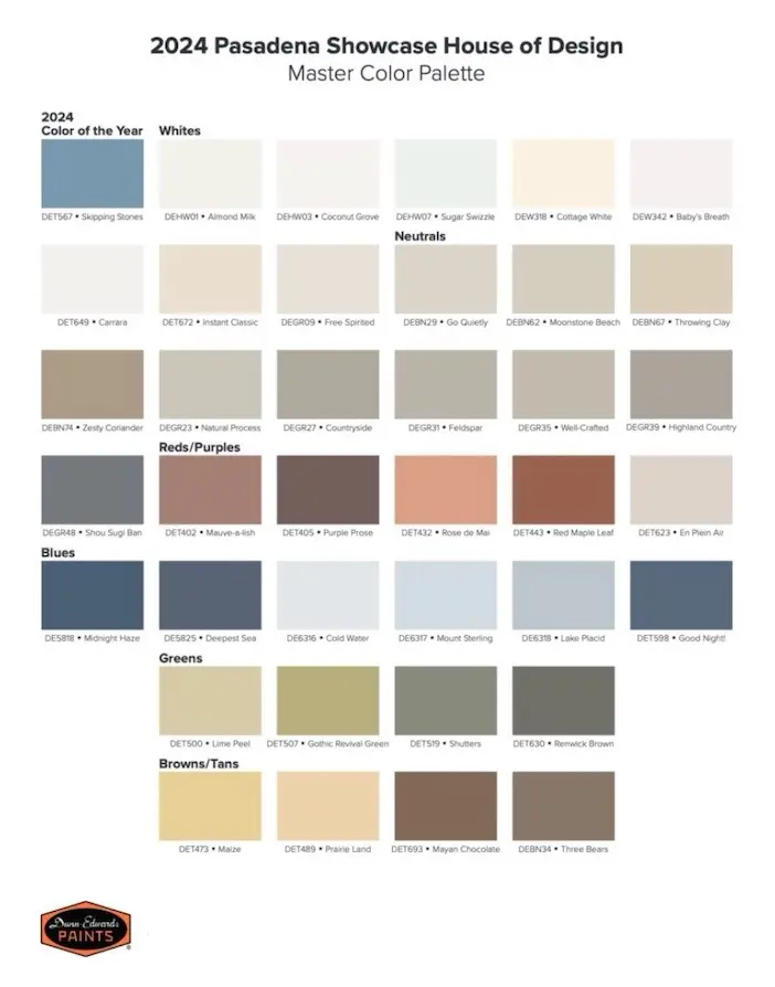
Founded in 1948, the Pasadena Showcase House of design is one of the oldest, largest and most successful local house and garden tours in the United States. Each year, a home is selected as a showcase and given a makeover with designer colors in a way that highlights its unique…
Painting an Accent Wall
By All Los Angeles Painting Company, Inc. |
Painting an accent wall as part of a decorating scheme is an easy and cost effective way to upgrade the look of a space. How does one choose the right accent wall? For maximum impact, choose the wall you see first when entering a room. Make sure the color compliments…
Trendy Front Door Colors
By All Los Angeles Painting Company, Inc. |
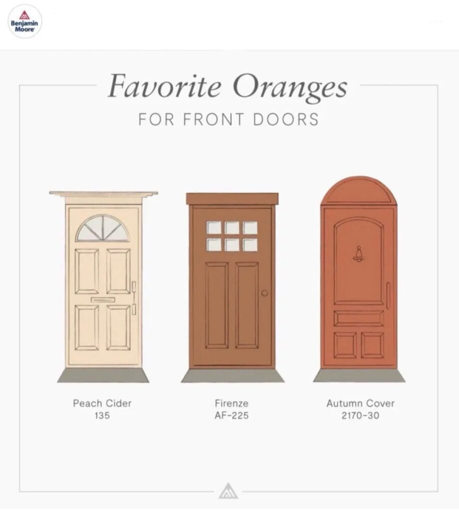
Front doors are a home’s focal point and an important part of its public presentation. Additionally, it makes a strong first impression on visitors, conveying a sense of how the people inside care about their dwelling. Trendy Front Door Colors set the tone for how people perceive you. Doors come…
