Color + Inspiration
All Los Angeles Painting Company, Inc.
Choosing color is personal and emotional. Multiple factors go into selecting appropriate hues. They include individual preferences, room size, lighting, existing furniture, art, architectural elements and cognitive associations.
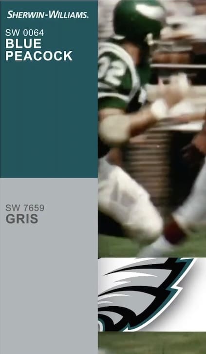
Sherwin Williams Philadelphia Eagles Colors
By All Los Angeles Painting Company, Inc. |
The Eagles have won four NFL championships and one Super Bowl. Their previous titles came before the Super Bowl era (1948, 1949, 1960). In 1978, the Eagles pulled out an improbable win over the New York Giants after the Giants fumbled the football in the final seconds while attempting to run out the clock….
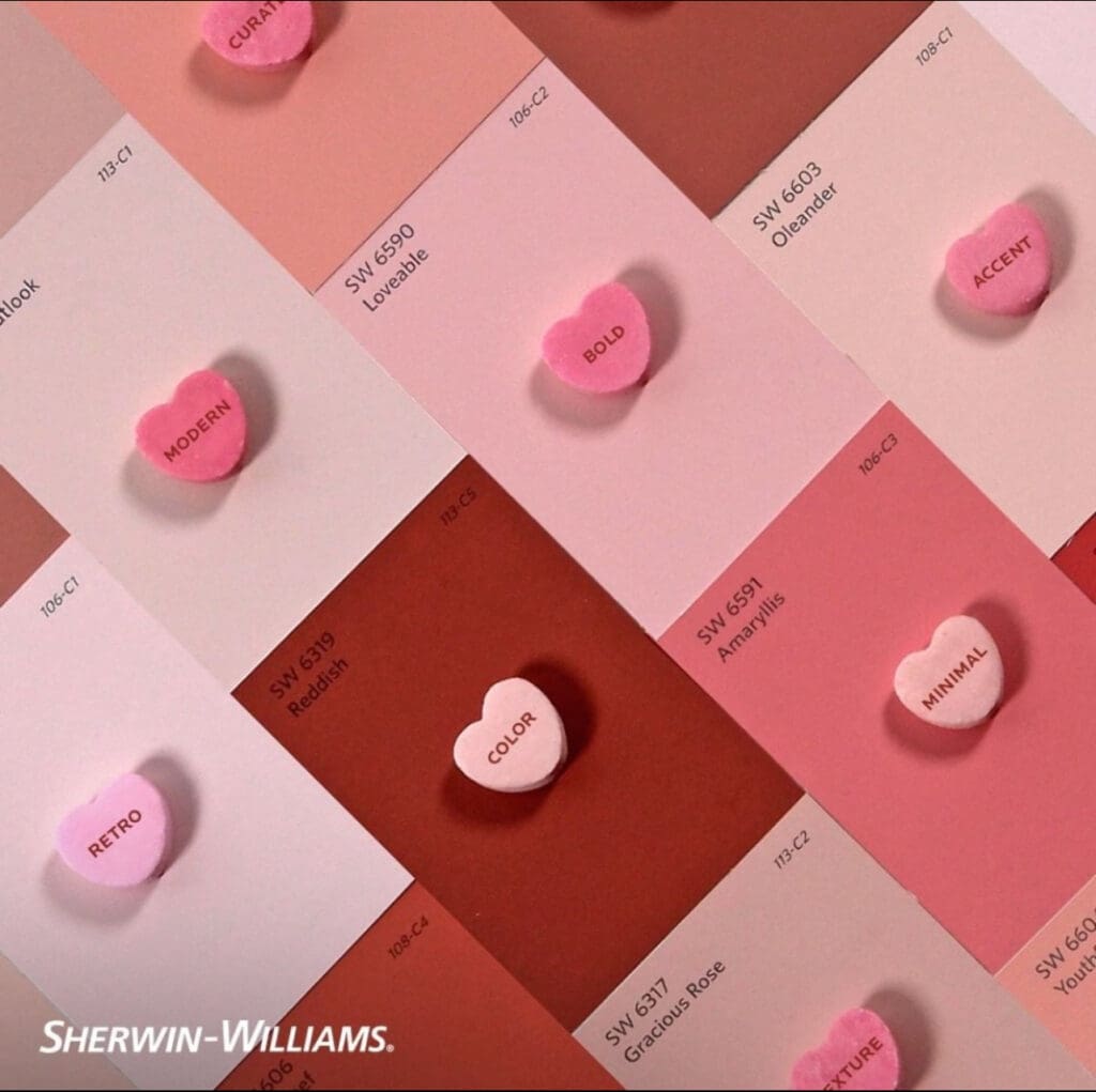
Valentine’s Day Color Inspiration
By All Los Angeles Painting Company, Inc. |
Valentine’s Day is a centuries old historic tradition. St. Valentine, a 3rd century Roman, has long been commemorated on February 14th. Additionally, in ancient times, it was believed that birds paired mid month, hence the association of this day with romance. Whether bold or understated, these Valentine’s Day color inspiration palettes…
Popular Winter Paint Colors
By All Los Angeles Painting Company, Inc. |
As mornings get colder and evenings get darker, homes become cozy havens for winter. From Christmas trees to beautiful handmade decorations, this festive season creates a wonderful opportunity to update your home with beautiful new colors. So if you have a space in mind that needs an makeover, here are…
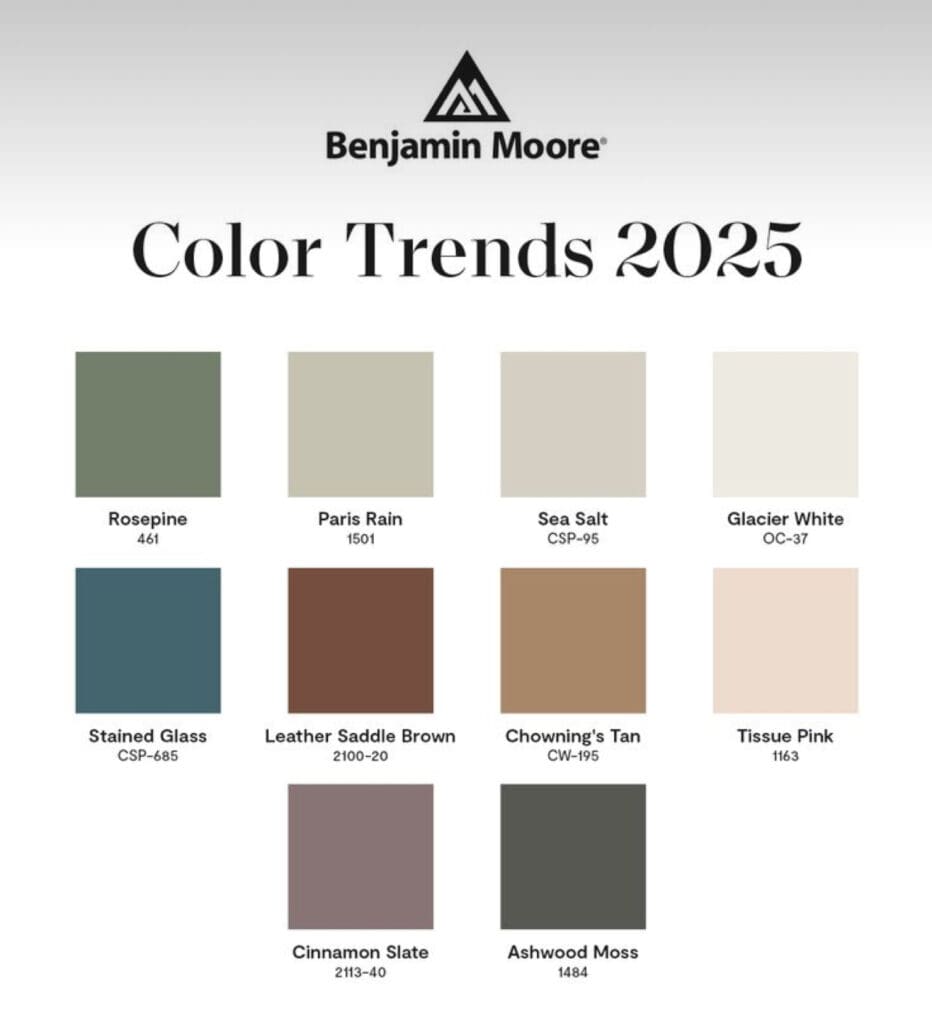
2025 House Paint Color Trends
By All Los Angeles Painting Company, Inc. |
Every year, paint manufacturers present their annual Color Trend Report. It highlights color directions for the coming year. The Color of the Year and 2025 House Paint Color Trends palettes provide key inspiration to designers and consumers for today’s modern spaces. Benjamin Moore 2025 Color Trends This year’s Benjamin Moore…
Popular Kitchen Cabinet Paint Colors
By All Los Angeles Painting Company, Inc. |
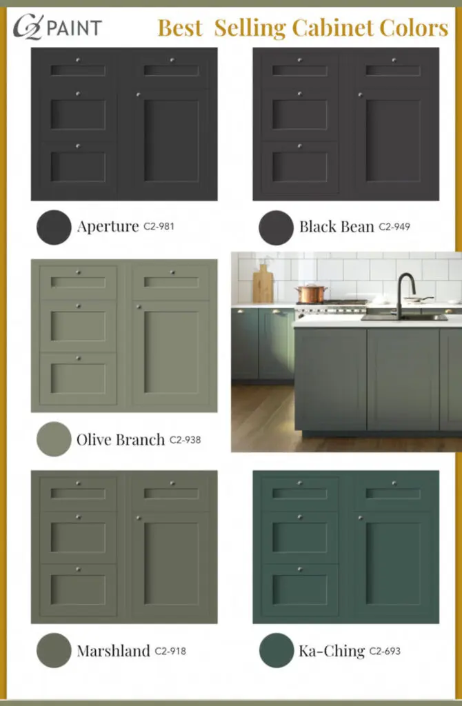
Cabinet painting is one of the most cost effective, easy and transformative home upgrades. Picking the right color is equally as important as having your cabinets professionally painted. Here are some C2 Best selling and popular kitchen cabinet paint colors. Beautiful Cabinets A cabinet repaint upgrades a home’s overall aesthetic…
1920’s Benjamin Moore Colors
By All Los Angeles Painting Company, Inc. |
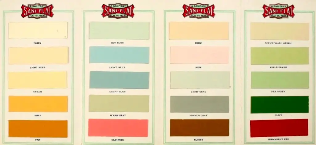
The 1920’s was a decade marked by the glamour of the Jazz Age, the rise of Art Deco, and the influence of modernism. This period saw a shift in color trends for house paint, emphasizing refined elegance and luxurious tones that reflected the optimism and sophistication of the era. 1920’s…
Winter Inspired Colors
By All Los Angeles Painting Company, Inc. |
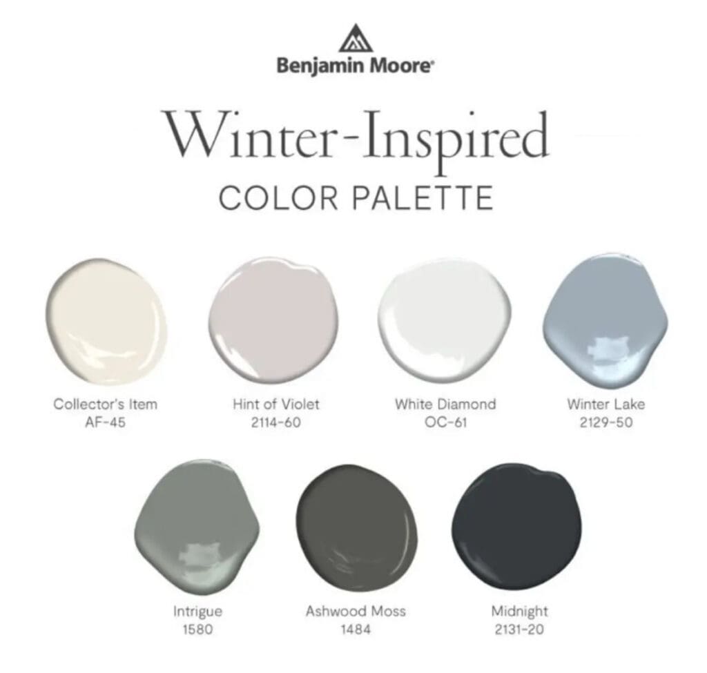
If winter is your favorite time of year, Benjamin Moore has some colors for you. These tones provide a cozy refresh to any room. Winter is associated with cold temperatures, snowfall, and white, gray, and blue hues. However, skillfully incorporating them into your decorating plans creates a warm color scheme….
Vintage Dunn Edwards Colors
By All Los Angeles Painting Company, Inc. |
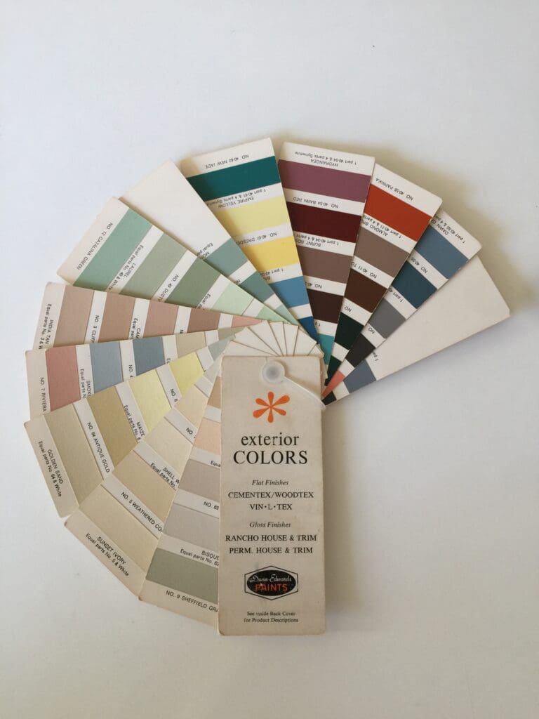
Mid Century colors appeal to homeowners because they connect to an era that evoked feelings of an unlimited bright future. These hues have a proven track record of popularity. Mix and match these vintage Dunn Edwards colors to create your own unique color scheme. 1960’s Exterior Colors Pictured here is…
Backdrop Color Collection
By All Los Angeles Painting Company, Inc. |
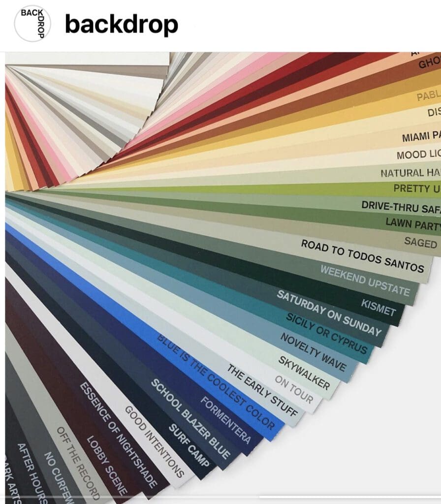
This is the Backdrop Color Collection fan deck. Be the cool kid on your block by updating your space with these trending colors. Available in premium acrylic latex interior and exterior finishes. Why use Backdrop colors in decorating schemes: First, the curated color selection easily complements and enhances most decorating…
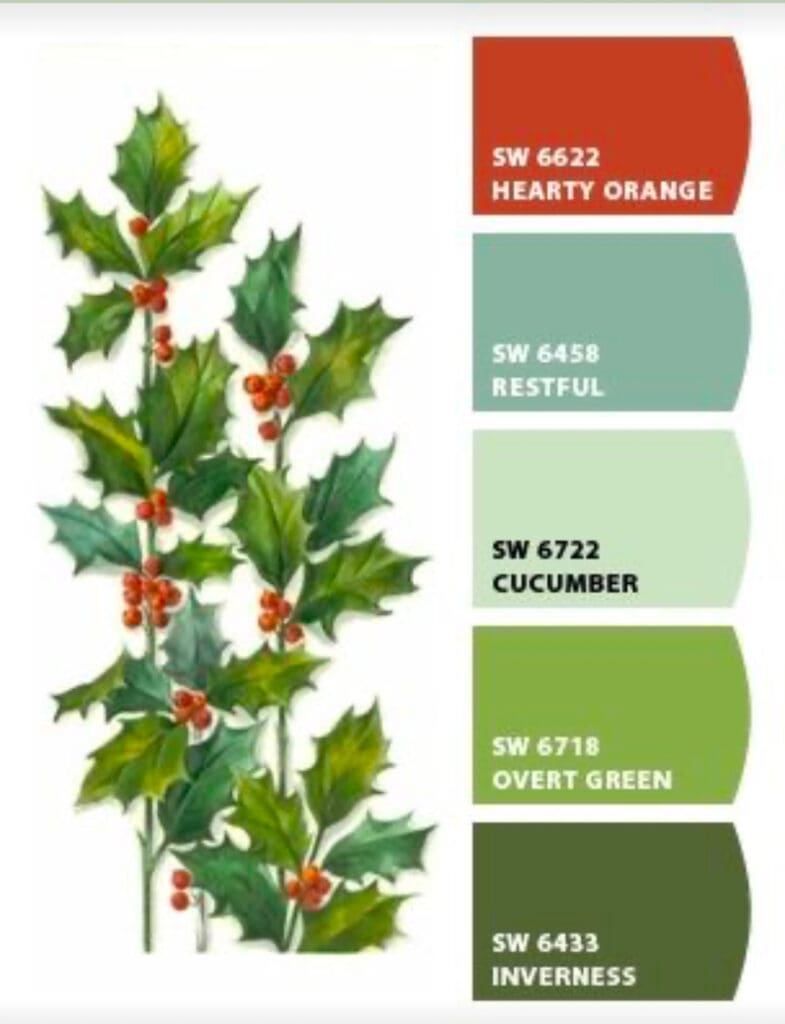
Popular Christmas Paint Color Ideas
By All Los Angeles Painting Company, Inc. |
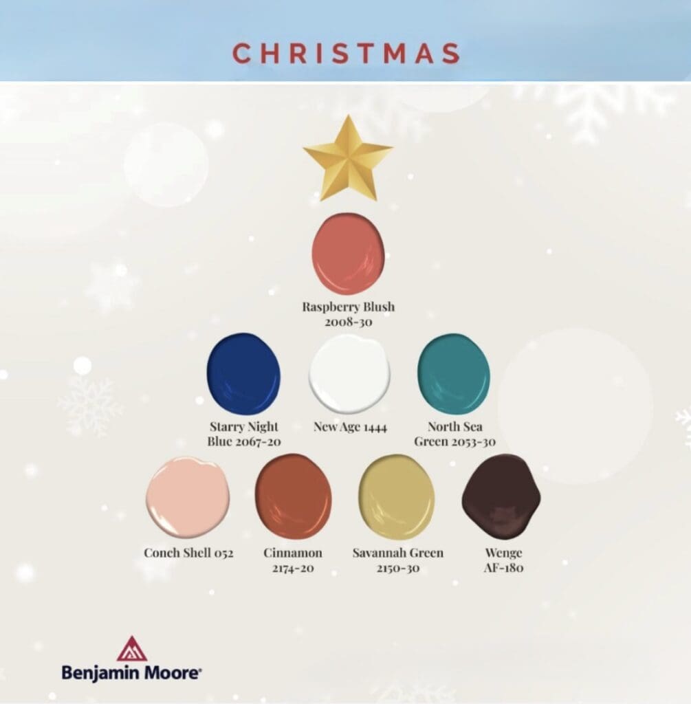
Turn your home into a cozy retreat with these popular Christmas paint color ideas. Holiday decorating is a great opportunity to get creative. Color schemes for the winter holidays include: Consider the overall mood you want to create in your space, and choose colors that complement each other, your furnishings,…
